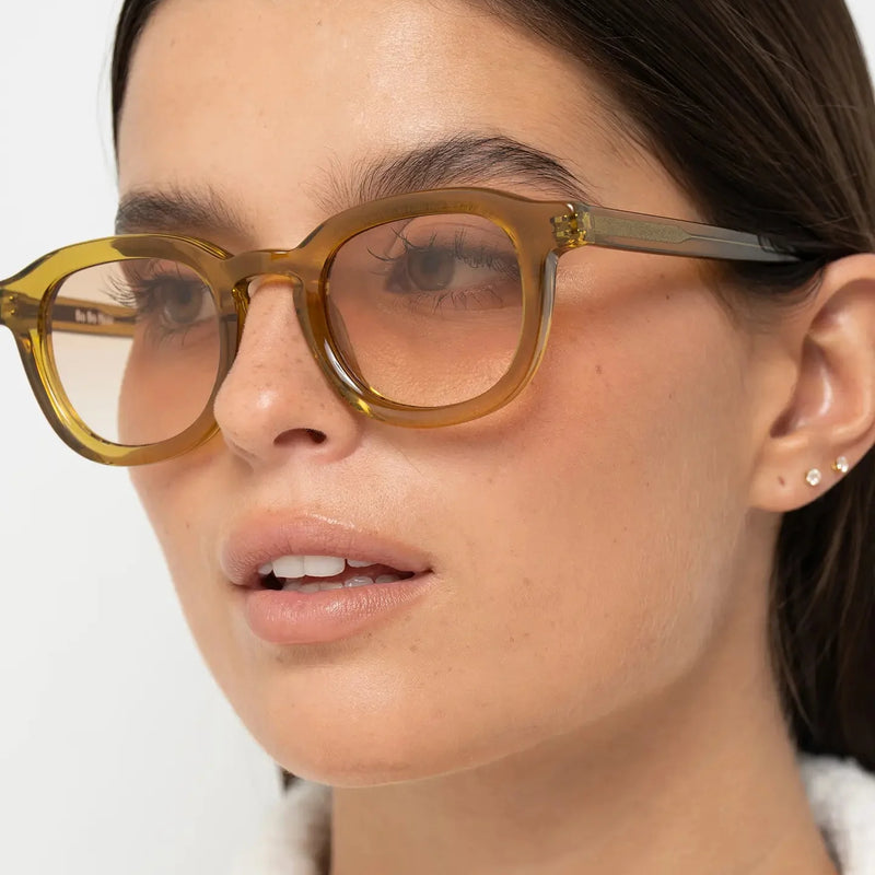
Have you ever looked at a pair of sunglasses and immediately thought they looked expensive—even before knowing the brand or the price?
That reaction is surprisingly common.
People often associate certain design characteristics with quality long before they notice logos, materials or cost.
This is because our brains respond instinctively to balance, proportion, precision and consistency. Sunglasses that combine these elements often feel more refined, more intentional and ultimately more premium.
Interestingly, many of these qualities have very little to do with price itself.
If you're interested in understanding why some sunglasses instantly suit your face, start with our guide to Why Do Some Sunglasses Suit Me Better Than Others?. It explains how facial balance influences the way eyewear is perceived.
This article explores the design principles that make some sunglasses look expensive—regardless of the price tag.
QUICK ANSWER
Expensive-looking sunglasses usually combine balanced proportions, controlled acetate thickness, refined frame geometry, consistent detailing and thoughtful colour contrast. Together, these elements create a sense of visual harmony that people naturally associate with quality.
Most people think sunglasses look expensive because of the brand.
In reality, your brain notices proportion before it notices logos.
Great design creates a premium impression long before branding becomes visible.
YOUR BRAIN RECOGNISES QUALITY BEFORE IT KNOWS THE PRICE

Human perception evolved to identify order, precision and consistency.
When those characteristics appear in an object, we instinctively associate them with care, quality and durability.
This is why certain sunglasses immediately feel more premium, even when we know nothing about their price or origin.
Balanced geometry, controlled symmetry, refined transitions between surfaces and carefully considered proportions all contribute to this first impression.
The brain interprets these visual cues as signals of thoughtful design.
Visual Principle
Premium isn't something your eyes read.
It's something your brain interprets.
That interpretation begins within seconds of seeing a frame.
FRAME GEOMETRY IS THE FOUNDATION OF PREMIUM DESIGN

Before we notice colour, branding or even materials, we recognise geometry.
Our brains are remarkably sensitive to proportion, symmetry and visual rhythm. When these elements feel balanced, a pair of sunglasses immediately appears more refined.
Premium eyewear is rarely defined by complex shapes. It is defined by well-resolved proportions.
A frame with carefully balanced curves, consistent line thickness and harmonious lens proportions creates a sense of precision that inexpensive designs often struggle to achieve.
This explains why timeless silhouettes continue to feel sophisticated decade after decade.
The most expensive-looking sunglasses are rarely the most complicated.
They are usually the most disciplined.
Every curve, angle and proportion feels intentional rather than decorative.
WHY VISUAL WEIGHT CREATES A PREMIUM IMPRESSION

One of the strongest signals of quality is visual weight.
Visual weight isn't determined by size alone. It comes from the relationship between acetate thickness, lens proportions, colour and frame geometry.
Balanced visual weight makes sunglasses feel substantial without appearing heavy.
Frames that are too delicate may look fragile, while excessively thick designs can overwhelm the face. Premium eyewear sits comfortably between these extremes.
The objective is confidence through proportion, not excess.
Very thin frames
Often feel lightweight, but can lack visual presence.
Balanced acetate
Creates structure, definition and a refined sense of permanence.
Excessively thick frames
Can dominate the face if visual weight isn't carefully controlled.
WHY ACETATE OFTEN LOOKS MORE REFINED THAN METAL

Material alone doesn't determine whether sunglasses appear premium.
However, acetate offers designers greater control over form, thickness and surface finish than many lightweight metal constructions.
This allows acetate frames to create smoother transitions, stronger visual presence and more consistent proportions.
Combined with carefully polished surfaces and rich colour depth, acetate often communicates craftsmanship through visual coherence rather than decoration.
This is one reason why well-designed acetate sunglasses frequently feel more timeless than trend-driven minimalist frames.
If you'd like to understand this relationship further, explore our guide to Thin vs Thick Frame Sunglasses.
People often describe premium acetate as looking "solid" or "well made."
What they are really responding to is consistency of proportion, depth of material and controlled visual weight.
DETAILS MATTER MORE THAN DECORATION

Many people associate premium products with more decoration.
In eyewear, the opposite is often true.
The strongest designs rely on restraint rather than excess.
Clean transitions, balanced hinge placement, carefully integrated temples and consistent surface finishing all contribute to a refined appearance without demanding attention.
This subtle consistency is one of the defining characteristics of eyewear that continues to look relevant long after short-lived trends disappear.
"More detail makes sunglasses look more expensive."
In reality, unnecessary decoration often distracts from proportion.
The most refined eyewear allows geometry, balance and material quality to speak for themselves.
WHY COLOUR DEPTH MAKES SUNGLASSES LOOK MORE REFINED

Colour is one of the first things we notice, but depth is what gives it character.
Premium-looking sunglasses rarely rely on bright colours or strong decoration. Instead, they use rich tones, subtle variations and controlled contrast to create visual depth.
Tortoise acetate is a perfect example. Rather than appearing flat, it contains multiple layers of colour that interact with light, giving the frame a more natural and sophisticated appearance.
Black acetate creates a different impression. Its strength comes from clarity, consistency and sharp definition rather than complexity.
The objective is not to make the frame more noticeable.
It is to make the overall composition feel more refined.
If you'd like to explore this further, read Black vs Tortoise Sunglasses.
Black acetate
Creates clean definition with timeless architectural contrast.
Tortoise acetate
Adds richness, warmth and natural colour variation.
Olive, honey and crystal tones
Introduce softer transitions while maintaining a premium visual presence.
WHY SOME DESIGNS NEVER GO OUT OF STYLE

Fashion trends change every season.
Good proportions rarely do.
The sunglasses that continue to feel contemporary after many years are almost always built around balanced geometry rather than temporary styling trends.
Timeless design relies on proportion instead of novelty.
Instead of exaggerated angles or decorative details, it focuses on harmony, consistency and restraint.
This is why many classic eyewear silhouettes continue to inspire modern collections decade after decade.
Trends attract attention.
Proportion earns longevity.
The most refined sunglasses are often the ones that still look relevant long after seasonal trends have disappeared.
OUR FAVOURITE BO BO NOIR SILHOUETTES

Every Bo Bo Noir silhouette is designed around the same principle: balance before decoration.
Rather than relying on oversized logos or unnecessary embellishment, each collection explores proportion, geometry and visual harmony in a different way.
Jane creates a confident architectural presence through clean rectangular lines and disciplined proportions.
Narr combines structured panto geometry with softer transitions, making it one of the most versatile silhouettes for everyday wear.
Triboulet pairs generous proportions with rich acetate colours and gradient lenses, creating warmth without sacrificing definition.
William demonstrates how bold round acetate can feel refined when visual weight and geometry remain carefully balanced.
Each collection expresses a different personality, yet all share the same commitment to proportion and long-term wearability.
Choose Jane if...
You appreciate clean architectural lines with confident definition.
Choose Narr if...
You want a timeless everyday silhouette that balances softness and structure.
Choose Triboulet if...
You prefer richer acetate tones and generous lens proportions.
Choose William if...
You enjoy expressive round geometry with carefully controlled visual weight.
PREMIUM DESIGN IS ABOUT CONSISTENCY

The strongest sunglasses don't rely on one outstanding feature.
Instead, every element works together.
Frame geometry, acetate thickness, colour, surface finish, bridge design and lens proportions all contribute to a single visual language.
When every detail follows the same design philosophy, the sunglasses feel intentional rather than assembled.
This consistency is one of the defining characteristics of eyewear that people naturally associate with premium quality.
If you want to recognise premium design, ignore the logo for a moment.
Instead, look at how the frame flows from front to temples, how balanced the proportions feel and whether every detail appears to belong to the same design language.
The best sunglasses rarely impress through one dramatic feature.
They impress because everything feels coherent.
COMMON MISTAKES WHEN JUDGING THE QUALITY OF SUNGLASSES
One of the biggest misconceptions in eyewear is believing that price alone determines whether sunglasses look premium.
In reality, people respond to visual cues long before they know how much a frame costs.
The sunglasses that look the most refined usually achieve this through proportion, consistency and thoughtful design rather than excessive branding or decoration.
The most common mistakes include:
- Assuming that large logos automatically make sunglasses look more expensive.
- Choosing oversized frames simply because they appear more dramatic.
- Focusing only on materials while ignoring proportion and geometry.
- Mistaking heavy decoration for premium craftsmanship.
- Following short-lived trends instead of timeless design principles.
- Ignoring how the sunglasses interact with your own facial proportions.
Great eyewear doesn't try to prove its quality.
It allows thoughtful design to speak for itself.
HOW TO RECOGNISE PREMIUM DESIGN
If you want to understand why some sunglasses immediately feel more refined, look beyond the logo.
Instead, pay attention to how every element works together.
Look at the proportions...
Do the lenses, bridge and temples feel balanced as a complete composition?
Look at the visual weight...
Does the frame create enough presence without overwhelming the face?
Look at the geometry...
Are the curves, angles and transitions disciplined and consistent?
Look at the finish...
Do the colours, surfaces and details feel calm rather than excessive?
Finally, look at yourself...
The best sunglasses should make your facial features feel more harmonious—not simply attract attention to the frame itself.
"If sunglasses cost more, they'll automatically look better."
Price can reflect better materials, construction and design, but it doesn't guarantee visual harmony.
The sunglasses that appear most premium are usually those where geometry, proportion, material and restraint work together as one coherent design.
FINAL THOUGHTS
People often associate premium eyewear with exclusivity or price.
Yet what creates that impression begins much earlier.
Balanced geometry, controlled visual weight, thoughtful colour, refined acetate and disciplined proportions all contribute to the way sunglasses are perceived.
These are the qualities that make a frame feel intentional, timeless and naturally refined.
The strongest sunglasses don't rely on trends or oversized logos to communicate quality.
They create confidence through clarity, consistency and proportion.
Once you recognise these principles, it becomes much easier to understand why some sunglasses continue to look exceptional year after year, regardless of changing fashion.
Frequently Asked Questions
Why do some sunglasses look more expensive than others?
People naturally associate balanced proportions, refined geometry, controlled visual weight and high-quality finishing with premium design.
Can affordable sunglasses look expensive?
Yes. Thoughtful proportions, restrained detailing and harmonious design can create a premium impression regardless of price.
Do luxury logos make sunglasses look better?
Not necessarily. While branding influences perception, balanced design and proportion usually have a much stronger visual impact.
Why does acetate often feel more premium?
Acetate allows greater control over thickness, colour depth and surface finishing, creating stronger visual consistency and refined proportions.
Do thicker frames always look more expensive?
No. Visual weight must remain balanced. Excessively thick frames can feel heavy, while very thin frames may lack presence.
Does frame colour affect perceived quality?
Yes. Rich tortoise patterns, deep black acetate and carefully developed translucent colours often create greater visual depth than flat finishes.
Why do timeless sunglasses often feel more premium?
Because timeless design prioritises proportion and balance over short-lived trends, allowing the frame to remain visually relevant for many years.
Can sunglasses look expensive without being flashy?
Absolutely. Many of the most refined designs rely on restraint, disciplined geometry and subtle detailing rather than decoration.
What should I notice first when evaluating a frame?
Look at the overall composition. If every element feels balanced and intentional, the sunglasses are more likely to create a premium impression.
How do I choose sunglasses that look refined on me?
Focus on facial harmony rather than trends. A frame that complements your proportions will almost always look more sophisticated than one chosen purely because it is fashionable.
👁 YOU MAY ALSO LIKE
Understanding why sunglasses look premium is closely connected to facial balance, frame geometry and intentional design. Continue exploring these principles with the guides below.
Why Do Some Sunglasses Suit Me Better Than Others?
Learn why proportion, facial balance and frame geometry determine whether sunglasses naturally suit your face.
Read the article →
What Makes Sunglasses Look Flattering?
Discover the design principles that make certain frames enhance facial proportions more effectively than others.
Read the article →
Thin vs Thick Frame Sunglasses
Explore how acetate thickness changes visual weight, facial definition and overall balance.
Read the article →
Black vs Tortoise Sunglasses
Compare how different acetate colours influence contrast, depth and the perception of premium eyewear.
Read the article →
Explore the Bo Bo Noir Sunglasses Collection
Discover acetate sunglasses designed around balance, geometry and long-term wearability.
Explore the collection →