Free Worldwide Shipping • 14-Day Returns • Designed in PortugalFree Worldwide Shipping • 14-Day Returns • Designed in PortugalFree Worldwide Shipping • 14-Day Returns • Designed in PortugalFree Worldwide Shipping • 14-Day Returns • Designed in PortugalFree Worldwide Shipping • 14-Day Returns • Designed in PortugalFree Worldwide Shipping • 14-Day Returns • Designed in PortugalFree Worldwide Shipping • 14-Day Returns • Designed in PortugalFree Worldwide Shipping • 14-Day Returns • Designed in PortugalFree Worldwide Shipping • 14-Day Returns • Designed in PortugalFree Worldwide Shipping • 14-Day Returns • Designed in PortugalFree Worldwide Shipping • 14-Day Returns • Designed in PortugalFree Worldwide Shipping • 14-Day Returns • Designed in PortugalFree Worldwide Shipping • 14-Day Returns • Designed in PortugalFree Worldwide Shipping • 14-Day Returns • Designed in PortugalFree Worldwide Shipping • 14-Day Returns • Designed in Portugal
Acetate glasses are not moving toward one dominant look in 2027. The more interesting shift is happening inside the material itself: transparency, opacity, colour, pattern and tonal depth are changing how substantial a frame appears on the face.
That distinction matters because acetate thickness alone does not determine visual presence. Two frames can use similarly substantial material and create very different effects. Crystal acetate allows skin and light to remain visible through the frame. Black creates a more defined boundary. Tortoise breaks that boundary into tonal variation, while richer colours can introduce identity without relying on an entirely new silhouette.
This makes the central acetate story of 2027 less about how much material is there and more about how strongly that material is perceived. For the wider optical context, Eyewear Trends 2027 maps the broader design direction, while this guide isolates what is changing specifically inside acetate.
Coloured crystal acetate shows why material presence in 2027 cannot be understood through thickness alone.
Quick answer: The key acetate glasses trends for 2027 are translucent and coloured crystal finishes, richer colour, renewed tortoise and patterned effects, greater tonal depth and more intentional use of substantial acetate. The important shift is not toward one shape or thickness, but toward controlling visual weight through structure, opacity, colour and material depth.
BBN Insight: Physical acetate volume and perceived visual weight are not the same thing. Transparency can make a substantial frame appear lighter; opacity can make similar dimensions feel more assertive. In 2027, understanding that difference is more useful than simply asking whether thick or thin frames are trending.
What is changing in acetate glasses in 2027?
The strongest change is not a sudden replacement of one frame shape by another. It is a broader exploration of what acetate can communicate through colour, transparency, pattern and surface.
Material-focused trend research for 2027 from Mazzucchelli 1849 and Peclers Paris places particular emphasis on the evolving relationship between eyewear, colour, materials and patterns. Recent MIDO trend analysis similarly highlights transparency, layering, material expression and a broad palette extending from crystal and black to havana, brown, burgundy, green, khaki, blue and more expressive accent colours.
That wider material shift is important because it allows familiar geometries to feel new without depending on novelty of shape alone. A round, rectangular or panto frame can change significantly when the material moves from opaque to translucent, flat colour to tonal variation, or uniform surface to layered depth.
This is also where this article separates from Eyeglasses Trends 2027. That guide asks what is changing across optical eyewear as a whole. Here, the narrower question is what acetate itself is doing differently.
Instead of treating acetate as one visual category, it is more useful to separate five variables.
Variable
What changes?
Visual effect
Structure
Thickness, rim presence and overall geometry
Establishes the physical silhouette
Opacity
How much light and skin remain visible
Controls how strongly the silhouette separates from the face
Colour
Contrast, warmth and chromatic identity
Changes emphasis and personality
Depth
Pattern, layering and tonal variation
Makes the material feel flatter or more dimensional
Visual Weight
The combined result of the other variables
Determines how strongly the frame registers on the face
This framework explains why describing a frame simply as “thick acetate” tells us surprisingly little about how it will actually look.
Structure creates the silhouette. Opacity, colour and depth determine how strongly that silhouette is perceived.
Translucent and crystal acetate are becoming more expressive
Transparency remains one of the clearest directions in contemporary acetate, but the interesting development is moving beyond completely colourless clear frames.
Crystal peach, yellow, smoke, amber and other translucent colour families allow acetate to retain physical presence while letting light and skin participate in the visual effect. The result can feel substantial without creating the hard boundary associated with fully opaque material.
This is why transparency should not automatically be interpreted as minimalism. A substantial translucent frame may still have considerable character. It simply distributes that character differently.
As explored in why transparent optical frames feel lighter, allowing more of the face to remain visible through the material can reduce perceived visual weight without reducing physical structure.
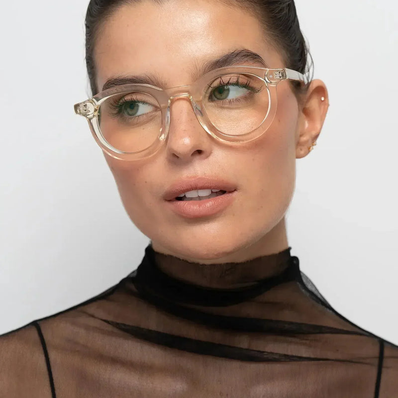
Crystal Peach preserves the physical structure of the William silhouette while reducing the strength of its visual boundary.
2027 shift: transparency is becoming less about making eyewear disappear and more about controlling how colour, light and material presence interact.
Richer acetate colour is moving beyond simple neutrals
Black and classic tortoise remain important because they create highly legible visual effects, but the 2027 material landscape is broader.
Recent eyewear trend research points toward browns, havana, burgundy, greens, khaki, blues, reds and other richer colour territories alongside crystal and neutral tones. The important point is not that every colour suddenly becomes an everyday basic. It is that colour is increasingly being used as a structural part of frame identity rather than as decoration added after the shape has been chosen.
A burgundy acetate frame, for example, can create substantial definition while producing a different relationship with the face than black. Olive can remain visually distinctive while feeling earthier and less absolute. Transparent yellow can be chromatically expressive while retaining lower opacity.
Colour therefore needs to be evaluated together with opacity. A brighter transparent colour can sometimes register less heavily than a neutral opaque one.
Colour and opacity are separate variables: a noticeable yellow can still allow the face to remain visible through the acetate.
The useful question is therefore not simply whether a colour is bold. It is how that colour behaves once opacity, skin tone, frame scale and material depth are considered together.
Tortoise and patterned acetate are gaining renewed relevance
Tortoise demonstrates one of acetate's most useful qualities: the ability to create variation inside the material rather than relying on a completely uniform surface.
Unlike solid black, tortoise does not create one continuous visual boundary. Lighter and darker areas interrupt the outline, producing material depth and variation as the frame moves through different light.
That makes patterned acetate particularly relevant to the broader 2027 interest in material expression, layering and renewed interpretation of familiar references.
It also explains why tortoise can remain useful beyond an individual trend cycle. The pattern has a recognisable history, but variations in scale, transparency, colour and contrast allow it to be continuously reinterpreted.
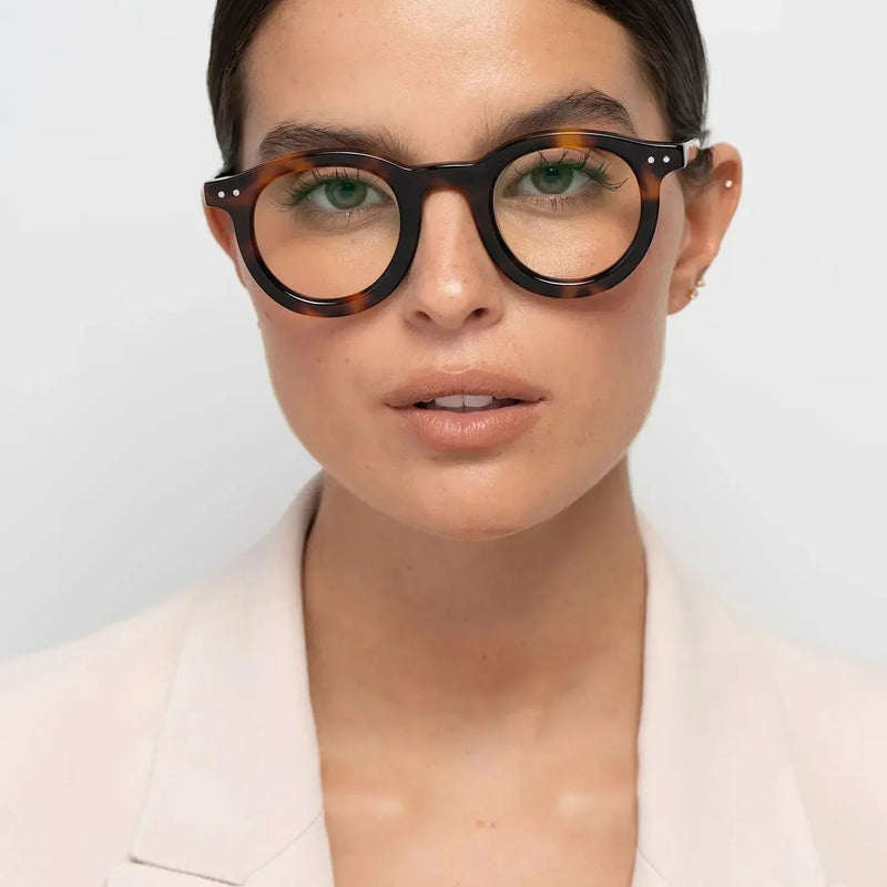
Tortoise breaks a solid frame outline into tonal variation, creating depth without removing acetate presence.
Material depth matters more than flat colour alone
One of the more useful ways to understand acetate in 2027 is to distinguish colour from depth.
Colour tells us whether a frame is black, brown, green, burgundy or yellow. Depth describes what happens inside that colour: transparency, pattern, tonal variation, layering and the way the material responds to light.
This is particularly important with acetate because its visual character can change as the viewing angle and lighting change. A flat opaque colour tends to create a more consistent boundary. A translucent or patterned material can reveal different levels of intensity across the same frame.
An angled view makes the distinction between flat colour and material depth easier to see: variation exists within the acetate itself.
The trend implication is straightforward: 2027 acetate is increasingly about what happens within the material, not only around its outer silhouette.
Substantial acetate remains relevant, but thickness is no longer the whole story
Bold acetate has not disappeared. Strong rims and clearly defined silhouettes continue to give eyewear presence, especially when glasses are intended to become part of a person's visual identity.
But treating thickness itself as the trend misses what is changing.
A substantial black frame can create a highly graphic effect. The same degree of material presence in crystal acetate can feel more open. Tortoise can fragment the outline. A richer translucent colour can sit somewhere between those extremes.
Opaque black makes the William silhouette highly legible, demonstrating how opacity can increase perceived visual weight without requiring a different geometry.
This means 2027 offers more ways to wear substantial acetate without producing the same visual result.
The better question is no longer simply “Are thick frames in style?” It is “How do I want this amount of material to register on my face?”
How does acetate change visual weight on the face?
Visual weight is the perceived strength of the frame relative to the face. It is not a measurement printed on a product page.
Several variables contribute at once: rim thickness, lens depth, frame width, colour contrast, opacity and pattern. That is why two acetate frames with comparable dimensions can feel very different when worn.
Acetate direction
Typical visual effect
Consider it when
Opaque black
Clear, graphic definition
You want the frame outline to register strongly
Tortoise
Structured but tonally varied
You want acetate presence with less uniformity
Soft crystal
Lower perceived boundary
You want substantial material with softer contrast
Coloured crystal
Colour identity with visible transparency
You want colour without full opacity
This is why the decision between clear and black frames is more accurately understood as a contrast and visual-weight decision than a simple choice between two colours.
Scale also matters. A wider or deeper frame can increase the area occupied by acetate even when the material itself is transparent. The guide to how frame width changes facial proportions explains why material and geometry should not be evaluated independently.
BBN Insight: Physical size tells you how much frame is present. Visual weight tells you how strongly you perceive it. Acetate trends become more useful when those two questions are separated.
How should you choose an acetate direction for 2027?
Trend relevance can help identify what feels current, but it should not make the final decision.
Start with the structure you want on the face. Then decide how visible that structure should be. Only after that should colour and pattern refine the effect.
Use the framework: Structure → Opacity → Colour → Depth → Visual Weight. First choose the amount of frame presence. Then decide whether that presence should feel graphic, translucent, tonal or patterned.
If the glasses will be worn with prescription lenses every day, trend appeal also has to survive repetition. The guide to choosing optical frames you'll wear every day adds fit, facial proportion, prescription compatibility and repetition to the decision.
If the unresolved question is the material itself rather than its colour or opacity, acetate vs metal glasses is the more useful comparison.
The best 2027 acetate direction is therefore not necessarily the newest-looking material. It is the one whose visual effect still makes sense once novelty has disappeared.
Four acetate effects through one Bo Bo Noir silhouette
The William optical frame provides a useful controlled comparison because the round silhouette remains consistent while the acetate treatment changes. This isolates the material effect more clearly than comparing completely different frame shapes.
Keeping the William geometry consistent makes the effect of opacity, pattern and colour easier to isolate.
William Shiny Black: opacity and definition
William Shiny Black Optical uses opaque dark acetate to make the silhouette highly legible. The frame creates a clear boundary around the eyes, so its structure becomes an obvious part of the face.
Consider it if: you want substantial acetate to feel graphic, defined and intentional.
Consider another direction if: you want the same kind of structural presence with less contrast against the face.
William Tortoise: pattern and tonal depth
William Tortoise Optical keeps the structure visible while introducing tonal variation inside the acetate. Instead of one uninterrupted dark outline, the pattern creates areas of different intensity.
Consider it if: you want material depth and visible acetate character without the uniformity of solid black.
Consider another direction if: you prefer either maximum graphic clarity or obvious transparency.
William Crystal Peach: transparency and softer contrast
William Crystal Peach Optical keeps the round acetate structure while allowing more light and skin to remain visible through it.
Consider it if: you want substantial acetate with a softer perceived boundary on the face.
Consider another direction if: you want the frame outline to create stronger definition.
William Crystal Yellow: transparency with colour identity
William Crystal Yellow Optical demonstrates that transparency does not have to mean neutrality. Colour remains clearly present while opacity stays lower than in solid black.
Consider it if: you want a visible colour statement without turning the acetate into a completely opaque boundary.
Consider another direction if: your preference is for quieter colour or stronger dark definition.
The controlled comparison: Black demonstrates opacity. Tortoise demonstrates tonal depth. Crystal Peach demonstrates transparency with softer contrast. Crystal Yellow demonstrates transparency combined with chromatic identity. The geometry remains consistent; the material changes what the frame does visually.
Which 2027 acetate trends may age best?
No trend can be guaranteed to remain relevant indefinitely, but some material directions have stronger foundations than novelty alone.
Black acetate has longevity because its visual function is clear: definition. Tortoise repeatedly returns because pattern and tonal variation can be reinterpreted without losing their recognisable identity. Crystal acetate has potential beyond a single season because transparency solves a practical visual problem: it allows substantial structure to interact more softly with the face.
Richer colours can also have longevity when the wearer chooses them for identity rather than novelty. Burgundy, olive, amber or yellow do not become timeless merely because they appear in a forecast. Their longevity depends on whether their effect remains useful to the person wearing them.
The same distinction applies more broadly to 2027 colour decisions: which 2027 sunglasses colours will stay timeless examines why repetition and identity matter more than simply labelling a colour neutral or fashionable.
A material direction becomes durable when its visual function survives after its trend label disappears.
Common mistakes when choosing acetate glasses
Assuming thicker acetate always looks heavier. Opacity and contrast can influence perceived weight as much as physical thickness.
Treating clear acetate as invisible. Transparency can lower contrast while a substantial silhouette still creates strong identity.
Choosing colour without considering opacity. The same colour family can produce very different effects depending on how much light passes through the material.
Thinking tortoise is one fixed look. Pattern scale, tonal contrast and transparency can change how strongly tortoise registers.
Buying a trend instead of a visual effect. “2027” explains why a material direction feels current; it does not explain whether it works for your face, prescription or everyday identity.
Assuming acetate is automatically the right material. Acetate and metal create different structural and visual effects. Material should solve the intended visual and practical role rather than win by default.
FAQ about acetate glasses trends in 2027
Are acetate glasses in style for 2027?
Yes. Current eyewear trend research continues to show strong interest in acetate and other expressive materials. The more important development is how acetate is being used through transparency, richer colour, pattern, layering and different levels of visual presence rather than one single frame shape.
What acetate colours are trending in 2027?
Relevant directions include crystal and translucent tones alongside black, havana, brown, burgundy, green, khaki, blue and more expressive colour accents. Rather than choosing colour from a trend list alone, consider how opacity and contrast change the effect on your face.
Are transparent glasses still in style in 2027?
Transparency remains relevant, particularly as coloured crystal and translucent acetate expand beyond completely clear frames. The direction is increasingly about combining visible colour with controlled opacity rather than making the frame disappear.
Are tortoise glasses trending in 2027?
Tortoise remains relevant within the broader interest in patterned, layered and tonally varied acetate. Its strength is that it can be reinterpreted through different colours, transparency levels and pattern scales rather than depending on one fixed version.
Do thick acetate glasses make the face look heavier?
Not automatically. Thick rims increase physical structure, but perceived visual weight also depends on opacity, colour contrast, transparency, lens depth and overall scale. A substantial crystal frame can appear lighter than an opaque dark frame with similar dimensions.
Are acetate or metal glasses more fashionable in 2027?
Neither material is universally more fashionable. Acetate offers colour, transparency, pattern and material depth, while metal creates different possibilities for line, structure and perceived lightness. The better choice depends on the visual effect and wearing role you want.
Final thoughts
Acetate glasses in 2027 are becoming more interesting not because the material is suddenly new, but because there are more ways to control how its presence is perceived.
Structure determines the physical silhouette. Opacity controls how strongly that silhouette separates from the face. Colour introduces contrast and identity. Pattern and layering create depth. Together, those variables determine visual weight.
That is a more useful way to approach the trend than simply choosing the thickest, clearest or most colourful frame of the moment.
The strongest acetate direction for 2027 is the one where material presence has a purpose — and where that purpose still makes sense after the trend itself becomes familiar.
Sources and methodology
This article distinguishes between documented industry direction and Bo Bo Noir editorial interpretation. Trend evidence was informed by Mazzucchelli 1849 and Peclers Paris research into eyewear materials, colours and patterns for 2027, together with recent MIDO trend analysis covering transparency, layering, acetate, colour and material expression. The BBN framework — Structure → Opacity → Colour → Depth → Visual Weight — is an editorial decision model developed to translate those material directions into practical eyewear choices.
Enjoy a 10% discount on your purchase! Sign up for our newsletter now.Enjoy a 10% discount on your purchase! Sign up for our newsletter now.Enjoy a 10% discount on your purchase! Sign up for our newsletter now.Enjoy a 10% discount on your purchase! Sign up for our newsletter now.Enjoy a 10% discount on your purchase! Sign up for our newsletter now.Enjoy a 10% discount on your purchase! Sign up for our newsletter now.Enjoy a 10% discount on your purchase! Sign up for our newsletter now.Enjoy a 10% discount on your purchase! Sign up for our newsletter now.Enjoy a 10% discount on your purchase! Sign up for our newsletter now.Enjoy a 10% discount on your purchase! Sign up for our newsletter now.Enjoy a 10% discount on your purchase! Sign up for our newsletter now.Enjoy a 10% discount on your purchase! Sign up for our newsletter now.Enjoy a 10% discount on your purchase! Sign up for our newsletter now.Enjoy a 10% discount on your purchase! Sign up for our newsletter now.Enjoy a 10% discount on your purchase! Sign up for our newsletter now.