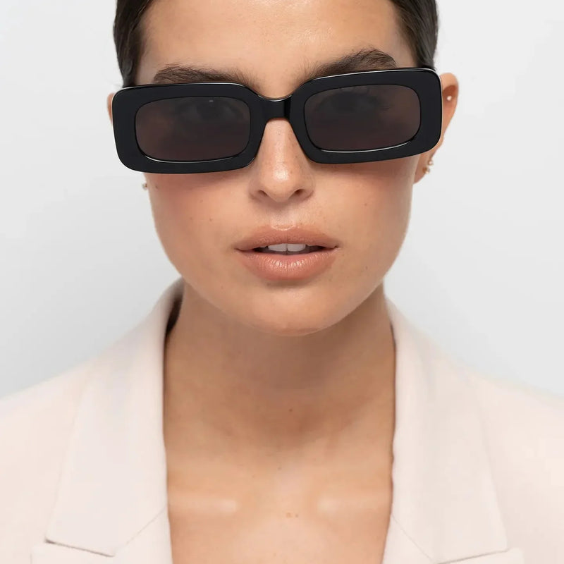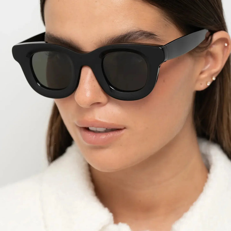
A large logo can make sunglasses easier to identify from a distance, but it does not tell you whether the frame is well proportioned, carefully finished or comfortable to wear. Visible branding and product quality are two different things.
Well-designed sunglasses can be recognisable through silhouette, frame geometry, acetate, colour, proportion and finishing before anyone notices the brand name. When those elements work together, the frame develops its own identity instead of depending on a logo to create interest.
That distinction becomes particularly useful when comparing premium eyewear. A recognisable brand may influence perceived value, but the frame still has to justify itself through the object you actually wear: how it sits on the face, how the material looks at close range and whether its proportions feel intentional.
For the broader design context, quiet luxury sunglasses without logos explores how proportion, material and restraint can create identity without overt branding.

Do good sunglasses need big logos?
No. A large logo can communicate brand identity, but it does not establish the quality of the sunglasses. Fit, material, construction, finishing, frame geometry and visual balance can all be evaluated independently of how visible the branding is.
A strong frame can be recognisable because of its silhouette, acetate colour and proportions. When the design itself carries enough identity, branding can remain secondary rather than becoming the main reason the sunglasses attract attention.
In this guide
- Why doesn't a large logo prove sunglasses are high quality?
- What gives sunglasses identity without a big logo?
- Why is silhouette more important than visible branding?
- How do proportions make sunglasses look more considered?
- How can acetate create brand identity?
- Why can colour make a frame recognisable?
- Why does finishing matter more than logo size?
- When does subtle branding work better?
- Can sunglasses be recognisable without a visible logo?
- Which signals should you judge instead of branding?
- How should you judge sunglasses before buying?
- Which Bo Bo Noir frames illustrate design-led identity?
- Frequently asked questions
BBN insight
Brand identity becomes more convincing when the frame still has character after the logo is mentally removed. Silhouette, material and proportion should give the eyewear a reason to be remembered on their own.
Why doesn't a large logo prove sunglasses are high quality?
Logo size is a communication choice, not a construction specification. A large mark can tell you which brand made the sunglasses, but it cannot tell you whether the frame width is appropriate, whether the bridge sits correctly, whether the hinges behave consistently or whether the acetate has been finished carefully.
Those qualities belong to the frame itself and remain observable whether the branding is obvious, discreet or absent. This makes logo visibility a weak quality signal when considered alone.
A better inspection starts with the object. How to tell if glasses are high quality explains which material, construction and finishing details are more useful when evaluating a pair.

What gives sunglasses identity without a big logo?
Eyewear identity can come from repeated design decisions working together: the shape of the upper frame, lens proportions, bridge geometry, acetate thickness, temple profile, colour palette and surface treatment. None of these elements needs to be extreme, but together they can make a frame distinctive before branding is considered.
This creates an important distinction between brand recognition and design recognition. Brand recognition can come from seeing a familiar mark; design recognition comes from understanding the character of the frame through the object itself.
Design recognition is harder to create because it requires coherence. The silhouette needs to feel intentional, proportions need to support one another and the material must contribute to the design rather than simply decorate it.
Why is silhouette more important than visible branding?
Silhouette is one of the first things the eye reads from a distance. Before someone notices a small detail on the temple, they can already perceive whether the frame is rectangular, round, panto, broad, narrow, substantial or visually light.
That gives geometry a strong role in first impressions. A bold rectangle introduces horizontal definition, a substantial round frame adds curvature and a panto combines a softer lower lens with more structure across the upper frame. Those visual effects remain even if the logo is covered.
For a deeper explanation of why geometry changes the wearer so noticeably, how frame shape changes facial balance explores the relationship between frame lines and facial proportions.

How do proportions make sunglasses look more considered?
A frame usually looks more resolved when its dimensions feel related. Width needs to make sense beside lens height, acetate thickness should reinforce rather than overwhelm the shape, and the bridge should position the frame coherently between the eyes.
When those relationships work, the sunglasses can feel distinctive without additional decoration because no single dimension appears accidental. Proportion becomes part of the identity of the object.
That is difficult for branding to replace. A logo can be applied to many frames, but the relationship between width, lens shape and material has to be designed into the sunglasses themselves. How frame width changes facial proportions explains one of the most important parts of that relationship.
What creates recognition before the logo?
- Silhouette: the overall geometry of the frame.
- Proportion: the relationship between width, lens height, bridge and acetate thickness.
- Material: how acetate colour, pattern and transparency behave.
- Colour: whether the frame creates stronger definition, softer contrast or a distinctive tonal direction.
- Finishing: how surfaces, edges and transitions appear at close range.
How can acetate create identity without visible branding?
Acetate occupies a large visible area of many frames, which allows colour, pattern, transparency and thickness to become part of the design language. Tortoise introduces tonal variation, crystal acetate reveals depth through transparency and opaque colours create stronger continuous outlines.
This means the same basic geometry can develop a completely different personality depending on the acetate. Material can therefore carry character without needing an oversized mark on the temple.
If material is one of your main buying signals, why premium acetate looks different examines colour depth, transparency and surface treatment in greater detail.
BBN perspective
A logo can identify the maker. Silhouette, proportion and material explain why the frame itself is worth looking at.
What Part 1 tells us about logos and good sunglasses
- A large logo communicates brand recognition, not material, fit, construction or finishing quality.
- Strong eyewear can create identity through silhouette, proportion and acetate before branding becomes visible.
- Geometry often influences the first impression of a frame more strongly than small external details.
- Balanced proportions can make sunglasses feel resolved without additional decoration.
- Acetate colour, pattern, transparency and thickness can become part of a recognisable design language.
- The strongest frame still gives the wearer reasons to choose it when branding is no longer the focus.
Next: colour, finishing, subtle branding, recognisable design and which quality signals matter more than logo visibility.
Why can colour make a frame recognisable?
Colour can change the identity of a frame before anyone notices the branding. Black acetate creates a strong, continuous outline; tortoise introduces warmth and tonal variation; olive feels quieter and more earthy; burgundy adds depth without becoming as visually hard as black. Crystal acetate behaves differently again, allowing light and skin tone to remain partly visible through the frame.
This matters because a frame does not need unusual geometry to become memorable. A familiar panto or rectangular silhouette can develop a very different character simply through the relationship between shape and acetate colour. When that relationship feels intentional, colour becomes part of the design language rather than an applied decoration.
If colour is an important part of your decision, how frame colour changes your face explains how different levels of contrast can alter the way eyewear interacts with the face.

Why does finishing matter more than logo size?
A logo is designed to be noticed quickly; finishing reveals itself more gradually. The consistency of the surfaces, the treatment of the edges, the transition between the frame front and temples and the integration of different components all contribute to how resolved the sunglasses appear when you examine them closely.
That makes finishing a more useful product signal than logo size because it affects the frame as a whole. A prominent brand mark cannot compensate for poorly resolved surfaces or awkward transitions, while coherent finishing can reinforce a design without drawing attention to itself.
When comparing sunglasses, look beyond the most recognisable detail and inspect the complete object. The guide to how to tell if glasses are high quality provides a broader framework for doing this.

When does subtle branding work better?
Subtle branding works particularly well when the frame already has enough character to stand on its own. If silhouette, proportion, acetate and colour establish a clear visual direction, the logo does not have to compete with those elements for attention.
The hierarchy then changes. Instead of recognising the brand first and examining the sunglasses second, the viewer encounters the shape, material and relationship with the face before noticing who made them. Branding still has a role, but it confirms the identity rather than creating all of it.
This is closely connected to the idea explored in quiet luxury sunglasses without logos: restraint is not an absence of design, but a decision about which elements deserve the most visual attention.

BBN insight
Subtle branding is most convincing when the frame has something worth noticing without it. Restraint should reveal the strength of the design, not compensate for the absence of one.
Can sunglasses be recognisable without a visible logo?
Yes. Recognition can develop through recurring design characteristics rather than a single external mark. A particular approach to silhouette, acetate thickness, proportions, colour or temple geometry can gradually create a visual language that feels consistent across different frames.
That consistency does not require every model to look the same. In fact, a useful design language allows individual frames to have different personalities while retaining related decisions in material, structure or proportion. Recognition then comes from familiarity with the design rather than simply reading the brand name.
For the wearer, this can create a different relationship with the sunglasses. The frame may be noticed because it is distinctive, yet it can remain integrated with the person's appearance instead of turning the side of the face into the main branding surface.

Does discreet branding make sunglasses look generic?
No — not when the frame has a clear point of view. Minimal branding and minimal design are different things. Sunglasses can use restrained logos while still having substantial acetate, expressive proportions, distinctive colours or a recognisable silhouette.
A frame begins to feel generic when there is little to distinguish it once the branding is removed. If its shape, material and proportions offer almost no character of their own, the logo may be carrying most of the recognition. Stronger design reverses that relationship: the product becomes identifiable because its elements work together.
This is why discreet branding does not require quiet-looking sunglasses. A frame can be bold without being logo-led, just as a logo-free frame can still be visually forgettable.
Do large logos make sunglasses look more expensive?
A highly visible logo can increase immediate brand recognition and may influence perceived status, but that is different from judging how considered the sunglasses themselves look. A frame can communicate quality visually through proportion, material, finishing and the coherence of its design without requiring the brand name to dominate the first impression.
When comparing frames, examine what remains once recognition is removed from the equation. Look at how the acetate is used, whether the dimensions work together, how the frame sits on the face and whether it remains convincing at close range. Those observations tell you more about the object you will actually wear.
The same distinction matters when considering why premium sunglasses can feel better: the wearing experience comes from the complete frame, not from how quickly someone else recognises the branding.

Which signals should you judge instead of branding?
Start with the qualities that affect the entire frame. Look at whether the proportions are coherent, whether the acetate surfaces and edges appear consistent, whether the temples connect cleanly with the front and whether the sunglasses sit naturally on the face.
Then ask whether the design gives you reasons to choose it independently of the brand name. Fit, shape, colour, material and finishing are useful because they remain part of your experience every time you wear the sunglasses.
| What you notice | What it can tell you | What it cannot prove alone |
|---|---|---|
| Large visible logo | The brand wants recognition to be immediately visible. | Fit, material quality, finishing or construction quality. |
| Distinctive silhouette | The geometry has a clear visual direction. | Whether the dimensions suit your particular face. |
| Acetate colour and depth | How material contributes to the character of the frame. | Overall durability without considering construction and use. |
| Clean finishing | Attention to surfaces, edges and transitions. | Whether the frame will fit every wearer. |
| Balanced proportions | The design variables appear to support one another. | Whether the resulting style matches your personal taste. |
| Subtle branding | Brand visibility is not being used as the dominant design feature. | Quality by itself; the frame still needs to justify that judgement. |
A better question than “Which logo is on the sunglasses?”
Ask what you would still value if the brand name disappeared from view. If the answer includes the shape, fit, acetate, colour, finishing and the way the frame works with your face, you are evaluating qualities that remain relevant after the purchase.
Why can quieter branding feel more personal?
Sunglasses sit directly on the face, so they inevitably become part of the wearer's appearance. When branding is restrained, attention can shift towards that relationship: how the upper line interacts with the brows, how the width changes facial balance and how acetate colour works with skin, hair and clothing.
The sunglasses can still be bold, substantial or colourful. What changes is the hierarchy. Instead of the logo becoming the first message, the person and the frame are read together, allowing the eyewear to express style without requiring brand recognition to dominate it.
For someone choosing eyewear as part of a personal wardrobe rather than primarily as a status marker, that distinction can be especially valuable.

BBN perspective
The absence of a big logo does not prove quality either. The frame still has to earn attention through design, material, fit and the experience of wearing it.
What Part 2 tells us about subtle branding and quality
- Colour can give familiar geometry a recognisable identity of its own.
- Finishing provides information about the complete object that logo size cannot.
- Subtle branding works best when silhouette, proportion and material already create character.
- Discreet branding and generic design are not the same thing.
- Brand recognition can influence perceived status without proving product quality.
- Fit, material, proportions, finishing and construction are more useful evaluation signals.
- Quieter branding can place more visual emphasis on the relationship between the frame and the wearer.
- A small or absent logo is not automatically a sign of better sunglasses.
Next: perceived value, independent eyewear, what makes a frame worth paying more for and how to separate genuine design value from branding alone.
Does a visible logo make sunglasses more valuable?
A recognisable logo can influence perceived value because it connects the sunglasses with an established brand identity. But perceived value and product value are not the same thing. Once the frame is on your face, what you continue to experience is its fit, proportions, material, colour, finishing and the way it works with your personal style.
This is why it helps to separate recognition from the qualities built into the object. If the silhouette suits you, the dimensions feel balanced and the acetate remains visually convincing beyond the first impression, those qualities continue to matter whether or not someone else recognises the maker.
Branding can still contribute emotional, aesthetic or social value. The important point is that brand recognition should add to a convincing frame rather than replace the reasons for choosing it.

What is the difference between a status signal and a design signal?
A status signal depends heavily on recognition. A visible logo or familiar brand code can communicate identity quickly because other people already understand what it represents. A design signal works through the sunglasses themselves: the silhouette, frame width, lens proportions, acetate thickness, colour and finishing create the impression.
The difference becomes useful when deciding what you actually want from a pair. If immediate recognition matters to you, branding may legitimately form part of the appeal. If your priority is how the sunglasses look and feel as an object on your face, the design signals deserve greater weight.
The two can coexist. What matters is understanding which qualities are creating the value you perceive rather than treating a familiar logo as evidence for qualities it cannot prove on its own.
BBN insight
Status can be recognised in seconds. Design often reveals itself more gradually, through proportion, material, detail and the way the frame behaves on the face.
Why can independent eyewear feel different?
Independent eyewear can place greater emphasis on the frame as a design object because recognition does not necessarily begin with a globally familiar logo. Shape, acetate, colour and proportion therefore have an important role in communicating what makes a frame distinctive.
That can create a more design-led experience for someone who wants eyewear to express personal taste rather than primarily communicate brand status. It does not mean independent eyewear is automatically superior; every frame still needs to justify itself through design, fit, material and construction.
The attraction is the possibility of choosing something for what it does visually rather than for how quickly the name is recognised. Why independent eyewear feels more personal explores that relationship between frame identity, choice and the wearer in greater depth.

Can sunglasses be distinctive without looking loud?
Yes. Distinctiveness does not require maximum contrast, unusual geometry, bright colour and visible branding all at once. Often a frame becomes more coherent when one or two elements lead while the others remain controlled.
A substantial rectangle in tortoise can let geometry and material provide most of the character. A panto frame in burgundy can keep the shape relatively familiar while colour becomes more expressive. A crystal round frame can use scale and transparency to create presence without producing the dense outline of an opaque dark frame.
This balance can also make expressive eyewear easier to wear repeatedly. The sunglasses remain memorable without every element competing to become the first thing people notice.

Why does restraint not mean boring eyewear?
Restraint is about hierarchy rather than absence. Sunglasses can have substantial acetate, strong geometry or an unusual colour while still feeling controlled if those elements have clear roles within the design.
A bold rectangular silhouette, for example, may need very little additional decoration because the geometry already creates enough structure. A curved panto frame can remain familiar in shape while a deeper acetate colour provides the personality. In both cases, the design has character because one idea is allowed to lead rather than every element being pushed equally hard.
This is one of the reasons subtle branding can work with expressive eyewear. Removing visual competition from the logo does not make the sunglasses less distinctive; it can make the intended shape, colour or material easier to read.
What makes sunglasses worth paying more for?
A higher price becomes easier to justify when it corresponds to qualities you can experience repeatedly: how the frame fits, how coherent the proportions feel, how the material looks, how the sunglasses are finished and whether the design continues to work after the initial excitement of buying something new has passed.
Frequency of wear matters too. A pair that works naturally with your wardrobe and is chosen again and again can deliver more practical value than several alternatives that seemed appealing at purchase but rarely leave the drawer. This is why price alone is an incomplete measure; the more useful question is what you receive from the frame over time.
That logic is explored further in why one good pair of sunglasses is better than five cheap ones, where value is considered through quality of use rather than purchase price alone.

Are you paying for the sunglasses or the logo?
The price of branded eyewear can reflect many things at once, including design, materials, production, distribution, marketing and brand positioning. It is therefore too simplistic to assume that every expensive pair is priced only because of its logo — or that a high price automatically guarantees a better frame.
For the buyer, trying to calculate exactly how much of the price belongs to branding is less useful than evaluating what the sunglasses give you. Do the dimensions suit your face? Does the material remain convincing at close range? Does the frame feel coherent from the front and side? Can you see yourself wearing it often?
Those questions turn an abstract discussion about brand value into a practical decision about the product you will actually own and wear.
A simple value test
Imagine the same sunglasses without visible branding. If you still want the shape, colour, proportions and material, the product itself is contributing strongly to your decision. Then imagine a familiar logo on a frame whose fit or design you dislike. The contrast helps separate attraction to the object from attraction to recognition.
Can discreetly branded sunglasses age better?
They can, but discreet branding does not automatically make a frame timeless. Long-term appeal depends more on whether the proportions, geometry, colour and overall design continue to make sense once the immediate trend context has changed.
Less prominent branding can reduce one highly visible reference to a particular status cycle, leaving more attention on the frame itself. But a highly trend-specific silhouette can still date quickly even without a visible logo. Longevity therefore comes from the complete design rather than from branding restraint alone.
If long-term wear matters to you, how to choose sunglasses you'll still love in five years offers a more useful framework for judging whether a frame has lasting potential.

Why should the frame support your personal style?
Sunglasses occupy a prominent position on the face, so their shape and colour quickly become part of how a person is perceived. A frame that works with your features, hair, clothes and overall visual language can feel integrated into your appearance rather than sitting on top of it as a separate branded object.
That does not require invisible branding, nor is there anything wrong with enjoying a recognisable brand. The useful distinction is whether the logo supports a frame you genuinely like or whether recognition is doing most of the work in convincing you to choose it.
A good purchase therefore starts with a personal question: would you still choose this shape, colour and proportion if nobody else knew which brand you were wearing?
Is choosing sunglasses for the brand always a bad decision?
No. Brand trust can be meaningful when it comes from positive experience with design, fit, service or previous products. Familiarity can also make the buying process easier because you already understand the aesthetic and know what attracts you to it.
The limitation appears when recognition replaces evaluation. Different shapes, widths, colours and proportions can produce very different results even within the same brand, so loyalty is most useful when it helps narrow the search rather than deciding the purchase before the individual frame has been considered.
The strongest brand relationship is therefore one in which familiarity brings you to the product, while the product itself gives you the reasons to choose it.

What should create value in a good pair of sunglasses?
| Source of value | What you experience | Why it matters |
|---|---|---|
| Fit | How securely and naturally the frame sits. | You experience it every time you wear the sunglasses. |
| Proportion | How width, lens height and bridge relate to the face. | It determines much of the visual balance. |
| Material | Colour depth, transparency, pattern and physical presence. | It contributes directly to the character of the frame. |
| Finishing | Surfaces, edges and transitions visible at close range. | It affects whether the complete object feels coherent. |
| Design identity | A recognisable relationship between shape, colour and proportion. | It gives the sunglasses character beyond branding. |
| Brand recognition | Familiarity, association and possible status signalling. | It can add value, but cannot replace fit or product quality. |
| Repeat wear | How often the frame works with your real wardrobe and routine. | Regular use increases the practical value of a well-chosen pair. |
What should you ask instead of “Is the logo visible?”
Ask whether the frame gives you something worth noticing without it. Look at the silhouette from the front, the thickness and temple profile from the side, the acetate at close range and the proportions when the sunglasses are worn. Then consider whether that combination fits naturally into the way you actually dress.
This moves the decision from recognition towards evidence. Instead of asking the brand name to prove that the sunglasses are worth buying, you evaluate the frame and decide whether its design, fit, material and likely frequency of use justify a place in your wardrobe.
Before making that decision, ask yourself these 10 questions before buying sunglasses for a broader final-purchase framework.
BBN perspective
The objective is not to choose sunglasses nobody can identify. It is to choose a frame whose appeal does not disappear when recognition is taken out of the decision.
What Part 3 tells us about logos and value
- Brand recognition can contribute to perceived value without proving product quality.
- Status signals depend largely on recognition, while design signals come from the frame itself.
- Independent eyewear can create identity through shape, acetate, colour and proportion.
- Distinctive sunglasses do not need every design element to compete for attention.
- A higher price becomes easier to justify when it corresponds to qualities you experience repeatedly.
- Long-term appeal depends on the complete design rather than discreet branding alone.
- Brand loyalty is useful when it supports evaluation instead of replacing it.
- Fit, material, finishing, design identity and repeat wear are stronger buying signals than logo visibility alone.
Next: the final buying framework, Bo Bo Noir frame examples, comparison, frequently asked questions and conclusion.
How should you judge sunglasses when the logo is not the main attraction?
Start with the frame itself. Ask whether the silhouette has a clear point of view, whether the width and lens proportions feel coherent and whether the acetate colour supports the geometry rather than simply decorating it.
Then move closer. Look at the front, edges, temples and hinge area, and check whether the material remains convincing from different angles. Finally, judge the sunglasses on the face: even a well-designed object still needs to fit properly and create the amount of structure, softness or contrast you actually want.
If you want a more technical framework, how to tell if glasses are high quality explains the material, construction and finishing signals worth checking.

The logo-free sunglasses test
| What to examine | Ask yourself | A stronger signal |
|---|---|---|
| Silhouette | Would the frame still look distinctive without visible branding? | The geometry has a clear character of its own. |
| Proportion | Do width, lens height and acetate thickness feel related? | No dimension feels accidental or disconnected. |
| Material | Does the acetate remain interesting from the front, side and edge? | Colour, pattern or transparency contribute to the design. |
| Finishing | Do surfaces and transitions remain convincing at close range? | The frame feels resolved beyond the first impression. |
| Fit | Does the frame sit naturally without excessive pressure or instability? | The design works on the wearer as well as in isolation. |
| Repeat wear | Would you choose the sunglasses regularly if nobody recognised the brand? | The product itself remains the reason for owning it. |
The shortest buying rule
Mentally remove the branding and ask whether the frame still gives you enough reasons to want it: shape, fit, acetate, colour, finishing and likely repeat wear. If it does, the product itself is contributing real value.
Which Bo Bo Noir frames illustrate design-led identity?
The following examples are not ranked from best to worst. Each illustrates a different way a frame can create character through geometry, material or colour rather than depending on oversized branding.
The useful comparison is therefore not “which one looks most expensive?” but which design language creates the effect you want on your face and in your wardrobe?
Jane Olive Green — rectangular structure with muted colour
Jane Olive Green uses a strong rectangular silhouette as its main structural signal, while olive changes the character of that geometry without requiring a bright or highly saturated colour.
Creates: clear horizontal definition with a quieter colour direction.
Best considered for: people who want distinctive rectangular eyewear without defaulting to black.
Consider another direction if: you prefer curved geometry or substantially softer frame presence.

Triboulet Olive — panto balance with controlled colour
Triboulet Olive combines curved lower lenses with a more structured upper frame. The muted olive acetate introduces colour while allowing the panto geometry to remain the main source of identity.
Creates: balanced structure with calmer earth-toned contrast.
Best considered for: people who want distinctive acetate without a highly graphic dark outline.
Consider another direction if: maximum facial definition is the priority.
Narr Burgundy — deeper colour with familiar geometry
Narr Burgundy keeps familiar panto geometry while allowing the acetate colour to become the more expressive element. Burgundy remains deep enough to provide definition without behaving like a conventional black frame.
Creates: recognisable colour with balanced curved geometry.
Best considered for: people who want more colour without moving into a very bright frame.
Consider another direction if: you want the quietest possible neutral.

William Crystal Peach — substantial round geometry with softer contrast
William Crystal Peach takes a different route. The round silhouette and substantial acetate provide presence, while transparency allows the frame to remain visually softer than a similarly substantial opaque version.
Creates: distinctive round geometry with lower visual density.
Best considered for: people who want recognisable, substantial eyewear without relying on dark contrast.
Consider another direction if: you want the strongest possible definition around the eyes.

How do these design-led frame directions compare?
| Frame direction | Identity comes mainly from | Best considered for | Main trade-off |
|---|---|---|---|
| Jane Olive Green | Rectangular geometry and muted colour. | Stronger facial structure without defaulting to black. | More directional than panto or round styles. |
| Triboulet Olive | Panto geometry and earth-toned acetate. | Softer structure with controlled colour. | Less graphic than dark rectangular eyewear. |
| Narr Burgundy | Deeper acetate colour. | More personality without extreme geometry. | Less neutral than black, tortoise or olive. |
| William Crystal Peach | Round scale, acetate thickness and transparency. | Distinctive substantial eyewear with softer contrast. | Less horizontal definition than rectangular frames. |
BBN insight
The frame does not need to be visually quiet. It simply does not need a large logo to be the strongest source of identity.
What should you check before buying sunglasses with subtle branding?
- Silhouette: does the shape have enough character on its own?
- Width: does the frame work with your facial proportions?
- Bridge: does it position the sunglasses naturally?
- Visual balance: do width, lens height and acetate thickness support one another?
- Material: does the acetate remain convincing from several angles?
- Colour: does the frame create the level of contrast you actually want?
- Finishing: do edges, surfaces and transitions look coherent?
- Branding: does the logo support the design rather than dominate it?
- Personal style: would you still want the frame if nobody recognised the maker?
- Repeat wear: can you realistically see yourself choosing it frequently?
For a broader quality assessment, return to how to tell if glasses are high quality. If material is the main question, why premium acetate looks different explains how depth, colour and transparency affect the finished frame.
Frequently asked questions
Do expensive sunglasses need big logos?
No. Price and logo size are separate issues. Fit, material, construction, finishing and design can all be evaluated independently of how visible the branding is.
Do big logos mean sunglasses are better quality?
No. A large logo identifies the brand more clearly, but it does not prove better acetate, stronger construction, better finishing or better fit.
Can sunglasses look premium without a visible logo?
Yes. Coherent proportions, material depth, finishing, geometry and colour can create a strong quality impression without prominent external branding.
What makes sunglasses recognisable without a logo?
A consistent combination of silhouette, proportions, acetate, colour and construction can give a frame a recognisable design identity.
Does subtle branding make sunglasses look generic?
Not when the frame has a clear design point of view. Strong geometry, material and colour can provide identity even when branding is discreet.
Are logo-free sunglasses always better?
No. The absence of a large logo is not evidence of quality by itself. The frame still needs appropriate fit, convincing material, coherent construction and strong design.
Why do some sunglasses look expensive without logos?
They may use coherent proportions, substantial material, controlled finishing and a resolved silhouette. Those qualities influence the complete frame rather than one branded detail.
What should I look for instead of a logo?
Look at fit, frame width, lens proportions, acetate, surface finishing, hinge behaviour and whether the design remains convincing when worn.
Is visible branding always a bad thing?
No. Branding can contribute to identity and enjoyment of a product. The important question is whether it supports a convincing frame or becomes the main reason the product appears valuable.
How do I know if sunglasses are genuinely well designed?
Look for coherence. Shape, width, lens height, bridge, acetate thickness, colour and finishing should support one another rather than compete without a clear reason.
The good sunglasses without big logos checklist
- The silhouette remains interesting without visible branding.
- The proportions feel intentional rather than exaggerated for attention.
- The acetate contributes colour, depth or transparency to the design.
- The frame remains convincing from the front, side and at close range.
- The branding supports the object rather than dominating it.
- The frame fits your face and creates the amount of visual presence you want.
- The design works with clothes you already wear.
- You can identify qualities you value beyond brand recognition.
- You would still want the sunglasses if nobody else knew the brand.
Why don't good sunglasses need big logos?
Because the frame itself can do the communicating. Silhouette creates the first impression, proportion gives the geometry coherence, acetate adds material character, colour controls contrast and finishing determines how convincing the object remains at close range.
A logo can still have a legitimate place in that design. It can identify the maker and contribute to brand recognition, but it does not need to become the primary source of value when the frame already has a clear identity.
Good sunglasses do not need to hide their brand. They simply should not need the logo to explain why the frame is worth noticing.
Final BBN perspective
Choose the frame first and the recognition second. If the silhouette, material, proportions and fit already make sense for you, branding becomes an addition to the product rather than the reason the product works.
Explore eyewear where design comes first
Compare Bo Bo Noir sunglasses through shape, acetate, colour and visual balance.
Continue reading
- Quiet Luxury Sunglasses Without Logos
- How to Tell if Glasses Are High Quality
- Why Premium Acetate Looks Different
- Why Do Expensive Sunglasses Look Better?
- What Makes Some Sunglasses Feel Premium?
- What Makes Eyewear Feel More Intentional?
- Why Do Thick Acetate Frames Look More Expensive?
- How Frame Width Changes Facial Proportions
- Why Dark Frames Create Stronger Facial Definition
- Why Transparent Frames Create Softer Facial Balance