Livraison gratuite dans le monde • Retours sous 14 jours • Conçu au PortugalLivraison gratuite dans le monde • Retours sous 14 jours • Conçu au PortugalLivraison gratuite dans le monde • Retours sous 14 jours • Conçu au PortugalLivraison gratuite dans le monde • Retours sous 14 jours • Conçu au PortugalLivraison gratuite dans le monde • Retours sous 14 jours • Conçu au PortugalLivraison gratuite dans le monde • Retours sous 14 jours • Conçu au PortugalLivraison gratuite dans le monde • Retours sous 14 jours • Conçu au PortugalLivraison gratuite dans le monde • Retours sous 14 jours • Conçu au PortugalLivraison gratuite dans le monde • Retours sous 14 jours • Conçu au PortugalLivraison gratuite dans le monde • Retours sous 14 jours • Conçu au PortugalLivraison gratuite dans le monde • Retours sous 14 jours • Conçu au PortugalLivraison gratuite dans le monde • Retours sous 14 jours • Conçu au PortugalLivraison gratuite dans le monde • Retours sous 14 jours • Conçu au PortugalLivraison gratuite dans le monde • Retours sous 14 jours • Conçu au PortugalLivraison gratuite dans le monde • Retours sous 14 jours • Conçu au Portugal
Not every sunglasses colour that feels relevant in 2027 will still feel convincing several years from now. The difference is rarely whether a shade is fashionable or classic. It is whether the colour continues to create a useful visual effect once its novelty disappears.
The sunglasses colour trends of 2027 are broadening beyond predictable black and tortoise. Transparency, olive, burgundy, warmer acetates and expressive colour are creating more choice — but more choice creates a harder buying decision: which colours have reasons to remain wearable after 2027?
This is not a forecast of which colours will be visible in 2027. It is a decision guide to which of those colours have the strongest potential to remain useful after the trend cycle moves on — and how to tell whether a colour has long-term value for you.
A colour can feel distinctive without depending entirely on novelty. Olive works when its character is supported by controlled contrast and wearable depth.
Quick answer
The 2027 sunglasses colours with the strongest potential to remain timeless are black, tortoise, muted olive, deep burgundy and selected crystal or translucent acetates. Black offers definition, tortoise softer tonal variation, olive controlled distinction, burgundy warmth and crystal reduced visual weight. The best long-term choice is not simply the most neutral colour. It is the one whose contrast, compatibility and material effect continue to work with your face, wardrobe and preferred frame geometry after its trend relevance fades.
BBN Insight
Colour longevity is not the same as colour neutrality. A shade lasts when its visual effect remains useful after its novelty disappears. The better question is not simply, “Is this colour classic?” but, “Will I still want the contrast, warmth, softness or transparency this colour creates?”
A sunglasses colour becomes timeless when its usefulness survives its trend cycle. That usefulness may come from strong definition, softer contrast, warmth, transparency or the way the colour integrates with a person's wardrobe and visual identity.
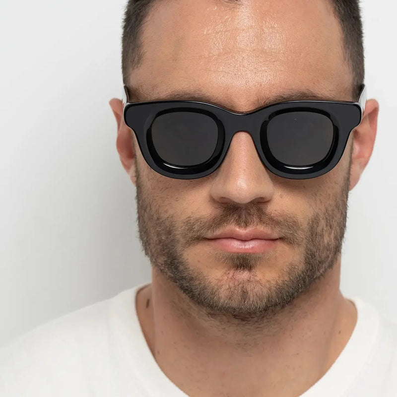
This is why timelessness should not be confused with familiarity. Black is familiar, but familiarity alone does not explain why it lasts. Black continues to work because it creates a clear boundary around the eyes, strengthens frame geometry and gives a silhouette visual precision.
The same principle can apply to less conventional shades. Olive can introduce colour without extreme contrast. Deep burgundy can behave more like a warm dark neutral than a bright accent. Crystal acetate can remain relevant because transparency changes perceived visual weight rather than depending entirely on a seasonal hue.
A colour with strong long-term potential usually satisfies five conditions:
Contrast: it creates an effect you genuinely like on your face.
Compatibility: it works with enough of your wardrobe and everyday environments.
Material: its depth, pattern or transparency contributes something visually useful.
Repetition: you keep choosing it rather than saving it for occasional use.
Identity: over time, it begins to feel associated with you rather than with a particular season.
This extends the logic of a timeless sunglasses collection: longevity becomes stronger when the design has reasons to last and the wearer has reasons to keep choosing it.
2. Timeless sunglasses colour vs trending colour: what is the difference?
A trending colour answers a cultural question: what feels visually relevant now? A timeless colour answers a personal and functional one: what continues to work when that cultural attention moves elsewhere?
The two categories can overlap. A colour can be highly visible in 2027 and still have long-term value. Equally, a familiar neutral can be a poor long-term purchase if its visual effect never feels right on the wearer.
This creates an important distinction between trend visibility and wearability longevity.
Question
Trend decision
Timeless decision
Why choose it?
It feels current
Its visual effect remains useful
What creates value?
Novelty and cultural relevance
Compatibility and repetition
What is the test?
Would I wear this now?
Would I still choose this without the trend label?
The aim is therefore not to avoid trends. It is to distinguish a trend that reveals a useful new option from one whose appeal depends mainly on being new.
3. Which 2027 sunglasses colours have the strongest long-term potential?
Black and tortoise remain the most established long-term options, but they are not the only colours with reasons to last. Muted olive, deep burgundy and controlled crystal acetates can also have strong longevity because each solves a different visual problem.
Colour
What it does
Consider it if...
Main trade-off
Black
Adds definition and structure
You like clear facial contrast
Can feel visually heavy
Tortoise
Adds warmth and broken-up contrast
You want softer everyday definition
Pattern and tone vary significantly
Olive
Introduces muted colour with controlled presence
You want an alternative to conventional neutrals
Saturated greens can feel more seasonal
Burgundy
Keeps depth while introducing warmth
Black feels too severe or expected
Less neutral across some wardrobes
Crystal / translucent
Reduces perceived visual weight
You like substantial geometry with softer contrast
Highly saturated transparent colours may date faster
The common factor is not neutrality. It is a clear visual purpose that can remain relevant after 2027.
4. Why does black remain one of the most timeless sunglasses colours?
Black has unusual longevity because its visual function is clear: it creates a strong boundary between the frame and the face. That strengthens geometry, increases definition and makes the silhouette immediately readable.
Its greatest strength is also its main trade-off. Thick black acetate can carry considerable visual weight. On smaller facial proportions, or for someone seeking softness rather than definition, that contrast can feel stronger than necessary.
Black is therefore most useful as a long-term choice when you repeatedly want structure rather than simply because it has a reputation for being classic.
If you are choosing between the two most established options, the guide to black vs tortoise sunglasses explains the difference in facial effect.
Black strengthens the boundary of the frame, making its geometry and facial contrast more immediately visible.
5. Why does tortoise age so well?
Tortoise creates longevity through variation rather than uniformity. Instead of one uninterrupted dark outline, its pattern introduces areas of warmth and different tonal intensity.
This can make substantial acetate feel softer while preserving enough visual weight to define the face. The effect is particularly useful for someone who likes the presence of a dark frame but finds solid black too graphic.
The trade-off is that not all tortoise is equivalent. A restrained brown pattern and a highly contrasted or unusually coloured tortoise can behave very differently. Long-term usefulness depends on the specific pattern, not merely the category name.
Tortoise replaces a single block of dark colour with tonal variation, softening substantial acetate without removing its presence.
6. Can olive sunglasses become a long-term neutral?
Muted olive occupies a useful position between obvious colour and conventional neutrality. It is visibly different from black or brown, yet can integrate naturally with navy, cream, grey, denim, brown, black and other restrained wardrobe colours.
Its value is controlled distinction. In acetate, a muted olive can give a substantial frame depth and character without creating the immediate intensity of a bright green.
This makes olive particularly interesting for someone who wants colour but normally avoids highly expressive frames. The important variable is saturation: the brighter and cleaner the green becomes, the more its longevity depends on personal style rather than broad compatibility.
No. Deep burgundy can have long-term value because depth changes how colour behaves. A dark burgundy frame can read first as a rich, controlled silhouette and only second as an obvious red.
It therefore occupies a useful space between a conventional dark neutral and a statement colour. For someone who repeatedly chooses dark frames but finds black too severe or impersonal, burgundy can preserve definition while adding warmth and identity.
The trade-off is compatibility. Burgundy is more specific than black or tortoise, so its long-term value rises when similar warm, earthy, navy, grey or restrained colours already appear naturally in the wearer's wardrobe.
Deep burgundy keeps much of the structural role of a dark frame while introducing warmer, more individual colour.
8. Will crystal and translucent acetate sunglasses stay relevant?
Crystal and translucent acetate can have lasting value because their most useful effect is not simply colour. It is the way transparency changes the relationship between frame and face.
When light and skin tone remain partially visible through the material, substantial acetate can appear less dense than an equally thick opaque frame. This allows someone to wear stronger geometry without creating the same level of facial contrast.
That distinction matters for longevity. Soft crystal, peach, smoke or amber effects can remain useful because they solve a visual-weight problem. Highly saturated neon transparency is more dependent on whether the wearer genuinely identifies with that colour.
Transparency can reduce the perceived weight of substantial acetate, making bold geometry feel more open.
9. Can brighter sunglasses colours be timeless?
Yes, but their longevity is more personal. Cobalt blue, vivid green, orange, yellow, pink and other high-impact colours occupy more visual space than muted shades, so they depend more heavily on the wearer's established style.
This reveals the difference between cultural longevity and personal longevity. A bright colour may disappear from trend coverage while remaining completely convincing on someone who has made that colour part of their visual identity.
The no-trend test
Imagine the same frame without the 2027 label, campaign imagery or trend context. Would you still want the colour for what it does to your face and the way you dress? If yes, it has a stronger case for personal longevity. If most of its appeal disappears with the trend story, treat it as a more directional purchase.
10. Does skin tone determine which sunglasses colour will stay timeless?
Skin tone influences how a frame behaves, but it does not create a rigid rule about which colours someone should wear. The more useful decision is how much contrast, warmth or visual separation you want around the face.
Tortoise, olive or burgundy can create varying degrees of warmth and continuity. Black can deliberately increase separation. Crystal acetate can soften the boundary between frame and face.
Preference remains important. A theoretically flattering colour that you rarely want to wear has poor personal longevity. A stronger or less conventional colour that repeatedly feels natural to you may be the better long-term choice.
11. How does frame geometry change whether a colour feels timeless?
Colour never operates independently from shape, scale and thickness. The same burgundy can feel restrained in a slimmer silhouette and far more expressive in thick acetate. Black can feel precise in compact geometry and dominant when the frame becomes oversized.
This means you are never really choosing colour alone. You are choosing a combined visual signal:
This interaction explains why an unconventional colour can sometimes be easier to wear than a conventional one. A translucent peach frame, for example, may create less facial contrast than a smaller but completely opaque black frame.
For long-term wear, judge the complete frame rather than the reputation of the colour in isolation.
12. The BBN timeless colour framework: contrast → compatibility → material → repetition → identity
Before buying a colour because it feels relevant in 2027, move through five decisions. Together, they help separate temporary attraction from a colour you are likely to keep wearing.
Contrast: what happens to your face?
Decide whether you want the colour to increase definition, soften the frame, add warmth or reduce visual weight. This establishes the purpose of the colour before considering whether it is fashionable.
Compatibility: where will you actually wear it?
Think in terms of your real wardrobe and routine rather than theoretical matching. A colour does not need to work with everything; it needs to work often enough to earn repetition.
Material: what does the acetate add?
Pattern, transparency and material depth can change how a colour behaves. Tortoise breaks up contrast. Crystal allows light through the frame. Opaque black creates a clearer visual boundary.
Repetition: will you keep reaching for it?
Frequency is stronger evidence of versatility than neutrality. A distinctive frame worn three times a week has more personal longevity than a supposedly safe frame that stays in its case.
Identity: would you choose it without the trend?
This is the final test. When the colour feels connected to your own visual language rather than to the year in which you bought it, trend relevance becomes less important.
Timeless colour = useful visual effect + repeated personal relevance.
13. Which sunglasses colour should you choose for everyday wear?
Start with the effect you want to repeat, not with the colour that appears most versatile on paper.
If you want...
Start with...
Consider another direction if...
Maximum definition
Black
Strong contrast overwhelms your features
Warm everyday flexibility
Tortoise
You prefer cleaner, more graphic definition
Quiet individuality
Olive
Muted green rarely works with the way you dress
Dark colour with more warmth
Burgundy
You need maximum colour neutrality
Lower visual weight
Crystal / translucent acetate
You want a strongly defined frame boundary
There is no universal winner. The most useful everyday colour is the one whose visual role you want often enough to make it part of your routine.
14. Which Bo Bo Noir frames illustrate these timeless colour principles?
Once you know the colour effect you want to keep, the next decision is geometry. The examples below are not a ranking of the “best” colours. Each combines colour and frame structure differently, so the useful comparison is what each one does — and when another direction would make more sense.
Jane Olive Green combines a bold rectangular silhouette with a muted colour that is more distinctive than black but less visually abrupt than a brighter green.
Visual effect: clear rectangular definition moderated by a softer, earthy colour.
Consider it if: you want strong geometry with a less conventional colour relationship to the face, or you want olive to function as an alternative neutral.
Consider another direction if: you want maximum dark contrast or a softer frame silhouette.
William Crystal Peach illustrates how translucent acetate can make a substantial silhouette feel visually lighter.
Visual effect: bold rounded geometry with softer contrast between acetate and face.
Consider it if: you like substantial frame design but want more openness than opaque dark acetate provides.
Consider another direction if: your priority is maximum facial definition or a strongly graphic frame.
Still deciding?
Choose the effect first. Black for definition. Tortoise for warm variation. Olive for controlled distinction. Burgundy for dark warmth. Crystal for lower visual weight. Then choose the frame geometry that creates the proportion and presence you want.
15. What are the most common mistakes when choosing a trend-led sunglasses colour?
Choosing colour before considering the complete frame
A shade that looks appealing by itself can behave very differently when combined with thick, narrow, oversized or highly curved geometry. Judge colour, silhouette and scale together.
Assuming neutral automatically means timeless
A neutral frame you rarely wear has less personal longevity than an olive or burgundy frame that becomes part of your normal rotation.
Buying for theoretical versatility rather than repetition
Ask how often you can realistically imagine reaching for the frame. Frequency is more useful than the idea that a colour “goes with everything”.
Buying a colour mainly because it is receiving attention
Trend visibility tells you what is culturally noticeable. It does not tell you whether the visual effect will continue to suit you.
Ignoring what your existing sunglasses already do
If you own several dark, high-contrast frames, another black pair may add less functional range than tortoise, olive or crystal acetate. Think about the role the new colour adds to the collection.
16. Frequently asked questions about timeless sunglasses colours
What sunglasses colour is the most timeless?
Black and tortoise are among the most established long-term choices because they create adaptable forms of facial definition. However, the most timeless colour for an individual is the one whose visual effect they continue to want and wear repeatedly.
Will black sunglasses still look current after 2027?
Black does not depend on a single trend cycle. Its longevity comes from its ability to define frame geometry and create clear facial contrast. Whether it is right for you depends on how much visual weight and definition you want.
Are tortoise sunglasses timeless?
Tortoise has strong longevity because its tonal variation adds warmth and softens the continuous outline of darker acetate. Different tortoise patterns can still create very different effects.
Can olive sunglasses be timeless?
Muted olive can have strong long-term potential because it introduces colour without the intensity of brighter green. It works particularly well for someone who wants an alternative to conventional black, brown or tortoise.
Can burgundy sunglasses work as an everyday colour?
Yes. Deep burgundy can behave closer to a warm dark neutral than a bright red, making it suitable for frequent wear when its warmth fits naturally with the wearer's wardrobe and preferred level of contrast.
Will transparent sunglasses go out of style?
Specific transparent colours can move in and out of fashion, but transparency has a lasting visual function: it can reduce the perceived weight of substantial frames. Controlled crystal tones therefore have reasons to remain useful beyond a single season.
Which sunglasses colour makes a frame look lighter?
Crystal and translucent acetates generally reduce perceived visual weight because the material creates a softer boundary between the frame and the face.
Which sunglasses colour creates the strongest facial definition?
Opaque black usually creates strong facial definition because it produces a clear boundary between the frame and surrounding features, particularly in substantial acetate.
Should sunglasses match your skin tone?
No. Skin tone influences contrast and colour interaction, but sunglasses do not need to match it. Decide whether you prefer harmony, warmth, softness or deliberate contrast.
Are colourful sunglasses less timeless?
Not automatically. A colourful frame can have strong personal longevity when the wearer repeatedly chooses it and the colour is connected to their established style rather than only to a trend.
Which sunglasses colour is easiest to wear every day?
Black and tortoise are common starting points because their visual roles are familiar. Olive, burgundy and controlled crystal acetates can be equally useful when their particular effect better matches the wearer's face, wardrobe and preferences.
How can I tell whether a 2027 sunglasses colour will date quickly?
Remove the trend context. If you would still choose the colour for its contrast, warmth, softness, transparency or identity without knowing it was associated with 2027, it has a stronger case for long-term wear.
17. Final thoughts: timeless colour begins when novelty stops being the reason
The strongest sunglasses colours of 2027 will not necessarily be the quietest. They will be the colours whose visual purpose remains useful when attention moves elsewhere.
Black can endure through definition. Tortoise through tonal variation. Olive through controlled distinction. Burgundy through depth and warmth. Crystal acetate through its ability to reduce visual weight.
That leads to a more useful way of buying colour. Do not ask only whether a shade is fashionable now. Ask what it does to your face, how naturally it fits your life and whether you would still choose that effect after the trend label disappears.
A colour becomes timeless when you stop choosing it because it feels new and keep choosing it because it feels like you.
Choose colour for the effect you want to keep.
Explore Bo Bo Noir sunglasses through proportion, contrast, material and identity — then choose the frame that gives you a reason to keep wearing it.
Bénéficiez de 10 % de réduction sur votre achat ! Inscrivez-vous à notre newsletter.Bénéficiez de 10 % de réduction sur votre achat ! Inscrivez-vous à notre newsletter.Bénéficiez de 10 % de réduction sur votre achat ! Inscrivez-vous à notre newsletter.Bénéficiez de 10 % de réduction sur votre achat ! Inscrivez-vous à notre newsletter.Bénéficiez de 10 % de réduction sur votre achat ! Inscrivez-vous à notre newsletter.Bénéficiez de 10 % de réduction sur votre achat ! Inscrivez-vous à notre newsletter.Bénéficiez de 10 % de réduction sur votre achat ! Inscrivez-vous à notre newsletter.Bénéficiez de 10 % de réduction sur votre achat ! Inscrivez-vous à notre newsletter.Bénéficiez de 10 % de réduction sur votre achat ! Inscrivez-vous à notre newsletter.Bénéficiez de 10 % de réduction sur votre achat ! Inscrivez-vous à notre newsletter.Bénéficiez de 10 % de réduction sur votre achat ! Inscrivez-vous à notre newsletter.Bénéficiez de 10 % de réduction sur votre achat ! Inscrivez-vous à notre newsletter.Bénéficiez de 10 % de réduction sur votre achat ! Inscrivez-vous à notre newsletter.Bénéficiez de 10 % de réduction sur votre achat ! Inscrivez-vous à notre newsletter.Bénéficiez de 10 % de réduction sur votre achat ! Inscrivez-vous à notre newsletter.