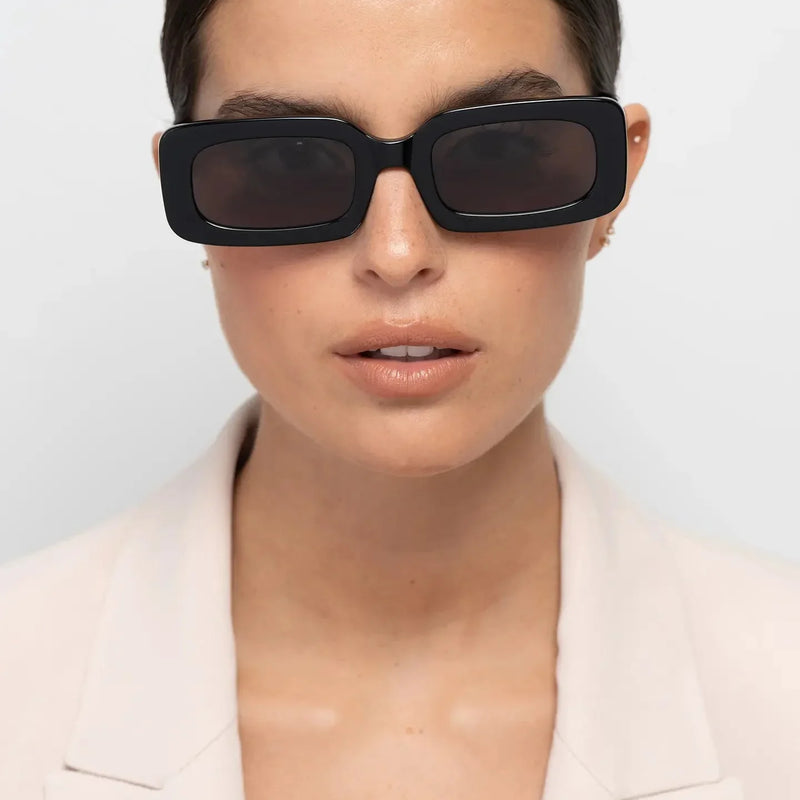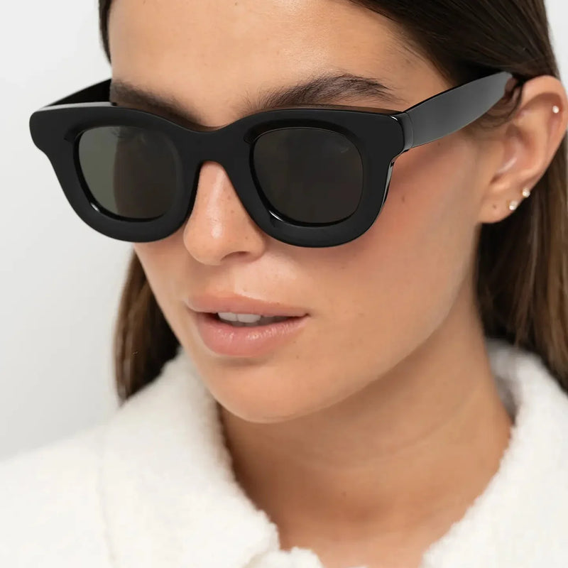
Sunglasses colour trends rarely change overnight. Unlike clothing, where a new palette can dominate a season and disappear almost as quickly, eyewear evolves more gradually because most people choose frames they expect to wear for years rather than months. That makes the most interesting sunglasses colour trends for 2027 less about novelty and more about how colour changes the presence of a frame. Crystal acetate creates a lighter visual boundary around the eyes, olive introduces muted colour, tortoise brings tonal variation, burgundy adds controlled warmth, cream makes substantial frames feel less visually dense, while glossy black remains the benchmark for strong definition. The result is a palette built around wearable distinction. Instead of choosing a colour simply because it feels current, the more useful question is whether it creates the contrast you want on your face, works with the clothes you actually wear and still has enough versatility to deserve a place in your collection after 2027. If you are building that collection deliberately, how to build a timeless sunglasses collection explains how different frames can complement one another rather than simply duplicate the same role. The strongest sunglasses colour directions for 2027 combine contemporary acetate finishes with colours that remain practical beyond a single season. The key palette includes crystal acetate, olive green, warm tortoise, deep burgundy, cream and soft neutrals, alongside timeless glossy black. The difference between them is not simply aesthetic. Dark opaque colours create stronger facial definition, patterned acetates interrupt the outline of the frame, muted colours soften contrast and translucent acetates allow more of the face to remain visually present through the material. The shift is not towards one dominant colour replacing everything that came before it. Instead, 2027 eyewear is expanding the space between conventional black and highly expressive fashion colours. Transparent acetates, earthy greens, deeper reds and softer neutrals offer more ways to control how strongly a frame appears on the face while remaining relatively easy to integrate into an existing wardrobe. Material is an important part of that change. With acetate, colour can have depth, transparency and tonal variation rather than behaving like a flat surface treatment. A tortoise pattern breaks up the visual outline, crystal acetate allows light and skin tone to remain partly visible, and a deep burgundy can shift between red and brown depending on the light. This makes colour part of the structure and character of the frame rather than simply an additional decorative choice. That relationship between material and appearance is explored further in why premium acetate looks different. For 2027, it is particularly relevant because several of the strongest colour directions depend as much on depth, transparency and finish as they do on hue. BBN insight The useful way to read a colour trend is not “Is everyone wearing this?” but “What does this colour allow the frame to do differently?” A colour becomes more valuable when it changes contrast, visual weight or wardrobe versatility in a way that suits the wearer. To compare the main 2027 colour directions consistently, the Bo Bo Noir Colour Index™ considers more than trend visibility. It evaluates how easily a colour integrates into different wardrobes, how much personality it introduces, how simple it is to style repeatedly and how likely it is to remain useful beyond the current trend cycle. We also consider facial contrast, because colour changes how strongly the frame separates itself from the face. This is not a quality score: high contrast is not inherently better than low contrast. It simply helps identify the visual effect each colour is more likely to create. The ratings are an editorial comparison rather than a universal rule. A lower-contrast colour may be ideal for someone who wants the frame to integrate more gently with the face, while another wearer may deliberately choose black because stronger definition is exactly the effect they want. Crystal acetate is one of the clearest directions in 2027 eyewear because it changes the visual weight of a frame without requiring the silhouette itself to become smaller or less expressive. Instead of creating a continuous opaque boundary around the eyes, translucent acetate allows light, skin tone and surrounding colour to remain partly visible through the material. That distinction becomes especially useful with substantial frames. A bold round silhouette in solid black can create a dense graphic outline; the same general level of acetate presence in a crystal finish can feel visually lighter because the material does not block the face in the same way. This makes crystal particularly relevant for people who like expressive geometry but want less contrast than a dark opaque frame would provide. Crystal is also more varied than the word “clear” suggests. Warm peach or yellow undertones can introduce colour while preserving transparency, so the frame retains personality without becoming a solid block of pigmentation. The result works naturally with neutral, earthy and monochrome wardrobes while remaining visibly different from conventional black or tortoise. For a deeper explanation of the effect, see why translucent frames feel lighter and how crystal acetate changes facial definition. If you are deciding between transparent and patterned acetate, crystal vs tortoise frames compares the two directions directly. Crystal acetate works particularly well when you want: a substantial frame with softer visual weight, lower facial contrast, visible acetate depth and a contemporary colour direction that can still integrate easily into an everyday wardrobe. If your priority is maximum definition around the eyes, crystal may feel too visually soft. Dark opaque acetate creates a clearer boundary against the face, which is why black remains a stronger option when graphic contrast is part of the desired effect. Crystal is not a universally “better” direction; its strength is precisely that it produces a different relationship between frame and face. Olive occupies a useful space between a conventional neutral and an obvious colour. It can introduce more personality than black without creating the stronger colour statement associated with brighter greens, which is why it works particularly well for someone who wants variation while keeping the frame easy to combine with everyday clothing. Its versatility comes partly from the colours around it. Olive sits naturally beside beige, brown, cream, denim, charcoal and other muted tones, allowing it to behave almost like a neutral in an earthy wardrobe. On the face, it can still create clear definition, but the effect is generally less severe than a similarly substantial glossy black frame. This makes olive particularly useful as a second colour. Someone who already owns black can introduce a noticeably different frame without moving immediately towards a brighter or more seasonal palette. The difference is visible, but the styling adjustment required is relatively small. For more detail, why olive acetate sunglasses feel softer and how olive green creates softer contrast than black examine why this colour behaves differently from a dark neutral. Olive is especially effective when your wardrobe already contains earth tones, denim, cream, grey or brown, or when black feels slightly too severe for the effect you want. It also gives substantial acetate a more understated character because colour becomes visible gradually rather than announcing itself immediately. If your wardrobe depends heavily on very crisp black-and-white contrast, however, glossy black may integrate more naturally. If you want the frame colour itself to become a stronger statement, burgundy offers a more expressive direction. Olive's advantage is the space between those two extremes. BBN perspective Crystal and olive illustrate two different ways colour is evolving in 2027. Crystal reduces visual density through transparency; olive retains an opaque frame but replaces the severity of black with a quieter earth-toned contrast. Neither requires unusual geometry to make the sunglasses feel different. What Part 1 tells us about sunglasses colour trends in 2027 Next: tortoise, burgundy, cream and glossy black — and why each creates a different balance between colour, facial definition and long-term wearability. Tortoise remains one of the most dependable eyewear colours because it combines the depth of a darker frame with tonal variation that prevents the outline from feeling completely solid. Amber, brown and honey tones interrupt the acetate visually, so substantial frames can retain presence without creating the same continuous boundary as glossy black. For 2027, the more interesting direction is towards warmer, lighter interpretations rather than very dark mottled tortoise. Honey and caramel tones can make the pattern easier to read, introducing warmth while keeping the frame versatile enough to work with denim, cream, camel, navy, brown and many neutral wardrobes. This is also why tortoise tends to age well. Its appeal does not depend on one unusual colour or one season-specific styling idea. The pattern itself creates visual depth, while the brown-based palette remains easy to integrate across different times of year. If you are deciding between the two most established frame colours, black vs tortoise sunglasses explains the difference between stronger graphic definition and warmer patterned contrast. You can also explore why tortoise frames feel more balanced. Tortoise works particularly well when you want one frame to move easily between casual and more polished clothing. It is dark enough to remain defined on the face, but the pattern introduces enough variation to keep the effect softer than a single opaque colour. If you already own black sunglasses, tortoise can also make a useful second pair because it changes the warmth and texture of the frame without requiring a major shift in your wardrobe.
What are the biggest sunglasses colour trends for 2027?
In this guide
How are sunglasses colour trends changing in 2027?
How does the Bo Bo Noir Colour Index™ compare frame colours?
Colour
Facial contrast
Versatility
Personality
Styling ease
Longevity
Best considered for
Crystal acetate
Low–medium
★★★★★
★★★★☆
★★★★★
★★★★★
Softer modern presence
Olive green
Medium
★★★★★
★★★★☆
★★★★★
★★★★☆
Muted everyday colour
Tortoise
Medium
★★★★★
★★★★☆
★★★★★
★★★★★
Timeless warmth and tonal variation
Burgundy
Medium
★★★★☆
★★★★★
★★★★☆
★★★★★
Controlled individuality
Cream
Low–medium
★★★★☆
★★★★☆
★★★★★
★★★★☆
Lighter statement frames
Glossy black
High
★★★★★
★★★★☆
★★★★★
★★★★★
Maximum definition and versatility
Why is crystal acetate one of the biggest sunglasses colour trends for 2027?
When might crystal acetate not be the best choice?

Why is olive green becoming an everyday eyewear neutral?

When does olive work particularly well?
Why does tortoise remain relevant in 2027?

When is tortoise a particularly strong choice?
Bo Bo Noir Colour Index™ — tortoise
Versatility: ★★★★★ Personality: ★★★★☆ Styling ease: ★★★★★ Longevity: ★★★★★
Best considered for: timeless warmth, tonal variation and a softer alternative to solid black.
Why is burgundy gaining popularity?
Burgundy occupies an interesting position between a dark neutral and a more expressive colour. It provides noticeably more personality than black, yet its depth keeps it relatively easy to wear. In lower light it can appear close to brown or very deep red, while brighter conditions reveal more of the colour.
That makes burgundy particularly useful for people who want eyewear to contribute more personality without moving towards a bright or highly seasonal shade. The colour works naturally with navy, charcoal, cream, brown, denim and other muted tones, so it can introduce individuality without demanding an entirely different wardrobe.
On the face, burgundy still creates clear definition because the acetate remains relatively deep, but the effect is warmer and less severe than a comparable glossy black frame. This balance between visible colour and everyday wearability is what gives burgundy strong potential beyond 2027.
For a direct comparison, burgundy vs black frames explains when each direction works better. The articles why burgundy frames feel more personal than black and why burgundy frames create warmer presence explore the effect in more detail.

Who should consider burgundy sunglasses?
Burgundy is particularly interesting if black feels too predictable but lighter or brighter colours feel too far from your usual style. It offers a noticeable change without becoming difficult to repeat, especially in wardrobes built around darker neutrals and warmer tones.
If your main priority is maximum neutrality, black or tortoise will generally be easier. If your priority is softer visual weight rather than stronger colour, crystal or cream may be more appropriate. Burgundy is strongest when you want the frame colour itself to contribute character.
Bo Bo Noir Colour Index™ — burgundy
Versatility: ★★★★☆ Personality: ★★★★★ Styling ease: ★★★★☆ Longevity: ★★★★★
Best considered for: deeper colour, warmer definition and controlled individuality.
Why are cream and soft neutrals growing?
Cream and softer neutral acetates offer another way to make a substantial frame feel less visually heavy. Unlike bright white, which can create a sharp contrast against the face, cream introduces warmth and gives bold geometry a cleaner, softer character.
This is particularly useful with rectangular sunglasses. Strong horizontal lines and thicker acetate can already create considerable presence, so a lighter neutral colour can reduce the severity of that structure without making the silhouette disappear. The result feels contemporary while remaining easy to combine with white, beige, denim, grey, navy and monochrome clothing.
Cream is not as universally neutral as black or tortoise because lighter frames are more visually noticeable in a different way. They may create less dark contrast, but they can still stand out strongly against hair, skin or clothing. That is why the best use of cream is not to make a frame invisible, but to make bold geometry feel cleaner and lighter.
For more detail, see how cream acetate softens rectangular structure and why lighter rectangular frames feel more refined.

When might cream be harder to wear?
Cream can require slightly more wardrobe awareness than black or tortoise because it is visibly lighter and may become a stronger focal point beside very dark clothing. This is not necessarily a disadvantage, but it means the frame should be chosen intentionally rather than treated as an invisible neutral.
It works particularly well when your wardrobe already contains lighter neutrals, denim, grey or monochrome pieces, or when you want a bold silhouette to feel fresher and less dense.
Bo Bo Noir Colour Index™ — cream
Versatility: ★★★★☆ Personality: ★★★★☆ Styling ease: ★★★★★ Longevity: ★★★★☆
Best considered for: lighter statement frames, minimalist wardrobes and softer treatment of bold geometry.
Why does black remain the benchmark?
Black remains the reference point for sunglasses because it combines strong facial definition with exceptional wardrobe versatility. Opaque black acetate creates a continuous frame boundary, making the silhouette easy to read and giving the eyewear a clear visual presence.
That strength is also what separates black from many of the 2027 colour directions. Crystal reduces visual density, tortoise interrupts the outline, olive softens the colour contrast, burgundy warms it and cream lightens it. Black does the opposite: it makes the frame geometry more explicit.
This makes black particularly effective when you want the sunglasses to create structure around the eyes or become a dependable anchor within a varied wardrobe. It works naturally with tailoring, denim, monochrome clothing and more expressive outfits because the colour itself rarely conflicts with what surrounds it.
If stronger definition is the effect you want, how black acetate creates stronger visual contrast explains why dark frames are perceived so clearly. For panto geometry, why black panto sunglasses create cleaner facial structure examines the effect more specifically.

When can black feel too strong?
The same contrast that makes black versatile can also make substantial frames feel more dominant. If you prefer softer facial balance, lighter colouring or a less graphic effect, tortoise, olive or crystal may integrate more gently while preserving a similar frame shape.
This is why black should not automatically be treated as the “best” colour. It is the benchmark because its effect is clear and its styling range is broad, but the right choice still depends on whether strong definition is what you want from the sunglasses.
Bo Bo Noir Colour Index™ — glossy black
Versatility: ★★★★★ Personality: ★★★★☆ Styling ease: ★★★★★ Longevity: ★★★★★
Best considered for: maximum definition, wardrobe flexibility and a first dependable pair.
How does sunglasses colour change the appearance of your face?
Frame colour changes how clearly the sunglasses separate themselves from the face. Dark opaque acetate creates a stronger boundary, while translucent and lighter colours allow more visual continuity between the frame and the features underneath or around it. Patterned colours such as tortoise sit between those effects because the outline is broken into different tones.
This means the same frame shape can produce very different results. A substantial round frame in black creates a dense, graphic perimeter; in crystal acetate, the same general scale can feel more open. A strong rectangle in cream keeps its directional geometry but reduces the dark boundary, while olive or burgundy preserve more definition while changing the temperature and character of the contrast.
Colour therefore does not replace shape — it modifies how strongly the shape is perceived. That is why it is more useful to choose the geometry first and then decide whether you want the colour to reinforce, soften or reinterpret it.
| Colour | Typical facial effect | Visual character |
|---|---|---|
| Black | Creates the strongest continuous definition. | Graphic, structured and clear. |
| Tortoise | Retains depth while breaking up the outline. | Warm, textured and balanced. |
| Olive | Creates definition with softer dark contrast. | Muted, earthy and understated. |
| Burgundy | Maintains definition while introducing warmer colour. | Deep, individual and expressive. |
| Crystal | Reduces the density of the frame boundary. | Open, modern and visually lighter. |
| Cream | Softens dark contrast while keeping the frame visible. | Clean, light and contemporary. |
BBN perspective
The same colour can behave differently depending on frame thickness and shape. A thin black frame and a substantial black frame do not create the same presence, just as crystal acetate becomes more noticeable when there is more material to see. Colour should always be judged together with geometry and scale.
What Part 2 tells us about the 2027 colour palette
- Tortoise remains relevant because tonal variation gives dark frames warmth and depth.
- Burgundy adds stronger personality while remaining much easier to wear than highly saturated colours.
- Cream can soften substantial geometry without making the frame disappear.
- Black remains the benchmark when strong definition and maximum wardrobe versatility are the priority.
- Frame colour changes how strongly the shape separates itself from the face.
- There is no universally best colour; the useful choice depends on whether you want stronger definition, softer contrast, warmth, transparency or greater individuality.
Next: the complete colour comparison, how to choose sunglasses for your wardrobe and personal style, which colour directions have the strongest long-term potential and which trends are less versatile.
How do the main sunglasses colours compare?
The six main directions in this guide solve different styling problems. Black is strongest when you want definition and maximum wardrobe flexibility; tortoise adds warmth and pattern; olive introduces muted colour; burgundy creates a deeper statement; crystal reduces visual density; and cream gives substantial geometry a lighter, cleaner character.
This is why asking which colour is “best” usually leads to the wrong decision. A colour can score highly for versatility and still create an effect you do not enjoy on your face. The more useful comparison is between contrast, wardrobe compatibility, personality and the role the frame needs to play.
| Colour | Main strength | Works naturally with | Best considered when | Main trade-off |
|---|---|---|---|---|
| Glossy black | Strong definition and maximum versatility. | Monochrome, tailoring, denim and most neutral palettes. | You want a dependable first pair or stronger facial structure. | Can feel visually dominant in substantial frames. |
| Tortoise | Warmth and tonal variation. | Cream, camel, brown, navy, denim and earth tones. | You want a timeless alternative to solid black. | Less graphic than an opaque dark frame. |
| Crystal acetate | Substantial geometry with softer visual weight. | Neutral, minimalist, earthy and monochrome wardrobes. | You like bold shapes but want more visual openness. | Provides less dark-frame definition. |
| Olive green | Muted individuality. | Beige, denim, grey, brown, khaki and cream. | Black feels too predictable but bright colour feels unnecessary. | May integrate less naturally with very crisp black-and-white wardrobes. |
| Burgundy | Controlled colour with visible personality. | Navy, charcoal, brown, cream and darker neutrals. | You want the frame colour itself to contribute more character. | Less universally neutral than black or tortoise. |
| Cream | A lighter interpretation of strong geometry. | White, beige, denim, grey, navy and minimalist palettes. | You want a substantial frame to feel cleaner rather than darker. | The light colour can itself become a strong focal point. |
BBN insight
If two colours both appeal to you, compare what role each one would play in your collection. The strongest second pair usually adds a different level of contrast, warmth or personality rather than reproducing what your first pair already does.
How should you choose a sunglasses colour for your wardrobe?
Start with the colours you already wear rather than an imagined future wardrobe. Sunglasses are repeated accessories, so a frame becomes far more useful when it connects naturally with several combinations you already own. This does not mean matching every colour exactly; it means understanding whether the frame should harmonise with your clothing or create deliberate contrast.
If your wardrobe is dominated by black, white, grey and cleaner lines, glossy black, crystal and cream can integrate easily because each creates a clear but different relationship with a minimalist palette. Earth-toned wardrobes usually give olive and tortoise more room to work, while burgundy can add depth to navy, charcoal, cream and brown without requiring brighter colour elsewhere.
The best test is repetition: imagine the same frame with five outfits you already wear. If the colour continues to make sense across them, it has a stronger chance of becoming part of your real style rather than remaining a pair you admire but rarely choose.
Which colours work best with minimalist wardrobes?
Minimalist wardrobes do not require invisible eyewear. In fact, a strong frame can become more noticeable when the clothing around it is restrained. The useful decision is whether you want the sunglasses to continue that restraint or create the main visual accent.
Glossy black reinforces clean contrast, crystal acetate adds scale without the same density, and cream can make strong geometry feel lighter while still remaining clearly visible. These three directions work especially well when the wardrobe relies on monochrome, denim, grey, white, beige or other controlled neutrals.
For further styling context, see minimalist sunglasses that still stand out and top minimalist sunglasses brands to know in 2027.

Which colours work best for timeless everyday wear?
If one pair needs to cover the widest possible range of clothing and situations, black and tortoise remain difficult to beat. Black offers the clearest definition and the broadest compatibility, while tortoise keeps much of that versatility but replaces the continuous dark outline with warmer tonal variation.
The choice between them is therefore less about which colour is more timeless and more about the kind of timelessness you prefer. Black is cleaner and more graphic; tortoise is warmer and more textured. Both can move between casual, travel and more polished settings without depending heavily on one season or one clothing palette.
The wider distinction between enduring and highly current eyewear is explored in top sunglasses styles that always work and classic vs trendy sunglasses.

Which colours work best if you want subtle individuality?
Olive and burgundy are strongest when you want someone to notice that the frame colour is different without the sunglasses behaving like a bright fashion accessory. Olive stays close to an earthy neutral, while burgundy creates a deeper and more recognisable colour statement.
The decision between them depends on how visible you want that colour to be. Olive usually integrates more quietly with the wardrobe, while burgundy contributes more personality to the face. Both can make a familiar shape feel more personal without requiring unusual frame geometry.
If colour is part of how you express personal style, how to choose sunglasses for your personality and why unconventional colours feel more personal develop that idea further.

Which sunglasses colour should you buy first?
If you are buying your first premium pair and need it to work as often as possible, black or tortoise usually provide the simplest starting point. Both are established colours with broad wardrobe compatibility, although they create noticeably different levels of contrast and warmth.
Once that everyday role is covered, a second pair can solve a different problem. Crystal is useful if you want something visually lighter, olive if you want a quieter alternative to black, burgundy if you want more personality and cream if you want strong geometry with a lighter colour treatment.
This creates a more useful collection than buying several frames that differ only slightly. The objective is not to own every colour, but to make each pair earn a distinct place.
A simple three-pair colour strategy
First pair: black or tortoise for maximum repeat wear.
Second pair: crystal or olive to change visual weight and contrast.
Third pair: burgundy or cream when you want the colour itself to play a more expressive role.
Which sunglasses colours have the strongest long-term potential?
Black and tortoise have the clearest evidence of long-term relevance because their usefulness does not depend on one particular fashion cycle. Black creates definition and works across almost every wardrobe, while tortoise provides warmth and pattern without becoming difficult to repeat.
Crystal acetate also has strong long-term potential because transparency solves a practical visual problem: it allows a substantial frame to feel more open. That function gives it a reason to remain useful even when the language surrounding the trend changes. Olive and burgundy can also last when they genuinely suit the wearer's wardrobe, because both sit closer to deeper, muted colours than to highly saturated novelty shades.
Cream has slightly more dependence on personal styling because lighter frames can become visually prominent in a different way, but its neutral base gives it far more longevity than many seasonal fashion colours. The deciding factor for all six directions is not whether they remain “trendy” forever, but whether their visual effect continues to solve something useful for the wearer.
For a broader view of which trend directions are likely to remain wearable, read future sunglasses trends you will actually wear.
Which sunglasses colour trends have less long-term versatility?
Not every expressive colour needs to be avoided. Bright neons, highly saturated blues, vivid pinks and very pale seasonal pastels can work extremely well when the goal is deliberate statement eyewear. Their trade-off is simply that they tend to demand more from the wardrobe and may be less useful as an only pair.
Highly saturated colours create a strong focal point, which can be exactly what some wearers want. The limitation appears when the same frame needs to work with many outfits, settings and seasons. In those situations, muted or deeper colours generally offer greater repeatability because they create personality without becoming the dominant colour in every look.
The important distinction is therefore not between “good” and “bad” colours. It is between a colour chosen for versatility and a colour chosen deliberately for expression. Both are valid decisions when the role of the frame is clear.
BBN perspective
A less versatile colour can still be an excellent purchase if you already own dependable everyday eyewear. The mistake is expecting a highly specific statement frame to perform the same role as a neutral pair.
Should your sunglasses colour match your personality?
Not literally, but the colour should make sense with the level of expression you enjoy. Someone who prefers quieter clothes may still choose burgundy as the strongest element in an otherwise restrained look, while someone who wears more colour may prefer black because it gives the outfit a stable visual anchor.
This is why wardrobe and personality should be considered together rather than separately. The same frame colour can behave as a neutral for one person and a statement for another depending on what surrounds it.
The useful question is not “What colour represents me?” but “How much attention do I want the frame colour to receive when I am wearing it?”
Editor's recommendation
If you are buying one primary pair, begin with the colour that fits the greatest number of outfits you already wear. For many people that will still be black or tortoise.
If those roles are already covered, crystal, olive and burgundy provide the strongest ways to make the collection feel meaningfully different without relying on a short-lived novelty colour.
What Part 3 tells us about choosing a sunglasses colour
- The best colour depends on the role the frame needs to play, not simply its trend ranking.
- Wardrobe compatibility is easier to judge using clothes you already own rather than hypothetical styling.
- Black and tortoise remain the strongest starting points for a highly repeatable first pair.
- Crystal and olive make useful second-pair directions because they change contrast without requiring extreme colour.
- Burgundy and cream give the colour itself a more expressive role.
- Black, tortoise and crystal have particularly strong long-term potential because their visual effects remain useful beyond 2027.
- Highly saturated or seasonal colours are not inherently poor choices; they simply offer less versatility when one frame needs to do everything.
- A stronger collection gives different pairs different jobs instead of repeating the same colour effect several times.
Next: Bo Bo Noir examples for each colour direction, final buying checklist, streamlined frequently asked questions and the final 2027 colour verdict.
Which Bo Bo Noir frames illustrate the main 2027 colour directions?
The most useful way to compare the 2027 palette is not to rank one colour above another, but to see how each colour changes a real frame. Geometry still matters, which means colour should be judged together with shape, acetate thickness and the amount of visual presence you want on the face.
The following Bo Bo Noir examples represent six different colour roles: softer transparency, muted colour, patterned warmth, deeper expression, lighter neutrality and strong definition.
William Crystal Peach — softer presence through transparency
William Crystal Peach combines substantial round geometry with translucent acetate. The frame remains visible and expressive, but transparency allows more light and skin tone to remain visually present through the material.
Best considered for: someone who likes bold acetate but wants less visual density than an opaque dark frame.
Main trade-off: crystal does not create the same level of graphic definition as black.
Jane Olive Green — strong geometry with muted colour
Jane Olive Green keeps the directional character of a substantial rectangular frame while replacing the severity of black with a quieter earth-toned colour.
Best considered for: someone who wants a structured frame that works naturally with denim, cream, grey, beige and earth tones.
Main trade-off: olive may integrate less naturally than black in wardrobes dominated by very crisp black-and-white contrast.
Narr Tortoise — warmth, pattern and long-term versatility
Narr Tortoise demonstrates why patterned acetate remains so useful. The brown and amber variation breaks up the outline of the frame while retaining enough depth to keep the panto geometry clearly defined.
Best considered for: someone looking for a long-term alternative to solid black with more warmth and tonal variation.
Main trade-off: tortoise is less graphic than a fully opaque dark frame.
Narr Burgundy — deeper colour without excessive brightness
Narr Burgundy keeps the same familiar panto direction while allowing colour to play a more expressive role. The acetate remains dark enough to provide definition but introduces considerably more personality than conventional black.
Best considered for: someone who wants a recognisable colour without moving towards highly saturated or seasonal eyewear.
Main trade-off: burgundy is less neutral than black, tortoise or olive and therefore asks slightly more of the surrounding wardrobe.
Jane Cream White — lighter colour with strong rectangular structure
Jane Cream White shows how a lighter acetate can change the same type of substantial geometry. The frame remains visibly rectangular, but cream removes the dense dark boundary associated with black.
Best considered for: minimalist wardrobes and people who want a strong silhouette to feel cleaner and lighter.
Main trade-off: a light frame can still become a strong focal point, particularly beside darker clothing.
William Shiny Black — the benchmark for definition
William Shiny Black demonstrates why black remains the reference point for other frame colours. The opaque acetate makes the round silhouette immediately visible and creates the strongest continuous boundary around the eyes.
Best considered for: maximum definition, broad wardrobe compatibility and a dependable everyday colour.
Main trade-off: substantial black acetate can feel more dominant than tortoise, olive, cream or crystal.
How do the Bo Bo Noir colour directions compare?
| Frame | Colour role | Visual effect | Best considered for |
|---|---|---|---|
| William Crystal Peach | Transparent colour | Lower visual density with substantial geometry. | Softer modern presence. |
| Jane Olive Green | Muted colour | Clear structure with softer dark contrast. | Everyday colour beyond black. |
| Narr Tortoise | Patterned neutral | Warm depth with a broken frame outline. | Timeless versatility. |
| Narr Burgundy | Deep expressive colour | Warm definition with more personality. | Controlled individuality. |
| Jane Cream White | Light neutral | Strong geometry with a lighter boundary. | Minimalist and lighter-coloured wardrobes. |
| William Shiny Black | Classic dark neutral | Maximum continuous definition. | Maximum versatility and stronger facial contrast. |
BBN insight
Colour should change the role of the frame, not simply make the same purchase look different. If you already own black, the strongest next colour is usually the one that adds a genuinely different level of warmth, transparency or expression.
What should you check before choosing a sunglasses colour?
- Contrast: do you want the frame to define the face strongly or integrate more softly?
- Shape: does the colour reinforce or soften the geometry of the frame?
- Acetate: is the effect based on opacity, transparency, pattern or tonal depth?
- Wardrobe: does the colour work with several outfits you already own?
- Hair and colouring: does the frame create the amount of harmony or contrast you enjoy?
- Role: is this your everyday pair, a second alternative or a more expressive frame?
- Seasonality: can you realistically see yourself wearing the colour beyond one summer?
- Repeat wear: will you choose it often enough for the colour to earn its place?
- Longevity: would you still like the colour without the 2027 trend label?
If the wider fit and style decision is still unclear, how to choose sunglasses that fit your face and style provides the broader framework. For established silhouettes, top sunglasses styles that always work helps separate long-term geometry from shorter trend cycles.
Frequently asked questions
What are the biggest sunglasses colour trends for 2027?
The main directions are crystal acetate, olive green, warm tortoise, deep burgundy, cream and soft neutrals, alongside glossy black. The broader trend is towards colours that create personality without sacrificing everyday wearability.
Are black sunglasses still fashionable in 2027?
Yes. Black remains the benchmark for strong facial definition, wardrobe versatility and long-term relevance. It is less a seasonal trend than a permanent reference point in eyewear.
Is tortoise still in style?
Yes. Tortoise remains highly relevant because its patterned acetate combines warmth, depth and versatility. Warmer honey and caramel directions can make the effect feel lighter and more contemporary.
Why is crystal acetate becoming so popular?
Crystal acetate allows substantial frames to remain visible while reducing the density of the frame boundary. Transparency can create a softer and more open relationship between the sunglasses and the face.
Are transparent sunglasses still fashionable?
Yes. Transparent and translucent acetate remain important because they offer a different visual effect from opaque frames rather than simply another colour.
Is olive green easy to wear?
Olive can be very versatile, particularly with beige, brown, denim, grey, khaki and cream. It works well when you want a softer alternative to black without moving into brighter colour.
Who should choose burgundy sunglasses?
Burgundy is useful for someone who wants more personality than black or tortoise while retaining a relatively deep, wearable colour. It works particularly well with navy, charcoal, cream and brown.
Are cream sunglasses difficult to style?
Not necessarily. Cream works naturally with white, beige, denim, grey and other restrained palettes, although lighter frames can become a focal point beside very dark clothing.
Which sunglasses colour is the most versatile?
Black remains the most universally versatile, with tortoise close behind. The better choice between them depends on whether you prefer stronger graphic definition or warmer tonal variation.
Which sunglasses colour creates the strongest facial definition?
Opaque black generally creates the strongest continuous boundary around the eyes, especially in substantial acetate frames.
Which sunglasses colours create softer facial contrast?
Crystal acetate, olive, tortoise and cream can all soften the effect compared with solid black, although they do so differently through transparency, muted colour, pattern or lighter opacity.
Should sunglasses match your skin tone?
They do not need to match it exactly. The more useful decision is whether you prefer harmony or contrast, while also considering hair colour, wardrobe and the visual weight of the frame.
Which sunglasses colour should I buy first?
If the frame needs to work as often as possible, black or tortoise are usually the simplest starting points because both have broad wardrobe compatibility and strong long-term potential.
What colour should I buy if I already own black sunglasses?
Tortoise adds warmth, crystal reduces visual density, olive introduces muted colour and burgundy creates more personality. The best second pair is the one that performs a genuinely different role from black.
Are colourful sunglasses a good long-term purchase?
They can be. Deeper and muted colours such as olive or burgundy generally offer greater wardrobe flexibility than highly saturated novelty shades, particularly when the colour already works with clothes you wear regularly.
Will these sunglasses colours still work after 2027?
Black and tortoise have especially strong long-term potential, while crystal, olive, burgundy and cream can also remain relevant when their visual effect and wardrobe role suit the wearer beyond the current trend cycle.
The sunglasses colour trends 2027 checklist
- Choose black when stronger definition and maximum versatility are the priority.
- Choose tortoise when you want warmth, pattern and long-term flexibility.
- Choose crystal when you like substantial frames but want softer visual weight.
- Choose olive when you want muted colour that behaves almost like a neutral.
- Choose burgundy when you want the frame colour to contribute more personality.
- Choose cream when you want strong geometry to feel lighter and cleaner.
- Judge colour together with shape and acetate thickness rather than in isolation.
- Use the colours already present in your wardrobe as a practical compatibility test.
- Give different pairs different roles instead of building a collection of near-duplicates.
- Choose the colour you would still want if nobody described it as a 2027 trend.
Which sunglasses colours are most likely to remain relevant beyond 2027?
Black and tortoise remain the safest long-term choices because both have proven useful across changing wardrobes and styling cycles. Black provides stronger definition, while tortoise offers a warmer and more varied alternative without sacrificing much versatility.
Crystal acetate represents the strongest contemporary addition because transparency changes the visual weight of a frame rather than functioning only as a seasonal colour. Olive and burgundy also have strong potential because their muted or deeper tones make them easier to repeat than brighter novelty colours, while cream gives lighter neutral wardrobes another way to wear substantial acetate.
The important point is that longevity is not created by a trend label. A colour lasts when its contrast works with your face, its palette works with your clothes and the frame continues to feel useful after the initial excitement has passed.
The best sunglasses colour for 2027 is therefore not simply the newest one. It is the colour that gives your frame a useful visual role and still makes sense every time you reach for it.
Final BBN perspective
Use colour to change something meaningful: contrast, warmth, visual weight or personality. When the colour has a clear purpose, it has a better chance of remaining relevant long after the trend conversation moves on.
Find your sunglasses colour
Explore Bo Bo Noir sunglasses in crystal, olive, tortoise, burgundy, cream and timeless black acetate.
Continue reading
- Black vs Tortoise Sunglasses
- Crystal vs Tortoise Frames
- Burgundy vs Black Frames
- How to Build a Timeless Sunglasses Collection
- How to Choose Sunglasses That Fit Your Face and Style
- Top Sunglasses Styles That Always Work
- Future Sunglasses Trends You Will Actually Wear
- Minimalist Sunglasses That Still Stand Out