Envío mundial gratuito • Devoluciones en 14 días • Diseñado en PortugalEnvío mundial gratuito • Devoluciones en 14 días • Diseñado en PortugalEnvío mundial gratuito • Devoluciones en 14 días • Diseñado en PortugalEnvío mundial gratuito • Devoluciones en 14 días • Diseñado en PortugalEnvío mundial gratuito • Devoluciones en 14 días • Diseñado en PortugalEnvío mundial gratuito • Devoluciones en 14 días • Diseñado en PortugalEnvío mundial gratuito • Devoluciones en 14 días • Diseñado en PortugalEnvío mundial gratuito • Devoluciones en 14 días • Diseñado en PortugalEnvío mundial gratuito • Devoluciones en 14 días • Diseñado en PortugalEnvío mundial gratuito • Devoluciones en 14 días • Diseñado en PortugalEnvío mundial gratuito • Devoluciones en 14 días • Diseñado en PortugalEnvío mundial gratuito • Devoluciones en 14 días • Diseñado en PortugalEnvío mundial gratuito • Devoluciones en 14 días • Diseñado en PortugalEnvío mundial gratuito • Devoluciones en 14 días • Diseñado en PortugalEnvío mundial gratuito • Devoluciones en 14 días • Diseñado en Portugal
Some eyewear feels like an accessory you happen to own. Other frames quickly become part of how you recognise yourself. That difference is difficult to reduce to a logo, price point or trend. It often comes from a more personal combination of shape, proportion, acetate, colour and design identity.
Independent eyewear can create more room for that connection because the frame itself has an opportunity to carry the identity. A distinctive brow line, an unusual but wearable colour, substantial acetate or a carefully controlled proportion can make the design recognisable without requiring a prominent brand mark to explain why it matters.
That does not mean independent eyewear is automatically more original, better made or more personal than every mainstream alternative. “Independent” is not a guarantee of good design. The useful question is what greater design freedom can make possible — and why a frame chosen for its own visual character can sometimes feel more closely connected to the person wearing it.
Personal does not have to mean customised. A distinctive combination of geometry, colour and visual weight can make a frame feel specific to the wearer's style without relying on conspicuous branding.
Why can independent eyewear feel more personal?
Independent eyewear can feel more personal when the design itself carries more of the identity. Shape, frame width, acetate thickness, colour, transparency and smaller design decisions can become the reasons you recognise and choose a frame, rather than the purchase depending primarily on familiarity with a large brand name.
The result is not automatically better eyewear. It is a different route to attachment: you can choose a frame because its proportions and visual character correspond to something specific in your face, wardrobe or personal style. When that happens, the sunglasses can feel less like a generic category purchase and more like a deliberate part of how you dress.
BBN insight
Personal eyewear is not necessarily the most unusual eyewear. It is eyewear whose design gives you a specific reason to choose it. Sometimes that reason is a bold silhouette; sometimes it is a subtle proportion, a particular acetate colour or simply the way the frame belongs with clothes you already wear.
Personal eyewear is easy to confuse with unusual eyewear. They are not the same thing. A frame can be visually dramatic and still feel disconnected from the person wearing it, while a comparatively restrained design can feel highly individual because its proportions, colour and visual weight correspond closely to that person's existing preferences.
A useful way to think about personal connection is through specificity. Why did you choose this frame rather than another one in the same broad category? Perhaps its upper line works particularly well around your brows. Perhaps you prefer the warmth of tortoise to the continuous definition of black. Perhaps a wider frame creates the horizontal balance you consistently like, or transparent acetate gives you substantial geometry without making the frame visually dense.
The more specific that answer becomes, the more the purchase moves away from a generic label such as “round sunglasses” or “designer eyewear”. The frame starts to become personal when you can describe why its particular design decisions matter to you.
The specificity test
Remove the brand name and ask: what would still make me choose this exact frame? Shape? Width? Brow line? Acetate thickness? Colour? Transparency? The stronger and more specific your answer, the more of the attraction belongs to the design itself.
What changes when design matters more than brand recognition?
Brand recognition can be a legitimate part of why people buy fashion. It can signal familiarity, cultural association or a particular aesthetic world. But when recognition becomes quieter, the frame has to communicate more through its own design. The wearer and the eyewear become the primary visual information rather than an immediately identifiable logo.
That changes the buying question. Instead of asking primarily “Do I want eyewear from this brand?”, you can ask “Do I want what this particular frame does?” The distinction is subtle but important. It moves attention towards the relationship between geometry and the face, the amount of material present, the character of the acetate and how naturally the frame works with the rest of your wardrobe.
This is one reason independent eyewear can feel more personal: the frame can earn recognition through repeated wear rather than arriving with all of its meaning already supplied by widespread brand recognition. Over time, people may associate the shape or colour with the wearer precisely because those characteristics have become part of that person's appearance.
Remove the logo from the decision and the design has to do more work. Here, round geometry, substantial acetate and transparency remain independently visible characteristics of the frame.
Why can independent eyewear create more distinctive choices?
Independent eyewear can place greater emphasis on a specific design point of view rather than trying to make every frame relevant to the widest possible audience. That can create room for more deliberate decisions around proportion, acetate presence, colour and the relationship between familiar shapes and less expected details.
Distinctiveness does not require inventing an entirely new eyewear shape. Much of it comes from adjusting familiar variables. A panto can become more substantial. A round frame can use transparent acetate to change its visual density. A rectangle can become broader without becoming extremely shallow. Burgundy or olive can give familiar geometry a different wardrobe role from black.
These differences matter because people rarely experience eyewear as an abstract shape category. They experience the complete frame on their face. Small changes in width, lens height, brow geometry, acetate thickness and colour can make two frames from the same family feel like very different expressions of personal style.
For the broader distinction between independent eyewear and larger-scale alternatives, see Why Independent Eyewear Is Different. Here, the focus is narrower: how those design choices can create a stronger sense of personal connection.
Design variable
What it changes
How it can become personal
Shape
Changes the balance between angular structure and curvature.
You repeatedly recognise yourself in rectangular, panto or round geometry.
Proportion
Controls width, lens height and how much facial space the frame occupies.
A particular scale creates the balance or presence you consistently prefer.
Acetate presence
Determines how strongly the physical frame registers around the lenses.
Substantial or quieter material presence becomes part of your accessory language.
Colour and opacity
Change warmth, contrast, visual density and wardrobe interaction.
The frame connects naturally with colours and contrast levels you already choose elsewhere.
How does frame shape contribute to personal identity?
Shape is often the first thing other people notice about eyewear because it changes the lines surrounding the eyes. Rectangular frames introduce stronger horizontal structure, panto frames balance a curved lower lens with greater upper-frame definition, and round frames make curvature the more visible counterpoint.
But shape becomes personal through repetition. If you repeatedly prefer straighter geometry, a rectangle can start to feel less like a fashion choice and more like part of your visual vocabulary. Someone else may consistently choose curves and experience a substantial round frame in exactly the same way. Personal style emerges less from finding one universally flattering shape than from recognising the visual relationships you continue to choose.
This also explains why independent eyewear does not need to be eccentric to feel individual. A familiar shape can become distinctive through proportion, material and colour. The relevant question is not whether anyone has made a rectangle or round frame before; it is whether the complete combination has enough character to create a specific relationship with the wearer.
BBN perspective
Individuality does not require uniqueness for its own sake. A frame can feel personal because familiar design elements have been combined in proportions that feel particularly right for you. That is a more useful standard than simply asking whether the sunglasses look different from everything else.
Why can proportion make similar shapes feel completely different?
Two frames can both be described as round, rectangular or panto and still communicate very different personalities. The difference often comes from proportion rather than shape category. Frame width, lens height, bridge relationship and acetate thickness determine whether the same basic geometry feels restrained, balanced, substantial or deliberately bold.
Width is particularly influential because it changes how far the frame extends across the face. Increasing lens height adds vertical presence, while thicker acetate makes the boundary around the lenses more visible. These variables work together, but they do not need to increase together. A wider rectangle can remain relatively controlled in height; a substantial round frame can use transparency to reduce visual density even when its physical proportions remain bold.
This is where eyewear becomes more specific than labels such as “classic” or “statement”. The proportion determines how much of the shape you experience on the face. Understanding that relationship makes it easier to choose a frame because of what it actually does rather than because it belongs to a category you generally like. For a deeper explanation, see How Frame Width Changes Facial Proportions.
A familiar rectangle can feel highly specific once width, lens depth, acetate presence and colour are considered together. Shape names describe the family; proportions create much of the personality.
BBN insight
When two frames share the same basic shape, compare width, lens height and material presence before deciding they will look similar. These quieter variables often explain why one frame immediately feels like you and another does not.
How do acetate and colour make eyewear feel more individual?
Acetate gives colour a physical presence around the eyes. In a substantial frame, black, tortoise, olive, burgundy or crystal are not simply surface choices: they change how clearly the geometry is perceived, how much contrast the frame creates and how naturally the eyewear connects with the colours already present in a wardrobe.
Black creates a clearer continuous boundary and can make geometry feel more graphic. Tortoise interrupts that boundary through tonal variation and warmth. Olive introduces muted colour that can behave almost like an earth-toned neutral, while burgundy provides deeper colour identity without relying on brightness. Crystal acetate changes the relationship again by allowing light and facial colour to remain visible through the material.
These distinctions create another route to personalisation. Someone who likes substantial frames but dislikes strong dark contrast may connect more naturally with crystal acetate. Someone whose wardrobe repeatedly contains brown, cream, khaki or other earth tones may find olive more personal than theoretically safer black. The relevant question is not which colour is most universally versatile, but which colour behaves most naturally within your existing visual language.
Colour therefore becomes most useful when it is considered together with geometry and material presence. For a deeper look at how darker acetate changes facial definition, see Why Dark Frames Create Stronger Facial Definition.
Acetate direction
Visual effect
Why it may feel personal
Black
Strong continuous definition around the lenses.
Dark, graphic accessories already form part of how you dress.
Tortoise
Warm tonal variation breaks up the frame's outline.
You repeatedly prefer warmer, patterned accessories to uniform black.
Olive
Muted colour adds identity without high saturation.
Earth tones already recur naturally throughout your wardrobe.
Burgundy
Deep warm colour makes the acetate more identifiable.
You want colour to become part of the frame's character without relying on brightness.
Crystal
Transparency lowers visual density while preserving physical geometry.
You enjoy visible frame proportions but prefer softer facial contrast.
Why can quieter branding make the wearer more visible?
A highly recognisable logo can become part of the visual message of an accessory. Quieter branding changes the balance. It does not make the frame invisible; instead, shape, colour, proportion and the wearer have more responsibility for creating recognition.
That can make eyewear feel more personal because the first question becomes less about identifying the label and more about noticing the frame itself. A distinctive burgundy panto may be remembered for its colour and geometry. A transparent round frame may be recognised through its combination of scale and lower visual density. With repeated wear, those characteristics can become associated with the person rather than functioning primarily as an external brand signal.
This does not make visible branding inherently inferior, nor does subtle branding automatically produce better design. The point is narrower: when the logo is not required to carry the identity, more of the visual relationship can exist between the frame and the wearer.
Without a conspicuous logo dominating the first impression, the identifiable elements become the frame itself: panto geometry, substantial acetate and muted olive colour.
Does personal eyewear need to be bold?
No. Personal and bold describe different things. Boldness concerns how strongly the eyewear registers visually; personal connection concerns how specifically the design corresponds to the wearer's preferences. A frame can therefore be both bold and personal, quiet and personal, or visually striking without feeling personal at all.
This distinction matters because independent eyewear is sometimes reduced to the idea of unusual or statement frames. Distinctive design can be much quieter. It might appear in the exact width of a rectangle, the transition between the brow line and curved lower lens of a panto, a transparent acetate that lowers contrast, or a muted colour that connects unusually well with someone's wardrobe.
The strongest expression is therefore not necessarily the loudest one. A frame feels individual when its design choices appear intentional in relation to the wearer. For someone who consistently dresses with substantial accessories, bold acetate may feel entirely natural. For someone who prefers lower contrast, transparency or tonal variation may create a more convincing form of individuality.
Distinctive is not the same as extreme
Ask whether you can identify what makes the frame specific without describing it as loud, unusual or different. If you can point to proportion, brow geometry, colour, transparency or another concrete design choice, the frame has identity beyond novelty.
Why does wardrobe compatibility make eyewear feel more personal?
Eyewear becomes part of personal style through repetition, and repetition becomes easier when the frame already has a natural relationship with the clothes and accessories you own. This is why theoretical versatility is less useful than personal compatibility. A black frame may work with many wardrobes in theory, while an olive or burgundy frame may integrate more naturally into yours.
Look for connections rather than exact colour matching. Tortoise can echo the warmth of brown leather or neutral clothing; olive can sit comfortably beside khaki, cream, denim and grey; burgundy can introduce a deeper warm accent alongside navy, brown or other restrained colours; crystal acetate can allow the frame to move between different palettes with less visual separation.
When those connections already exist, the eyewear requires less effort to become part of your appearance. The frame feels personal not because nobody else could wear it, but because it makes immediate sense beside choices you have already made elsewhere.
Personal style appears through relationships rather than isolation. Here, substantial round geometry and patterned tortoise create a recognisable accessory without needing the frame to become an extreme statement.
BBN perspective
The most personal frame in a collection is not necessarily the rarest colour or most dramatic shape. It is often the one that connects most naturally with decisions you already repeat — in clothing, accessories, colour, proportion and the amount of visual presence you enjoy.
Why does repeat wear matter more than novelty?
A frame can feel intensely personal the first time you see it simply because it is unfamiliar. But novelty and personal connection are not the same thing. Novelty depends on the design continuing to feel new; personal style becomes stronger when you continue choosing the frame after that first reaction has disappeared.
Repeat wear provides useful evidence because it shows that the sunglasses work beyond one outfit, one mood or one trend moment. You begin to understand how the width interacts with your face, which clothes make the acetate feel natural and whether the frame's visual weight remains comfortable within the way you normally present yourself. The more naturally a frame returns to your rotation, the more likely its identity has become connected to yours.
This is also why distinctive eyewear does not need to be reserved for occasional use. If a bold round frame, muted olive panto or wider rectangle repeatedly works with your wardrobe, its distinctiveness can become familiar without disappearing. Personal style often develops through exactly that process: something noticeable becomes recognisable because you keep choosing it.
The repeat-wear test
Imagine the frame after the first compliment, the first photograph and the initial excitement have passed. Can you still picture yourself reaching for it on an ordinary day? If the answer is yes because the shape, colour and proportions already work with your life, the connection is based on more than novelty.
What does independent eyewear not guarantee?
Independent eyewear should not be treated as an automatic quality label. A smaller or independent brand is not inherently more original, better designed, better suited to your face or more personally meaningful simply because it operates outside a larger fashion group. The individual frame still has to earn the decision.
That distinction is important because romanticising independence can become just another form of buying by label. If the objective is more personal eyewear, replacing one type of brand recognition with another does not solve the underlying problem. You still need to evaluate the frame's geometry, proportions, material presence, colour, fit and relevance to your wardrobe.
Nor does distinctiveness automatically mean versatility. A highly specific frame may be exactly right as an expressive second pair while being less suitable as the one pair you expect to wear in every situation. Conversely, a relatively restrained independent design may become highly personal through repeated wear even if its individuality is not immediately obvious to someone else.
The advantage worth looking for is therefore meaningful choice rather than independence for its own sake. Judge whether the design gives you a reason to prefer that particular frame, then decide whether that reason matters enough in your own life.
BBN insight
Do not replace “I want this because everyone knows the brand” with “I want this because the brand is independent.” In both cases, the label can overwhelm the frame. The stronger question is: what does this particular design give me that I genuinely value?
How should you choose independent eyewear?
Start by temporarily ignoring the story around the brand and examining the frame itself. Identify the geometry first: does the design give you the horizontal definition of a rectangle, the balance of curves and structure found in panto, or the stronger curved counterpoint of a round silhouette? Then look at how proportion changes that basic shape.
Next, decide how much presence you want. Width, lens height and acetate thickness establish physical scale, while colour and opacity determine how strongly that scale appears. If you enjoy substantial geometry but want lower visual density, transparency may be more relevant than reducing the size. If you want clearer definition, darker or more opaque acetate can make the same broad design language feel considerably stronger.
Then connect the frame to your wardrobe. Look at colours, accessories and proportions you already repeat rather than imagining an entirely new style around the sunglasses. A frame becomes easier to own when it extends preferences that already exist, even if it pushes one of those preferences slightly further.
Finally, ask what remains after the brand name, trend and product styling are removed. If you can still give several specific reasons for choosing that frame, you are evaluating independent eyewear through design rather than through the idea of independence.
Question
What you are evaluating
A stronger answer sounds like
Why this shape?
Your relationship with angularity, curves and facial structure.
“I consistently prefer the horizontal definition this rectangle creates.”
Why this proportion?
How width, height and material presence interact with your face.
“The broader width gives me presence without more lens height than I want.”
Why this acetate?
Colour, opacity, warmth and visual density.
“I like substantial frames, but transparency gives me the softer contrast I prefer.”
Why in my wardrobe?
Whether the frame has a realistic styling role.
“This colour already works with several combinations I wear regularly.”
Why this exact frame?
Whether the complete design gives you a specific reason to choose it.
An answer based on several design characteristics rather than the label alone.
Should independent eyewear look different from mainstream eyewear?
Not necessarily. Independence does not require a frame to reject familiar eyewear vocabulary. Rectangles, round frames and panto shapes have long histories, and using those geometries does not make a design generic. What matters is how the individual elements have been resolved.
A familiar silhouette can still have a clear point of view through its width, lens depth, brow line, acetate thickness, colour or transparency. The useful measure of distinction is not how difficult the frame is to categorise, but whether its combination of familiar elements feels intentional and identifiable.
Is independent eyewear only for people with bold personal style?
No. A strong personal style can be quiet, minimal, colourful, graphic or highly expressive. Independent eyewear can serve any of those directions when the design decisions are coherent with the wearer. Someone who prefers restrained clothing may use one substantial frame as a focal point, while someone with a more expressive wardrobe may choose eyewear that feels comparatively quiet within the complete look.
This is why visual weight should be evaluated personally rather than treated as a universal scale of good or bad. The right amount of presence is the amount that makes the frame feel intentional without asking you to become someone else in order to wear it.
Distinctive eyewear does not need to overwhelm the wearer. The frame can remain clearly identifiable while still functioning as one element within a broader personal style.
Can a distinctive frame become an everyday frame?
Yes. Distinctive and everyday are not opposites. A frame becomes suitable for frequent wear when its particular form of expression works naturally with your face, wardrobe and routine. What initially appears distinctive to someone else may quickly become normal within your own appearance.
This is where wardrobe compatibility and repeat wear reinforce one another. If the sunglasses work with clothes you already own, you have more opportunities to wear them. As you wear them more often, their shape and colour become increasingly familiar as part of your style rather than something that needs a special occasion.
For long-term purchases, this distinction is particularly useful. A frame does not need to become visually anonymous in order to remain relevant. For a broader decision framework, see How to Choose Sunglasses You'll Still Love in Five Years.
From distinctive to signature
A useful way to think about personal eyewear is as a progression: you notice the frame → you understand why it works → you integrate it into your wardrobe → you repeat it → other people begin to associate it with you. Distinctiveness creates the possibility; repeated personal use creates the signature.
Does having more choice always make eyewear more personal?
No. More options can be useful, but choice only becomes valuable when the differences between those options are meaningful. Ten colours do not necessarily create a better decision if none connects with your wardrobe, and an unusual silhouette does not become more personal simply because fewer people wear it.
What matters is relevant choice: enough variation in shape, proportion, material and colour to let you identify the combination that corresponds most closely to what you actually value. Personalisation comes from the quality of that match, not from the number of alternatives available.
BBN perspective
Independent eyewear feels most personal when independence creates room for a more precise decision. The value is not simply having something fewer people own; it is having clearer reasons why the frame belongs to you.
Which Bo Bo Noir frames illustrate different kinds of personal expression?
Personal expression does not require every frame to communicate in the same way. One person may recognise themselves in a structured black rectangle, another in muted olive panto geometry, and another in a substantial transparent round frame. The useful comparison is therefore not which design is the most distinctive, but which design variables create the kind of identity you want to repeat.
The examples below translate the principles in this guide into concrete choices. Each frame has a different relationship with geometry, colour and visual weight, and each involves a trade-off. That is important: a personal choice becomes stronger when you understand not only what attracts you to a frame, but also what you are choosing instead of something else.
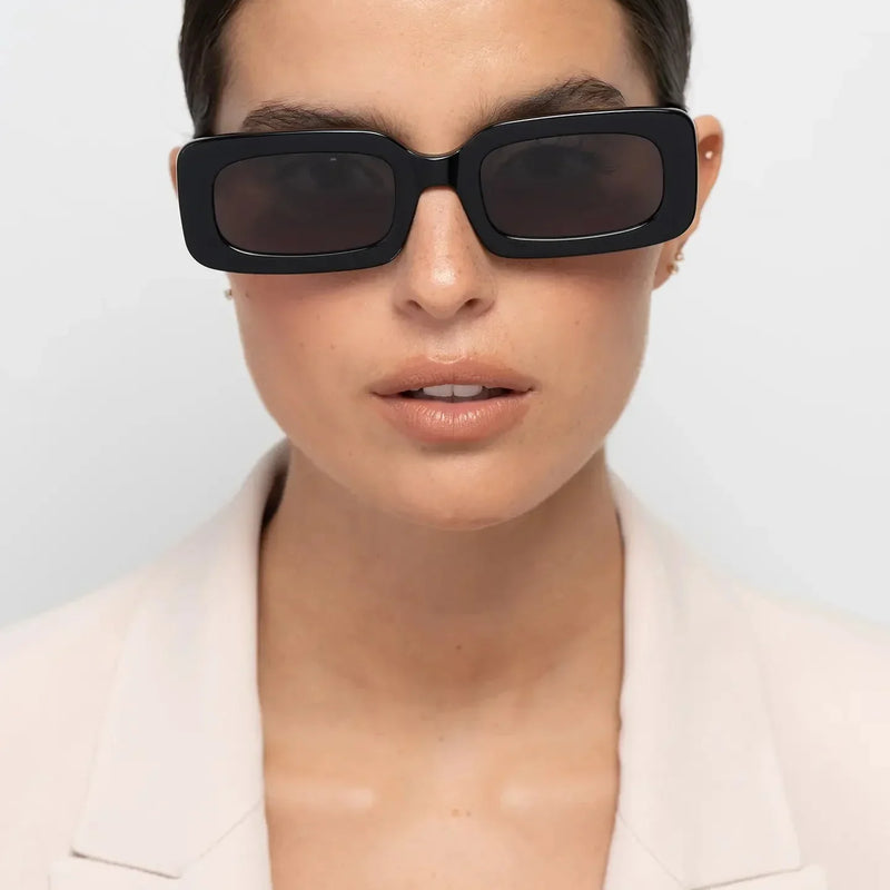
Jane Shiny Black — graphic rectangular identity
Jane Shiny Black places more of its identity in structure and contrast. Rectangular geometry creates a stronger horizontal line, while substantial opaque black acetate makes that geometry clearly visible around the eyes.
Consider it if: straighter geometry, dark accessories and stronger facial definition already feel natural within your style. Consider another direction if: you prefer curves, tonal variation or lower visual density around the eyes.
Triboulet Olive — panto balance with muted colour
Triboulet Olive creates identity through a different combination. Panto geometry balances lower curvature with greater upper-frame definition, while olive introduces recognisable colour without depending on high saturation.
Consider it if: you prefer curves with some structure and regularly wear earth tones or muted colours. Consider another direction if: you want the graphic definition of opaque black or the stronger curvature of a fully round silhouette.
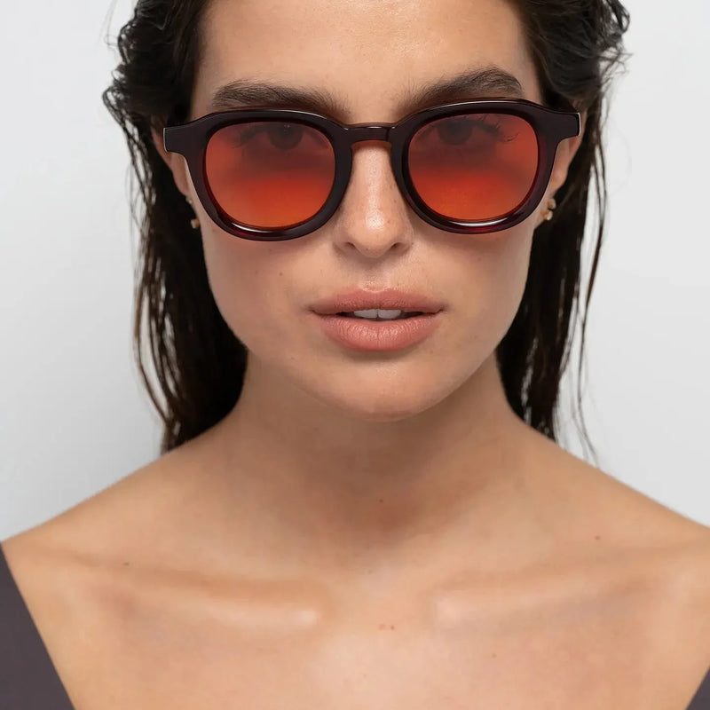
Narr Burgundy — deeper colour as part of the identity
Narr Burgundy demonstrates how colour can become one of the reasons a frame feels specific. Burgundy gives the acetate a deeper warm identity, while panto geometry prevents colour from being the only expressive element.
Consider it if: you want colour to be recognisable without moving towards a bright frame and deeper warm tones already make sense in your wardrobe. Consider another direction if: you want your eyewear to behave as a quieter neutral.
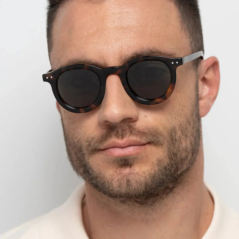
William Tortoise — substantial curves with tonal variation
William Tortoise makes curved geometry and visible acetate central to the design. Tortoise breaks the frame into warmer tonal variation, giving the substantial round silhouette a different visual character from the same scale in uniform black.
Consider it if: you repeatedly prefer round eyewear, visible material and patterned warmth. Consider another direction if: horizontal structure or lower frame presence matters more to you.
William Crystal Peach — visible geometry with softer density
William Crystal Peach shows why physical size and visual weight should not be treated as the same thing. Its substantial round geometry remains visible, while transparent acetate allows more light and facial colour through the frame and reduces the continuous boundary created by an opaque finish.
Consider it if: you enjoy bold proportions but prefer softer facial contrast. Consider another direction if: dark definition is one of the main reasons you wear substantial eyewear.
Substantial round geometry combined with transparency.
You want visible proportions without a dense dark outline.
Provides less graphic definition than an opaque dark frame.
BBN insight
Do not ask which of these frames has the most personality. Ask which source of personality you are most likely to keep choosing: angular structure, balanced curves, muted colour, deeper colour, patterned warmth or transparency.
What should you check before buying independent eyewear?
The final check should bring the decision back from the idea of independent eyewear to the specific frame. A strong brand story can explain why a collection exists, but it cannot decide whether an individual design belongs in your wardrobe.
Shape: do you genuinely prefer what this geometry does around your features?
Proportion: are the width and lens height creating the scale you want rather than simply attracting attention?
Material presence: do you enjoy how much of the acetate remains visible around the lenses?
Contrast: does the frame create the amount of facial definition you normally prefer?
Colour: can you connect the acetate naturally with several clothes or accessories you already own?
Distinctiveness: can you explain what makes the design specific without relying only on the brand name?
Repeatability: can you imagine wearing it on an ordinary day as well as when you deliberately style around it?
Trade-off: are you comfortable with what this frame gives up in exchange for the characteristic you value most?
If those answers remain convincing after the novelty and brand story are removed, you have a stronger reason to expect the frame to become personally meaningful through use.
Frequently asked questions
What is independent eyewear?
Independent eyewear generally refers to eyewear created by brands operating independently rather than as part of a large fashion or eyewear group. Independence can create room for a more specific design point of view, but it does not automatically guarantee originality, quality or a better frame.
Why does independent eyewear feel more personal?
It can feel more personal when the frame's own design carries more of the identity. Shape, proportion, acetate, colour and quieter branding can give the wearer specific reasons to choose a frame beyond widespread brand recognition.
Is independent eyewear better than designer eyewear?
Not automatically. Independent and designer describe different contexts, not guaranteed levels of design or quality. The more useful comparison is between individual frames: their proportions, materials, visual character, fit and relevance to your own style.
Does independent eyewear have to look unusual?
No. A frame can use familiar rectangular, round or panto geometry and still have a clear identity through width, lens depth, brow geometry, acetate thickness, colour or transparency. Distinctiveness does not require novelty for its own sake.
Does personal eyewear need to be bold?
No. Boldness describes visual presence; personal connection describes how closely a design corresponds to your preferences. A quieter frame can feel highly personal, while a dramatic frame can feel disconnected from your style.
Why does subtle branding matter in eyewear?
Subtle branding can allow more attention to remain on the frame and wearer. When a prominent logo is not carrying the first impression, geometry, proportion, material and colour have a greater role in making the eyewear recognisable.
How can frame colour make sunglasses feel more personal?
Colour changes facial contrast and the relationship between eyewear and clothing. Black, tortoise, olive, burgundy and crystal acetate behave differently, so a colour that already connects with your wardrobe may feel more personal than one chosen because it is theoretically more versatile.
Can bold independent eyewear be worn every day?
Yes. A distinctive frame can become an everyday frame when its shape, scale and colour work naturally with your face and wardrobe. Repeated wear can turn something initially noticeable into a recognisable part of your appearance.
How do I know if a distinctive frame is really my style?
Remove the brand name and trend context, then identify why you still want that exact frame. Specific reasons based on geometry, proportion, colour, contrast and wardrobe compatibility are stronger signals than novelty alone.
Is a more unusual frame always more individual?
No. Rarity and individuality are different. An unusual frame only becomes personally meaningful when its design makes sense for the wearer. A more familiar silhouette can feel considerably more individual when its proportions and material choices align closely with someone's established style.
Can independent eyewear become part of a signature style?
Yes. When a distinctive shape, colour or proportion works well enough to be worn repeatedly, it can become associated with the wearer. The signature develops through consistent personal use rather than through distinctiveness alone.
Why does the right frame eventually stop feeling like an accessory?
The most personal eyewear does not necessarily announce itself as personal on the first day. The connection develops because the frame keeps making sense. Its shape creates a relationship with your features that you continue to enjoy; its colour belongs with clothes you repeatedly wear; its proportions provide the amount of presence that feels natural rather than performative.
Independent eyewear can create fertile ground for that connection when a clear design point of view gives you more specific choices in geometry, material, colour and proportion. Quieter branding can leave more room for those decisions to become associated with the wearer rather than requiring the brand itself to remain the dominant message.
But independence alone is not what makes the relationship personal. The wearer completes the design decision through selection and repetition. A frame becomes yours because you understand why you chose it, integrate it into your wardrobe and continue reaching for it after the novelty has gone.
That is ultimately why some eyewear begins to feel like more than an accessory. Not because nobody else can own the same frame, but because its particular design has found a convincing place within the way you already express yourself.
Find the frame that feels like yours
Explore different shapes, proportions, acetate colours and levels of visual presence, then compare the designs by what they contribute to your face and wardrobe rather than by recognition alone.
¡Disfruta de un 10% de descuento en tu compra! Suscríbete a nuestro boletín informativo.¡Disfruta de un 10% de descuento en tu compra! Suscríbete a nuestro boletín informativo.¡Disfruta de un 10% de descuento en tu compra! Suscríbete a nuestro boletín informativo.¡Disfruta de un 10% de descuento en tu compra! Suscríbete a nuestro boletín informativo.¡Disfruta de un 10% de descuento en tu compra! Suscríbete a nuestro boletín informativo.¡Disfruta de un 10% de descuento en tu compra! Suscríbete a nuestro boletín informativo.¡Disfruta de un 10% de descuento en tu compra! Suscríbete a nuestro boletín informativo.¡Disfruta de un 10% de descuento en tu compra! Suscríbete a nuestro boletín informativo.¡Disfruta de un 10% de descuento en tu compra! Suscríbete a nuestro boletín informativo.¡Disfruta de un 10% de descuento en tu compra! Suscríbete a nuestro boletín informativo.¡Disfruta de un 10% de descuento en tu compra! Suscríbete a nuestro boletín informativo.¡Disfruta de un 10% de descuento en tu compra! Suscríbete a nuestro boletín informativo.¡Disfruta de un 10% de descuento en tu compra! Suscríbete a nuestro boletín informativo.¡Disfruta de un 10% de descuento en tu compra! Suscríbete a nuestro boletín informativo.¡Disfruta de un 10% de descuento en tu compra! Suscríbete a nuestro boletín informativo.