Some sunglasses feel more premium before you notice the brand, price or logo.
That feeling usually comes from proportion, balance, colour depth, material presence and visual restraint.
A frame can look expensive without being loud.
It can feel refined without relying on obvious branding.
What matters is how the frame sits on the face, how the acetate carries visual weight and how every detail works together.
The best sunglasses feel considered because nothing feels accidental.
For a deeper view on this idea, read Why Balanced Sunglasses Feel More Expensive.
WHY SOME SUNGLASSES FEEL DIFFERENT IMMEDIATELY
Premium-looking sunglasses usually create an immediate sense of control.
The frame does not feel random, decorative or overly trend driven.
Instead, the shape, colour, lens depth and thickness feel connected.
This creates a frame that feels visually complete.
People often describe this as quality, but what they are really seeing is coherence.
Premium eyewear usually feels:
- balanced
- intentional
- structured
- visually calm
- easy to wear repeatedly
The strongest frames create presence without needing to force attention.

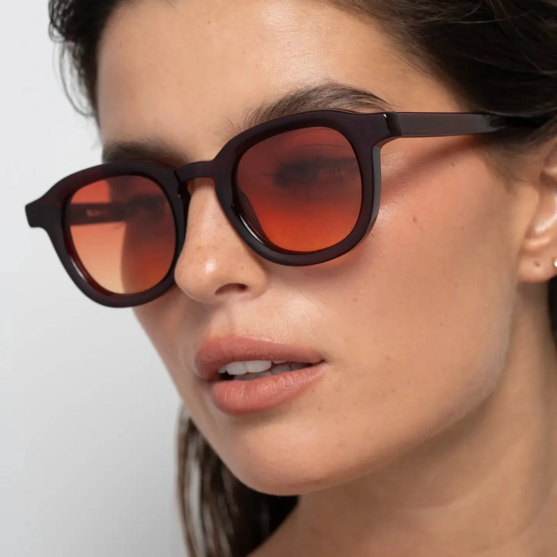
Narr Burgundy shows how rich tone, structured panto geometry and controlled visual weight can make a frame feel distinctive without becoming excessive.
PREMIUM DOES NOT ALWAYS MEAN EXPENSIVE
Premium is not only about price.
Many sunglasses feel premium because their proportions, finish and visual balance create a stronger sense of intention.
A frame can be expensive and still feel awkward if the shape is unbalanced or the contrast feels too harsh.
Another frame can feel more elevated because the structure, colour and lens choice work naturally together.
This is why perceived quality often comes from design clarity rather than decoration.
For related reading, see What Makes Sunglasses Look Expensive.
WHY PEOPLE ASSOCIATE CERTAIN FRAMES WITH QUALITY
Most people decide whether sunglasses feel premium within seconds.
That judgement usually happens before they know the brand, the materials or the price.
The brain naturally responds to visual signals.
When proportions feel balanced, colours feel controlled and the frame appears intentional, people often associate those qualities with higher value.
This is why some sunglasses feel more refined even when viewers know nothing about the product itself.
The perception of quality often comes from:
- balanced proportions
- visual consistency
- controlled contrast
- clear frame geometry
- absence of unnecessary details
People rarely describe these elements directly.
Instead, they simply say the sunglasses look better.
PROPORTION IS THE FIRST THING PEOPLE NOTICE
Proportion is one of the strongest signals of premium eyewear.
If the frame width, lens height, bridge placement and acetate thickness feel balanced, the sunglasses usually look more considered.
Frames that are too narrow can make the face feel wider.
Frames that are too oversized can feel forced.
Frames that are too thin can lack presence.
Frames that are too heavy can overpower the face.
The most refined result usually comes from proportion that supports the wearer rather than fighting the face.
For more on this relationship, read How Sunglasses Change Facial Balance.
FRAME THICKNESS CREATES VISUAL PRESENCE
Acetate thickness changes how premium a frame feels.
Thicker acetate can create stronger presence, but only when the shape and proportions remain controlled.
Too little thickness can make sunglasses feel visually weak.
Too much thickness can make them feel heavy or aggressive.
The best frames usually find a middle point where the acetate feels present, structured and wearable.
Frame thickness affects:
- facial definition
- visual weight
- perceived quality
- long-term wearability
For a deeper comparison, read Thin vs Thick Frame Sunglasses.

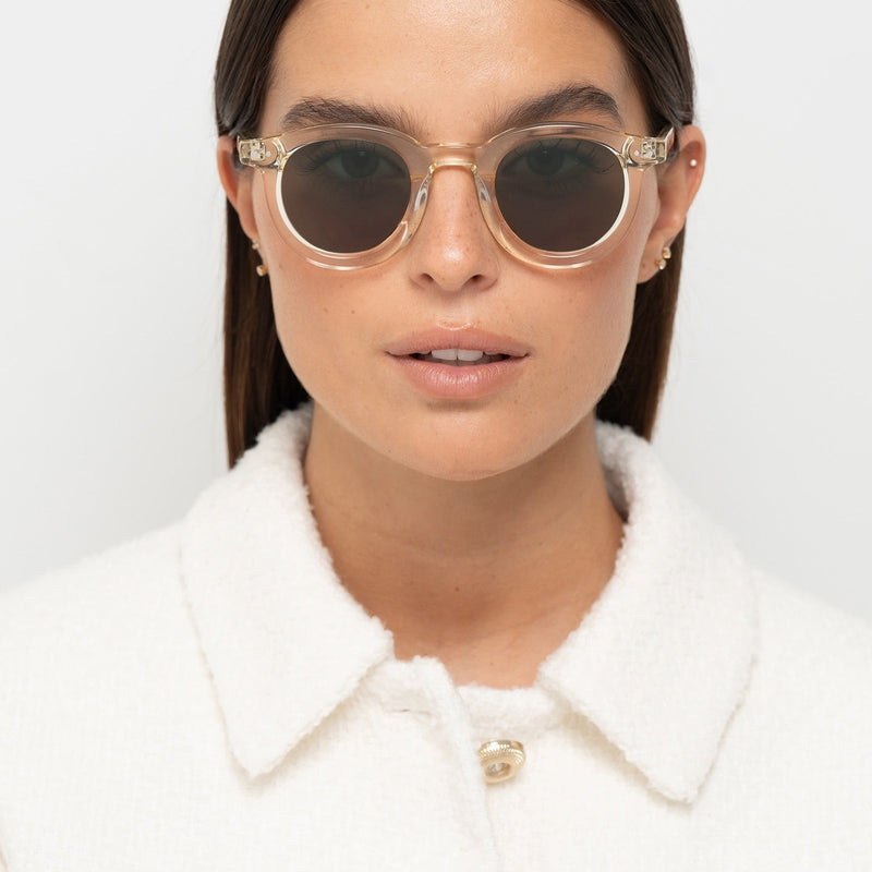
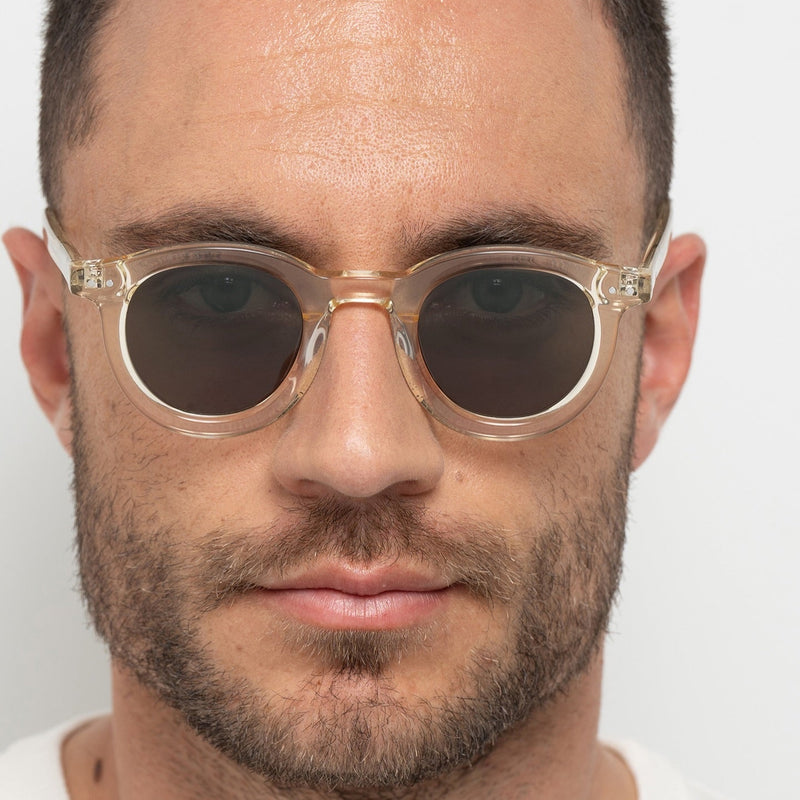
Jane Cream White demonstrates how visible acetate thickness and lighter colour can create structure without excessive visual heaviness.
COLOUR DEPTH CHANGES PERCEIVED QUALITY
Colour depth can make sunglasses feel more premium because it adds dimension.
Flat colour can feel simple, while deeper tones often create a richer and more controlled visual effect.
Black acetate creates sharp definition.
Tortoise creates warmer depth.
Burgundy creates controlled richness.
Olive creates softer tonal balance.
Translucent acetate creates openness and lighter presence.
The strongest colours feel connected to the frame shape rather than applied as decoration.
For more on contrast and colour, read Black vs Tortoise Sunglasses.
WHY BALANCED FRAMES FEEL MORE REFINED
Balanced sunglasses often feel more premium because they reduce visual tension.
When the frame shape, width, lens depth and colour work together, the eyewear feels more refined and easier to trust.
The face looks more composed.
The frame feels more natural.
The design does not need to explain itself.
This is why balance is often more powerful than decoration.
Balanced frames usually create:
- cleaner facial structure
- better visual harmony
- less harshness
- stronger long-term wearability

Triboulet Olive creates a quieter premium effect through softer tonal contrast, balanced panto proportions and controlled frame presence.
PANTO FRAMES OFTEN FEEL MORE CONSIDERED
Panto sunglasses often feel premium because they balance structure and softness.
The upper frame creates definition, while the rounded lower shape keeps the silhouette less severe.
This makes panto frames feel intelligent, wearable and composed.
They are not as rigid as sharp rectangular frames.
They are not as soft as fully round frames.
They sit between both, which often creates a more considered visual effect.
Panto frames usually work well when the goal is:
- controlled definition
- soft structure
- balanced presence
- long-term wearability
For more on this silhouette, read How Oversized Panto Frames Create Stronger Facial Definition.
PREMIUM FRAMES LOOK INTENTIONAL, NOT ATTENTION SEEKING
One of the strongest differences between premium eyewear and ordinary eyewear is restraint.
Premium frames rarely try to impress through excess.
They create presence through proportion, structure and coherence.
Nothing feels exaggerated.
Nothing feels added purely for attention.
The frame feels complete because every detail supports the overall silhouette.
This is why many of the most enduring sunglasses designs share similar characteristics.
- clean frame lines
- balanced acetate thickness
- controlled colour palettes
- consistent visual weight
- timeless proportions
The strongest sunglasses do not dominate the face.
They belong to it.
MINIMAL DESIGN AGES BETTER
Premium sunglasses often age better because they rely on proportion rather than novelty.
Minimal design does not mean plain. It means every visual decision has a reason.
Frames with excessive branding or exaggerated shapes can quickly feel tied to a moment.
More restrained frames often remain relevant longer because they are built around silhouette, structure and balance.
The strongest minimal frames usually have:
- clear geometry
- controlled colour
- strong proportions
- low visual noise
- enough presence to feel intentional
For more on this direction, read Quiet Sunglasses Without Logos.

William Crystal Peach shows how translucent acetate can feel light, refined and intentional when the frame still has enough structure.
WHY PREMIUM SUNGLASSES OFTEN FEEL EASIER TO WEAR
People often assume premium eyewear is only about appearance.
In reality, one of the biggest differences is wearability.
Frames that feel visually balanced often feel easier to wear repeatedly.
They work with more outfits.
They work across different situations.
They feel appropriate years after purchase.
This is why premium sunglasses often become everyday favourites.
They create enough presence to feel distinctive while remaining versatile enough for long-term use.
The result is a frame that feels natural rather than demanding.
WHAT MAKES SOME SUNGLASSES LOOK CHEAP
Sunglasses often feel less premium when too many elements compete at once.
The issue is usually not one detail, but a lack of visual control.
Frames can look cheaper when they rely on:
- excessive logos
- unbalanced proportions
- thin or weak-looking structure
- overly aggressive shapes
- flat colour without depth
- visual noise instead of design clarity
Premium-feeling sunglasses usually do the opposite.
They reduce noise, control contrast and make the frame feel connected to the face.
HOW TO RECOGNISE A PREMIUM FRAME
A premium-feeling frame is usually easy to recognise when you know what to look for.
It should feel balanced from the front, considered from the side and natural when worn.
Look for:
- proportion that suits the face
- acetate with enough visual presence
- colour with depth or controlled contrast
- a silhouette that feels intentional
- lens depth that supports facial balance
- minimal branding or visual noise
The best test is whether the sunglasses still feel strong without needing explanation.
If the frame feels balanced, wearable and visually coherent, it usually has the qualities people associate with premium eyewear.

Narr Shiny Black brings the idea together through clean black acetate, balanced panto geometry and a frame presence that feels controlled rather than decorative.
FAQ ABOUT PREMIUM SUNGLASSES
What makes sunglasses feel premium?
Premium sunglasses usually feel balanced, structured and visually coherent, with strong proportions, controlled colour and enough material presence.
Do premium sunglasses need logos?
No. Many premium-feeling sunglasses rely on silhouette, proportion and material presence rather than obvious branding.
Does acetate thickness make sunglasses feel better?
Yes. Acetate thickness can create stronger presence and perceived quality when the frame remains balanced.
Why do some sunglasses look expensive?
They usually look expensive because the proportions, contrast, frame shape and colour depth feel controlled and intentional.
Are black sunglasses more premium?
Black sunglasses can feel premium when the frame shape is balanced and the contrast does not feel too harsh.
Do tortoise sunglasses feel premium?
Yes. Tortoise frames often create warmer depth and more dimensional contrast than flat colour.
Can translucent sunglasses feel premium?
Yes. Translucent acetate can feel refined when the frame has enough structure and proportion.
What makes sunglasses look cheap?
Unbalanced proportions, excessive logos, weak structure, flat colour and overly aggressive design can make sunglasses feel less premium.
Are minimal sunglasses more premium?
Minimal sunglasses can feel premium when the design feels intentional, structured and visually controlled.
How do I choose sunglasses that feel premium?
Look for balanced proportions, strong frame presence, controlled colour depth and a silhouette that feels natural on your face.
FINAL THOUGHT
Premium sunglasses are rarely defined by logos, trends or price alone.
They feel premium because every visual decision appears intentional.
Proportion, colour depth, acetate thickness, frame shape and balance all contribute to how eyewear is perceived.
The strongest frames do not rely on excess to create presence.
They create confidence through structure, coherence and restraint.
Premium sunglasses are rarely defined by how much attention they demand.
They are defined by how naturally they belong on the face.
Explore Bo Bo Noir's sunglasses collection for eyewear designed around balance, structure and long-term wearability.
👁 YOU MAY ALSO LIKE:
Why Balanced Sunglasses Feel More Expensive
Learn how proportion, visual weight and structure influence perceived value.
Read the article
What Makes Sunglasses Look Expensive
Understand how frame shape, colour depth and contrast affect how eyewear is perceived.
Read the article
Black vs Tortoise Sunglasses
Compare stronger definition with warmer, softer visual balance.
Read the article