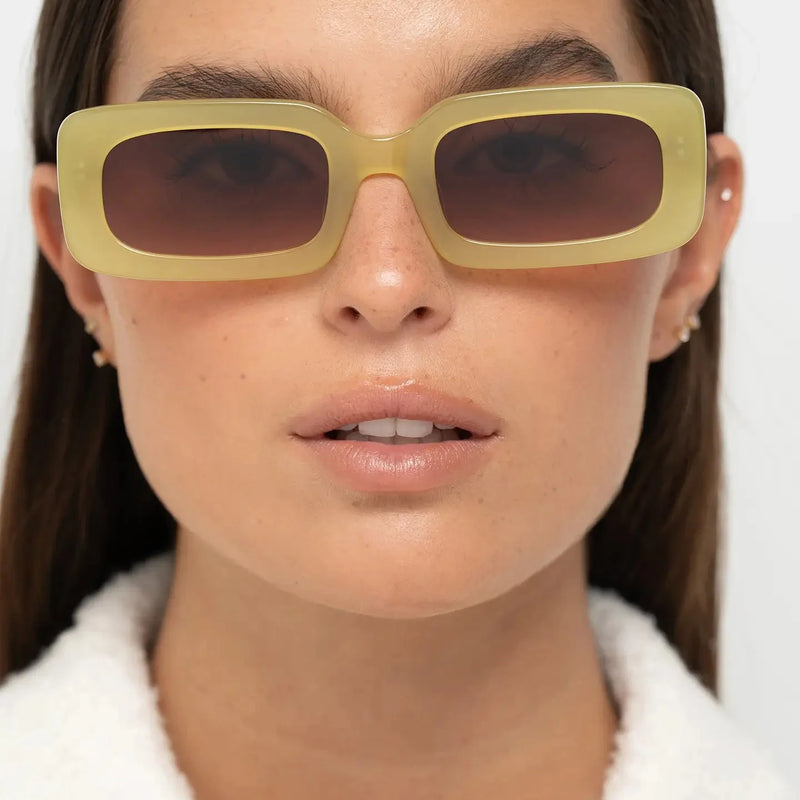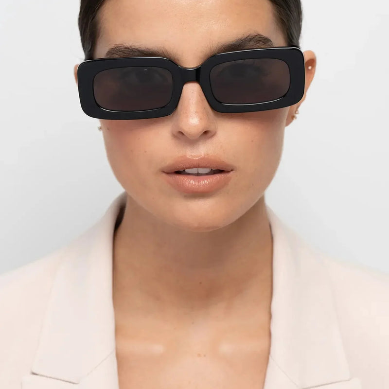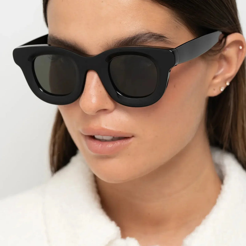
Choosing eyewear should be a question of proportion, purpose and personal expression. Yet trend coverage often makes the decision harder than it needs to be.
One season declares narrow rectangles essential. The next replaces them with oversized curves, transparent acetate or a new colour presented as universally flattering. The result is more choice, but not necessarily more clarity.
The real value of understanding eyewear trends for 2027 is not knowing what appears new. It is learning which changes affect visual balance, which materials alter the presence of a frame and which ideas are likely to remain relevant after the fashion cycle moves on.
Eyewear is different from most accessories because it sits within the face rather than around the body. A small variation in lens height, bridge width, brow-line direction or acetate thickness can change how the eyes, cheekbones and jaw are perceived. Colour can sharpen that effect or soften it.
A rectangular frame can introduce horizontal definition. A panto can soften stronger facial angles without losing structure. Crystal acetate can reduce visual weight, while polished black creates a clearer outline around the eyes. None is universally superior. Each creates a different relationship between the frame and the face.
This article examines the materials, silhouettes, colours and buying behaviours shaping eyewear in 2027. It explains what each development creates, who may benefit from it, where its limitations appear and how to distinguish a lasting design direction from a short-lived fashion signal.
For readers already deciding between familiarity and experimentation, our guide to classic versus trendy sunglasses provides a useful starting point. If your priority is longevity rather than novelty, how to build a timeless sunglasses collection approaches the same decision from a longer-term perspective.

Quick Answer
The defining eyewear trends for 2027 are refined bold acetate, crystal finishes, balanced panto and rectangular silhouettes, earth-inspired colours and a stronger preference for independent design and long-term wearability.
Choose by visual effect rather than trend name. Crystal acetate is useful when dark frames feel too heavy. Rectangular frames create stronger horizontal definition. Panto shapes balance softness with upper-frame structure. Olive, tortoise and burgundy introduce colour while remaining practical for everyday wear.
Avoid treating any one trend as a universal solution. Frame width, bridge fit, lens height and colour contrast should always be considered together.
BBN Insight
Most people begin with face shape. In practice, frame width, brow-line direction and visual weight often have a greater influence on balance. Two round frames can produce completely different effects when one is narrow and dark while the other is broad and translucent.
Why Do Eyewear Trends Matter in 2027?
Eyewear trends matter when they reveal a broader change in how frames are designed and worn. They become less useful when they are reduced to lists of fashionable colours or shapes without explaining the visual consequences.
The wearer does not experience a trend as an abstract idea. They experience it through the way a frame changes the face, sits on the bridge, interacts with clothing and performs during everyday use.
This is why the most important developments in 2027 are not isolated design details. They reflect four connected shifts: greater attention to material, more controlled geometry, colour that behaves like part of the wardrobe and a more selective approach to buying.
Eyewear Has Become Part of Facial Architecture
A frame creates a new set of lines within the face. The brow line introduces direction. The lenses create scale. The bridge changes the perceived distance between the eyes, while the lower rim can either echo or contrast with the cheekbones and jaw.
This relationship explains why the same frame can feel restrained on one person and dominant on another. A thick acetate silhouette may create useful definition on a broader face, but excessive visual weight on a smaller one. A narrow rectangle may sharpen soft facial contours, yet make a long or narrow face appear more compressed.
This is why width deserves to be considered independently from the basic shape label. Our guide to how frame width changes facial proportions explains why relatively small changes in width can alter the relationship between the eyewear, temples and cheekbones.
The position of the upper rim matters too. If you are trying to understand why otherwise similar frames interact differently with the eyes and brow, see how eyebrow position affects which sunglasses suit you.
Trend language often overlooks these differences because it focuses on the product in isolation. A more useful approach considers what the frame does once it becomes part of the wearer’s facial architecture.
Colour Now Changes Structure as Much as Mood
Colour is not simply decorative. It changes the apparent weight of a silhouette.
Black acetate creates a strong, continuous outline. The geometry becomes immediately visible, which can increase definition but also make an already substantial frame feel heavier. We examine this effect specifically in why dark frames create stronger facial definition.
Crystal acetate allows some of the wearer’s skin tone to remain visible through the frame. The silhouette can retain thickness and character while producing less contrast. This is one reason transparent frames can support substantial geometry without creating the same graphic effect as black acetate.
Olive, smoke and amber sit between these extremes: more visible than clear acetate, but often softer than black. The broader relationship between frame colour and the wearer is explored in how frame contrast changes your appearance.
This helps explain the growth of earth-inspired and translucent colours. They allow wearers to explore stronger geometry without creating the full graphic effect of an opaque dark frame.
Our dedicated analysis of sunglasses colour trends for 2027 compares the emerging palette in greater depth, while crystal versus tortoise frames is useful when choosing specifically between transparency and patterned warmth.
Fit Is Becoming Part of the Trend Conversation
A frame can appear current and still be the wrong choice. If the bridge does not sit securely, the temples create pressure or the width places the eyes too close to the inner lens edge, styling becomes secondary.
The increased interest in bolder acetate and directional silhouettes makes fit more important, not less. More material creates more visual presence, but it can also magnify poor proportion.
Physical weight is only part of this equation. Pressure distribution can make a relatively light pair feel surprisingly substantial during extended wear, a distinction explained in why some sunglasses feel heavy even when they’re lightweight.
For this reason, 2027 should not be understood as a year of one dominant shape. It is better understood as a movement towards frames whose design decisions are easier to read: clear brow lines, deliberate lens proportions, visible material and colours chosen for a specific level of contrast.
If the larger question is why one apparently suitable frame works while another does not, why some sunglasses suit you better than others brings proportion, contrast and fit together in one decision framework.
How Did We Evaluate the Eyewear Trends in This Guide?
Not every unfamiliar frame deserves to be described as a trend. Some designs gain visibility because they photograph well or appear repeatedly for a short period. Others indicate a more meaningful change in materials, proportions or buyer behaviour.
We evaluated each direction according to its usefulness rather than its novelty. A trend needed to explain a genuine change in the way frames are designed, selected or worn.
| Editorial Criterion | What We Considered | Why It Matters |
|---|---|---|
| Visual consequence | How the frame changes balance, contrast and facial definition. | A useful trend should explain an observable effect. |
| Wearability | Whether the idea works across wardrobes, settings and routines. | A frame has limited value if it cannot be worn naturally. |
| Material integrity | Whether construction and finish support the design. | Material should contribute to the effect rather than imitate it. |
| Longevity | Whether the direction can remain relevant beyond one season. | Eyewear is often worn for years rather than months. |
| Decision value | Whether understanding the trend helps someone choose more confidently. | Editorial coverage should reduce hesitation, not add to it. |
This method deliberately avoids declaring universal winners. A crystal frame is not better than a black frame. A rectangle is not more advanced than a panto. Each option becomes more or less suitable according to the result the wearer wants to create.
The comparisons throughout this guide therefore follow a consistent principle: define the effect, explain the trade-off and identify the facial proportions, wardrobe or use case for which it is more suitable.
That same approach is useful when evaluating quality. Instead of relying on price or branding alone, how to tell if glasses are high quality looks at construction, material, finishing and the details that can actually be inspected.

How Is Eyewear Design Language Changing?
The clearest shift is from visible novelty towards deliberate structure.
That does not mean eyewear is becoming conservative. In many cases, frames are becoming more expressive. The difference is that expression increasingly comes from proportion, material and colour rather than conspicuous logos or arbitrary decoration.
A substantial acetate rim can create identity through its contour. A panto becomes recognisable through the relationship between its softer lower curve and its directional upper line. A translucent finish can reveal depth without introducing another decorative element.
The best eyewear rarely needs to announce what it is doing. Its presence is created by the consistency of its decisions.
Bold No Longer Means Simply Oversized
Scale remains important, but boldness is becoming more precise.
A very wide or deep frame can attract attention, yet attention alone does not create balance. Contemporary bold eyewear is more often defined by controlled lens height, considered bridge placement and acetate thickness that supports the shape rather than obscures it.
This distinction matters because excessive scale can reduce the visibility of the wearer. A well-proportioned bold frame should reinforce the eyes and brow while still allowing the face to remain legible.
If you are deciding how far to take that scale, oversized versus standard sunglasses compares the two approaches through facial proportion rather than trend preference.
Thickness also creates its own visual signal. Why thick acetate frames look more expensive explains why material depth, edge definition and polishing can make a substantial silhouette appear more intentional rather than simply larger.
Quiet Branding Places More Pressure on Design
When logos become less visible, silhouette and construction must carry more of the identity.
This is one reason independent eyewear has gained a stronger position within contemporary design. A collection can become recognisable through repeated geometry, temple structure, bridge shape and colour language rather than external branding.
The approach also benefits the wearer. A frame chosen for its proportion and visual effect is easier to integrate into a personal style than one whose identity depends mainly on a visible mark.
It also changes how quality is perceived. What makes some sunglasses feel premium examines why proportion, finishing and tactile detail can communicate quality before a logo or price is considered.
Materials Are Becoming Part of the Message
Acetate is no longer treated only as the substance from which a frame is made. Its transparency, layering, polish and thickness increasingly define the design itself.
This is particularly visible in crystal finishes. Because the material allows light to pass through it, the frame can reveal its structure without creating a hard boundary around the eyes. The material and the visual effect become inseparable.
For readers who want to understand the material rather than simply recognise it, how acetate frames are made explains the production process, while why premium acetate looks different focuses on the visible result.
The next chapter examines why this material shift matters and how to distinguish genuine depth and finishing from a frame that merely imitates the appearance of acetate.
How Can You Distinguish a Trend from a Lasting Design Change?
A trend becomes useful when it solves a recurring visual or practical problem.
Crystal acetate, for example, is more than a seasonal colour direction because it gives wearers a way to use substantial frames with less contrast. Rectangular geometry remains useful because it creates horizontal definition. Panto frames endure because they provide a middle ground between angular and fully round silhouettes.
That distinction is particularly useful when comparing panto with more familiar angular eyewear. Our guide to panto versus Wayfarer sunglasses explains how the two geometries create different levels of softness and structure.
By contrast, a detail that depends entirely on surprise may have less long-term value. Once the novelty disappears, there must still be a reason to wear it.
A Practical Test
Before choosing a trend-led frame, ask four questions:
- Does it create a visual effect I actually need?
- Does the colour work with the clothes I wear most often?
- Would I still choose the shape without knowing it was fashionable?
- Does the fit remain convincing after several minutes of wear?
If the answers are clear, the frame is more likely to become part of your personal style rather than a record of one season. For a practical wardrobe-first approach, see how to choose the best everyday sunglasses.
Fashion changes the context around a frame. Good design gives the frame a reason to remain.
The first major chapter begins with material, because material determines how colour, thickness and light behave before silhouette is even considered. From there, the article moves into geometry, colour and buying decisions — the elements that determine whether a 2027 direction becomes something you actually continue to wear.
Materials That Will Define Eyewear in 2027
Before shape becomes visible, material has already influenced the way a frame will behave.
It determines whether colour appears flat or layered, whether the rim feels sharp or softened, whether light passes through the frame and how much visual weight sits around the eyes. It also affects the way thickness is perceived. A substantial frame in translucent acetate can feel lighter than a slimmer frame in dense black.
This is why material is one of the most important themes in contemporary eyewear. The strongest frames of 2027 are not treating acetate as a neutral support for colour. They are using depth, transparency, polish and structure as part of the design language itself.
The result is a more nuanced form of expression. Rather than relying on excessive branding or decorative hardware, the frame communicates through the way its surfaces, edges and colour respond to light.
Material is not the background of the design. In the best eyewear, material is the design.
Premium Acetate Becomes the New Standard
Premium acetate is becoming central to the way modern eyewear is judged because it offers something ordinary moulded plastic cannot easily reproduce: depth.
That depth appears in several ways. Colour can move through the material rather than sitting only on the surface. Transparent layers can create subtle shifts in tone. Polished edges can reflect light differently from the flatter front of the frame. Even a single-colour silhouette can feel more dimensional when the material has been carefully cut and finished.
For the wearer, this matters because visual richness does not require additional decoration. A well-finished acetate frame can appear expressive through its proportion and material alone.
If you want to understand the difference at a glance, why premium acetate looks different explains how depth, polish and colour separation affect the appearance of a finished frame.
Why Acetate Looks More Dimensional
Acetate can be produced in layered sheets, allowing different tones, levels of transparency and pattern to exist within the material itself. When those sheets are cut and polished, the frame reveals colour through its depth rather than presenting one uniform surface.
This is especially visible in tortoise, crystal and marbled finishes, but even solid colours can benefit. A polished black acetate frame may still show subtle changes in reflection across the brow, bridge and temple.
The visual effect is important because eyewear is seen from several angles throughout the day. A frame that appears flat from the front can feel less convincing in profile. Acetate gives the designer more control over both views.
The production process also helps explain why two frames described simply as “acetate” can look very different. Our guide to how acetate frames are made follows the material from sheet to finished eyewear and shows where cutting, shaping and finishing begin to influence the final result.
Why Thickness Matters
Thicker acetate allows a frame to create stronger presence, but thickness alone does not guarantee quality. The relationship between the front, bridge, temples and lens openings must remain controlled.
When those elements are balanced, a substantial frame can create authority without appearing clumsy. The brow line gains definition, the eyes become more visually anchored and the frame feels intentional from both the front and side.
When the proportions are not controlled, thickness can dominate the wearer rather than support them.
This is why the question is not simply whether a frame is thick or thin. Why thick acetate frames can look more expensive examines how bevels, edge control and polishing make substantial material feel considered rather than bulky.
BBN Material Check
Look for smooth polishing, even edges, clean lens insertion, stable hinges and a consistent relationship between the front and temples.
A premium material should feel resolved at close range. The frame should not depend on distance or branding to appear convincing.
For buyers evaluating a frame rather than the material name alone, how to tell if glasses are high quality provides a more practical inspection checklist.

Crystal Acetate Changes the Meaning of Bold
Crystal acetate is one of the most significant material directions shaping eyewear in 2027 because it allows thickness and softness to exist in the same frame.
Opaque acetate creates a clear boundary between the frame and the face. Crystal acetate changes that relationship. Light passes through the material, reducing the sense of a hard outline while preserving the silhouette.
This makes translucent frames particularly useful for wearers who appreciate expressive geometry but find dense black too severe. The frame can remain bold in shape without becoming equally bold in contrast.
This effect is explored in more detail in why transparent frames create softer facial balance, which looks specifically at how transparency changes the relationship between the eyewear and facial features.
Crystal Does Not Mean Invisible
A common misunderstanding is that transparent frames disappear. In practice, they remain visible because the rim still has thickness, edge definition and reflected light.
The difference is that the contrast becomes more tonal. Instead of drawing one dark continuous line around the eyes, crystal acetate interacts with skin tone, hair and surrounding light.
This can create a calmer result, but it does not automatically make the frame subtle. A large crystal frame can still be highly expressive. It simply expresses itself through volume, transparency and reflected light rather than dark colour.
For readers choosing directly between transparency and a warmer patterned finish, crystal versus tortoise frames compares the two effects side by side.
Warm Crystal versus Cool Crystal
Not all translucent acetate produces the same effect.
- Crystal peach introduces warmth and can create a softer transition between frame and skin.
- Crystal yellow is more visible and expressive while remaining lighter than opaque acetate.
- Smoke crystal creates a cooler, more architectural effect.
- Olive transparency works as an earth-toned neutral with greater character than clear acetate.
The best choice depends on the contrast you want. Warm crystal tends to feel more integrated. Cooler or deeper translucent tones can create stronger definition while remaining softer than black.
Within the Bo Bo Noir collection, the difference between two warm transparent directions can be seen in Crystal Peach versus Crystal Yellow frames.
Who Should Consider Crystal Acetate?
- Wearers who find black frames visually heavy.
- People who want bold geometry with softer contrast.
- Neutral wardrobes that benefit from tonal colour.
- Anyone looking for a frame that changes subtly in different light.
Crystal acetate may be less suitable when the main goal is maximum graphic definition. In that case, black, dark tortoise or a sharper rectangular silhouette may provide a clearer result.
The contrast between these two approaches is particularly visible in clear versus black frames, where visual weight rather than shape becomes the main variable.
Acetate versus Injection-Moulded Plastic
The distinction between acetate and injection-moulded plastic is often simplified into a question of premium versus ordinary. The real difference is more useful when considered through design, finish and wear.
Injection-moulded frames can be light, practical and consistent. They can also be produced efficiently in complex shapes. Acetate, however, offers greater control over layered colour, polishing and the sculptural quality of the frame.
Neither material should be judged by name alone. A poorly finished acetate frame can be less convincing than a carefully made moulded frame. Construction, hinges, alignment and fit remain essential.
| Characteristic | Cellulose Acetate | Injection-Moulded Plastic |
|---|---|---|
| Colour depth | Can show layering, transparency and internal variation. | Usually more uniform and surface-led. |
| Finish | Supports polished edges, bevels and hand-finished surfaces. | Typically consistent but less sculptural. |
| Visual weight | Can feel substantial, especially in opaque colours. | Often lighter in both appearance and physical weight. |
| Design expression | Strong for material-led and colour-led design. | Strong for efficient, highly consistent forms. |
| What to judge | Polish, edge control, hinge integration and alignment. | Surface quality, flexibility, hinge security and fit. |
The most useful conclusion is not that acetate is always better. It is that acetate gives designers more opportunities to create depth, especially when the frame is intended to be visibly expressive.
Material preference can also depend on the rest of the frame architecture. If you are comparing fundamentally different constructions, acetate versus metal glasses explores the trade-offs in visual presence, structure and wearability.
Polish, Bevels and Edge Control Become More Visible
As branding becomes quieter, finishing becomes easier to notice.
A frame may look simple from a distance, but close inspection reveals whether the edges are clean, whether the surface has been evenly polished and whether the transitions around the bridge and temples feel deliberate.
These details matter because eyewear is handled constantly. The wearer feels the bridge, folds the temples and sees the front at close range every day. Finishing therefore contributes both to perception and use.
Why Bevels Matter
A bevel changes the way light travels across an edge. It can make a thick frame appear more refined, create definition without adding colour and reduce the impression of a flat block of material.
Bevels can also alter the character of a silhouette. A sharper upper edge may make the brow line feel more directional, while a softer bevel can reduce severity.
Why Hand Polishing Matters
Polishing influences the way light moves across acetate. A clean, even surface makes depth easier to perceive, particularly around thicker rims and curved transitions.
That effect is why finishing can make two frames made from broadly similar material look noticeably different. Why hand polishing makes acetate frames look better explains how this final stage changes surface clarity and edge definition.
Why Side Profile Matters
Eyewear is often evaluated from the front, yet the side profile can reveal whether the design has been fully considered.
Temple thickness, hinge placement and the relationship between the frame front and arms all influence the way the eyewear feels in motion. A frame with a convincing front but unresolved temples can lose much of its visual authority when viewed from an angle.
The Close-Range Test
A well-finished frame should remain convincing at close range. Look beyond the front shape and inspect the bridge, inner rims, hinges, temple transitions and polished edges.

Hardware Should Support the Frame, Not Compete with It
Hinges and metal details are structurally important, but visually they should serve the frame rather than distract from it.
In a strong acetate design, hardware is integrated into the overall language. It may be visible, but it should not feel added only to create the impression of quality.
The most useful indicators are stability, alignment and a clean relationship between the hinge and temple. Decorative metal has little value if the frame does not open smoothly, sit evenly or maintain its shape.
What to Check Before Buying
- Do both temples open with similar resistance?
- Does the frame sit level when placed on a flat surface?
- Are the hinges aligned cleanly with the front and temples?
- Do metal details support the design rather than dominate it?
- Does the frame remain stable after repeated opening and closing?
This is where a general quality checklist becomes useful. Before buying, compare these details with the criteria in how to tell if glasses are high quality.
Material and Colour Can No Longer Be Separated
The same colour can create very different effects depending on whether it is opaque, translucent, patterned or layered.
Black acetate produces a strong outline because light does not pass through it. Olive transparency softens the same thickness. Burgundy can appear deep and restrained in opaque acetate, while tortoise interrupts the outline through pattern.
This is why colour names alone are insufficient. The wearer should consider three elements together:
- Hue: the actual colour, such as olive, burgundy or peach.
- Transparency: whether the material is opaque, translucent or clear.
- Thickness: how much material is present around the lenses and temples.
A thick translucent frame may feel softer than a thinner black one. A pale crystal frame may still appear bold if the lens height and brow line are substantial.
Readers deciding between specific colour families can compare burgundy versus black frames, while the broader 2027 palette is covered in Sunglasses Colour Trends 2027.

How to Choose the Right Material Effect
The most useful material choice begins with the level of contrast you want.
| Desired Effect | Material Direction | Likely Result | Consider Instead When |
|---|---|---|---|
| Strong definition | Opaque black acetate | Graphic outline and maximum contrast. | The frame feels too heavy against the face. |
| Soft boldness | Crystal peach, crystal yellow or clear acetate | Visible volume with reduced visual weight. | Sharper facial definition is required. |
| Warm neutrality | Tortoise acetate | Depth, pattern and softer contrast than black. | A cleaner or more minimal effect is preferred. |
| Quiet individuality | Olive acetate | Earth-toned colour with controlled visibility. | The wardrobe depends on strong black-and-white contrast. |
Material should not be chosen independently from frame shape. A strong rectangular silhouette in black creates a very different result from the same geometry in olive. The next chapter moves from material to shape and examines how bold, panto and rectangular frames alter facial balance.
Long-term wear should also be considered. A frame that looks convincing when new should continue to age well through repeated use. Why high-quality acetate ages better than ordinary plastic explains why material stability and finishing matter beyond the initial purchase.
Materials Chapter: Key Takeaways
- Premium acetate creates depth through layering, transparency and polish.
- Crystal acetate allows substantial frames to feel lighter on the face.
- Thickness is useful only when bridge, lens and temple proportions remain controlled.
- Acetate is not automatically better; finishing and construction still determine quality.
- Bevels, polishing, side profile and hinge integration affect how a frame feels at close range.
- Colour should always be judged together with transparency and frame thickness.
Next: frame geometry — why bold, panto and rectangular silhouettes create different forms of visual balance.
Frame Shapes That Will Define Eyewear in 2027
Material determines how a frame holds colour and light. Shape determines how it reorganises the face.
The most useful frame-shape trends for 2027 are not based on one universal silhouette. They are based on clearer geometry: stronger brow lines, more controlled lens proportions and a deliberate relationship between width, height and visual weight.
This is why bold, panto and rectangular frames are all relevant at the same time. Each creates a different form of balance. Bold frames concentrate attention around the eyes. Panto silhouettes soften lower facial angles while preserving upper-frame direction. Rectangular frames introduce horizontal definition and make the face feel more structured.
The question is not which shape is most fashionable. It is which geometry creates the effect the wearer actually needs.
Shape is not decoration around the lenses. It is a set of visual instructions for how the face should be read.
How Frame Geometry Changes Facial Balance
Eyewear introduces new horizontal, vertical and curved lines within the face. These lines can reinforce existing features or create contrast with them.
A broad rectangular frame emphasises width. A deep round lens adds vertical presence. A directional brow line can make the upper face feel more defined, while a softer lower rim can reduce the appearance of angularity around the cheeks and jaw.
Four elements matter most:
- Frame width: how far the front extends across the face.
- Lens height: how much vertical space the lenses occupy.
- Brow-line direction: whether the upper frame feels flat, curved or lifted.
- Lower-rim geometry: whether the silhouette remains angular, rounded or tapered.
These elements should be considered together. A round frame with a flatter brow behaves differently from a perfectly circular one. A rectangle with softened corners creates less severity than a narrow frame with harder geometry.
This is why face-shape rules work best as a starting point rather than a final answer. Our guide to how frame shape changes facial balance explains how different silhouettes alter the way facial width, length and structure are perceived.
For readers still deciding whether shape should dominate the choice at all, should sunglasses match your face shape? looks at the limitations of using one rule in isolation.
BBN Fit Principle
Face-shape labels can be useful, but they should not replace proportion. Two people described as having the same face shape may still need different frame widths, bridge positions or lens heights.
Bold Acetate Frames Become More Precise
Bold frames remain central to eyewear in 2027, but boldness is no longer defined by size alone.
The strongest designs create presence through proportion. The brow line is deliberate, the bridge has enough visual strength to connect both lenses and the temples support the front without making the frame feel top-heavy.
This matters because an oversized frame can attract attention without improving balance. A well-designed bold frame should make the eyes feel more anchored, not make the face disappear behind the product.
This distinction is explored directly in bold sunglasses without looking overpowering, which focuses on the difference between visible presence and excessive scale.
What Makes a Bold Frame Successful?
- Controlled width: enough presence to frame the face without extending excessively beyond the temples.
- Balanced lens height: sufficient depth to create character without covering too much of the cheek area.
- Bridge proportion: strong enough to support the design while maintaining a stable fit.
- Temple continuity: arms that feel visually connected to the frame front.
- Material discipline: thickness used to reinforce geometry rather than create bulk.
Thickness should therefore be judged in relation to the whole frame. If you want to understand why some substantial frames look more resolved than others, why thick acetate frames look more expensive examines the interaction between material depth, edge finishing and proportion.
Who Bold Frames Suit
Bold frames can work especially well on medium and broader facial proportions, or on wearers who want eyewear to become a defining element of their appearance.
They can also suit smaller faces when the width and lens height remain controlled. The mistake is assuming that bold must mean large in every direction.
Translucent acetate can make a bold silhouette easier to wear because it reduces contrast. Opaque black creates a stronger result and requires more careful attention to width and brow-line placement.
Who Should Be Careful?
A very narrow or short face can be overwhelmed by excessive lens height, thick black rims or temples that extend too widely. In that case, a slimmer panto or a medium-width rectangle may create clearer balance.

Round versus Panto: Similar Curves, Different Effects
Round and panto frames are often discussed as if they were interchangeable. They are not.
A fully round frame creates a more continuous curve around the lenses. This can soften angular features, but it may also feel overly gentle when the upper line lacks direction.
A panto frame usually retains a rounded lower lens while introducing a flatter, lifted or more directional brow line. This creates a compromise between softness and structure.
The difference is subtle, but it matters because the upper line has a strong influence on how structured the frame feels around the eyes and brow.
| Characteristic | Round Frame | Panto Frame |
|---|---|---|
| Upper line | More continuously curved. | Usually flatter or more directional. |
| Main effect | Maximum softness and circular emphasis. | Softness with additional brow definition. |
| Best considered for | Angular features and expressive styling. | Versatile daily wear and mixed facial geometry. |
| Potential limitation | Can feel too soft or overly circular. | Can appear narrow if the width is not balanced. |
Wearers comparing softer and more structured silhouettes may also find round versus rectangular sunglasses useful, as it places curved and directional geometry at opposite ends of the same decision.
Panto Frames Offer Balanced Curves
The panto remains one of the most useful silhouettes in contemporary eyewear because it combines several visual effects without fully committing to any one of them.
Its lower curve softens stronger facial angles. Its upper line introduces direction. The lens shape often has enough depth to feel expressive, yet the frame can remain versatile when the width is controlled.
This makes panto eyewear particularly effective for people who find rectangular frames too severe but perfectly round frames too gentle.
Why Panto Frames Remain Relevant
The panto survives trend cycles because its logic is practical. It creates contrast with angular faces while preserving enough structure to work with tailored clothing, minimal wardrobes and professional settings.
Colour can change its character significantly. Burgundy creates warmth and visible depth. Olive makes the frame feel quieter and more neutral. Black produces stronger definition, while lighter tortoise can soften the silhouette.
For a direct comparison with a more familiar angular shape, panto versus Wayfarer sunglasses explains how the two frame families differ in brow-line structure and overall presence.
When Panto Frames Work Best
- When the wearer wants softness without a fully circular silhouette.
- When angular cheekbones or a defined jaw need visual contrast.
- When one frame must move between formal and casual settings.
- When the brow should remain visible and structured.
For everyday use specifically, why tortoise panto frames work so well for everyday wear shows how a familiar pattern can make this geometry even easier to integrate.
When to Consider an Alternative
A panto may be less suitable when the main objective is strong horizontal definition. In that case, a rectangular frame can create a clearer directional effect.
It may also be less effective when the frame width is too narrow for the face. Narrow panto shapes can exaggerate facial width rather than balance it.

Rectangular Frames Create Clearer Horizontal Definition
Rectangular eyewear is one of the most visible shape developments for 2027, but its strongest forms are more controlled than the extremely narrow styles associated with earlier revivals.
Contemporary rectangular frames often include more lens height, softened corners and better bridge balance. This creates structure without compressing the face into one thin horizontal line.
Their main effect is directional. They draw the eye across the face, reinforce the brow and create contrast with rounder or softer facial contours.
Our guide to why rectangular frames feel more confident explores this visual direction in greater detail.
Why Rectangles Are Returning
Rectangular frames answer a desire for clarity. Their geometry is immediate and easy to read. In a period when colour and material are becoming more nuanced, the rectangle provides a stable structure around which those variations can operate.
This is why olive, tortoise and lighter rectangular frames can feel particularly current. The shape provides definition while colour changes how strongly that structure is perceived.
The styling effect is explored further in modern rectangular sunglasses and directional styling.
Who Rectangular Frames Suit
- Wearers who want stronger horizontal definition.
- Rounder or softer facial contours that benefit from contrast.
- Minimal wardrobes that need one more directional accessory.
- People who find round frames too gentle.
For rounder faces specifically, the broader decision is explained in how sunglasses can add structure to a round face.
Who Should Be Careful?
A very angular or narrow face can become more severe in a hard black rectangle. Softened corners, slightly greater lens height or a lighter colour can create a more balanced result.
Extremely narrow rectangular frames can also reduce comfort and visual usefulness. A current-looking silhouette should still provide enough lens area and bridge stability for real wear.

Panto versus Rectangle: Which Creates Better Balance?
Neither shape is universally better. The useful comparison is between the effects they create.
| Decision | Choose Panto | Choose Rectangle |
|---|---|---|
| Desired facial effect | Softer curves with controlled upper structure. | Stronger horizontal definition. |
| Facial geometry | Angular or mixed proportions. | Rounder or softer contours. |
| Wardrobe effect | Versatile, balanced and adaptable. | Minimal, directional and more graphic. |
| Colour approach | Burgundy, tortoise, olive or black. | Black for definition; olive, tortoise or cream for a softer result. |
If the decision still feels too abstract, compare the frame directly with your own proportions using how to choose sunglasses that fit your face and style.
Choose by Facial Effect, Not by Label
Face-shape terminology can simplify the first stage of a decision, but it often becomes too rigid.
Two people described as having round faces may have very different forehead widths, bridge heights or cheekbone positions. One may benefit from a broad rectangle, while another may need a lifted panto with more lens height.
A more reliable approach is to begin with the effect you want:
| Desired Effect | Shape Direction | What to Watch |
|---|---|---|
| More horizontal definition | Rectangular or directional brow line. | Avoid frames that are excessively narrow. |
| Softer facial angles | Panto or round lower lenses. | Keep enough upper-frame structure. |
| Stronger eye emphasis | Bold acetate with controlled lens height. | Do not allow the frame to cover too much of the face. |
| Lower visual weight | Lighter or translucent acetate in the preferred shape. | The silhouette can still feel bold if it is very deep. |
The distinction between shape and appearance is important. Do sunglasses change how your face looks? explains why eyewear can alter perceived structure even when the underlying facial proportions remain unchanged.
Frame Width Matters More Than Most Shape Rules
A frame can have the right geometry and still look wrong when the width is incorrect.
When the frame is too narrow, the temples may angle outward and the eyes can appear too close to the outer lens edges. When it is too wide, the frame may slide, sit unevenly or make the face appear smaller than it is.
The front should generally feel aligned with the natural width of the face. The temples should travel back without obvious pressure or excessive outward flare.
This is why width should be considered separately from the basic shape. Our dedicated guide to how frame width changes facial proportions explores this in greater depth.
Signs the Frame May Be Too Narrow
- The temples bow outward immediately after the hinges.
- The frame creates pressure near the sides of the head.
- The face appears wider than the eyewear.
- The eyes sit too close to the outer lens edges.
Signs the Frame May Be Too Wide
- The frame slides easily when the head moves.
- The temples sit far from the sides of the head.
- The eyes appear unusually close to the inner lens edges.
- The silhouette dominates the face without creating clear structure.
Lens Height Determines How Bold a Shape Feels
Lens height influences both style and proportion.
A deep lens creates greater vertical presence and can make a frame feel more substantial even when the width is moderate. A shallow lens produces a more directional effect and can reinforce horizontal lines.
This explains why some rectangular frames feel balanced while others appear compressed. Slightly greater lens height can make the silhouette easier to wear and less dependent on a narrow trend reference.
In round and panto frames, lens height affects how much of the cheek area is occupied. Too much depth can overwhelm smaller faces, while too little can make the frame feel narrow and visually tense.
If scale is the main concern, oversized versus standard sunglasses provides a useful comparison of how size changes perceived presence.
Frame-Shape Selection Guide
| Shape | Main Visual Effect | Often Works Well For | Possible Limitation | BBN Example |
|---|---|---|---|---|
| Bold round | Soft curves with visible scale. | Angular features and expressive styling. | Can dominate small faces in dark acetate. | William Crystal Peach |
| Panto | Curved lower rim with directional brow structure. | Angular or mixed facial proportions. | Can appear narrow if the width is insufficient. | Narr Burgundy |
| Panto in olive | Soft structure with calmer colour contrast. | Neutral wardrobes and everyday versatility. | Less suitable when maximum graphic definition is wanted. | Triboulet Olive |
| Rectangular | Clear horizontal definition. | Rounder or softer facial contours. | Can appear severe on very angular faces. | Jane Olive Green |
Frame Shapes Chapter: Key Takeaways
- Bold frames are becoming more controlled rather than simply larger.
- Round and panto frames share curves but create different brow-line effects.
- Panto silhouettes balance softness with directional upper structure.
- Rectangular frames create the clearest horizontal definition.
- Frame width and lens height often matter more than face-shape labels.
- Material and colour change how strongly any geometry is perceived.
Next: colour, independent eyewear and considered buying — the trends that determine how these shapes become part of a real wardrobe.
How Is Eyewear Colour Changing in 2027?
Colour in eyewear is moving away from novelty and towards structure.
The most useful shades for 2027 are not simply fashionable colours applied to familiar frames. They are colours chosen for the way they alter contrast, reinforce geometry and connect eyewear to the rest of the wardrobe.
Olive, burgundy, tortoise, warm crystal and black are especially relevant because each creates a different level of definition without requiring the wearer to change the rest of their style.
This is an important distinction. A frame colour becomes genuinely useful when it changes the appearance in a deliberate way while remaining easy enough to wear repeatedly.
For a wider analysis of the emerging palette, see Sunglasses Colour Trends 2027.
The strongest eyewear colours do not compete with the face. They change the way the frame belongs to it.
Why Are Earth-Inspired Frame Colours Becoming More Wearable?
Black remains one of the clearest ways to create definition, but it is no longer the only practical neutral.
Earth-inspired colours expand the role of eyewear within the wardrobe. Olive can sit naturally beside black, navy, cream, stone, denim and brown. Burgundy adds warmth without the brightness of red. Tortoise introduces pattern while retaining familiarity.
These colours are useful because they create variation without demanding a completely different approach to dressing.
Olive Creates Colour Without Strong Contrast
Olive is particularly useful because it reads as a colour at close range while often behaving like a neutral from a distance.
In a rectangular frame, olive can reduce some of the severity associated with hard geometry. In a panto silhouette, it can make the curves feel calmer and easier to integrate into everyday clothing.
This relationship between frame colour and facial definition is explored more broadly in how frame contrast changes your appearance.
Burgundy Adds Warmth Without Becoming Bright
Burgundy introduces visible colour around the eyes while remaining controlled enough for repeated wear.
Its advantage is depth. It is clearly more expressive than black, yet it does not produce the same visual interruption as a brighter red.
For readers choosing directly between these two levels of contrast, burgundy versus black frames explains the trade-off between warmth and stronger definition.
Tortoise Uses Pattern to Soften the Outline
Tortoise remains useful because it combines colour, pattern and familiarity.
Unlike a flat solid colour, tortoise breaks up the continuous outline around the eyes. This can make substantial acetate feel less severe while retaining more definition than a transparent frame.
That places tortoise between two visual extremes: stronger than crystal, but usually softer than polished black.
Our comparison of crystal versus tortoise frames shows how transparency and pattern create different kinds of softness.
Black, Crystal, Olive, Burgundy or Tortoise: Which Creates the Right Effect?
The useful comparison is not which colour is best. It is which colour produces the level of contrast, warmth and visibility you want.
| Colour Direction | Visual Effect | Often Works Well For | Possible Limitation |
|---|---|---|---|
| Black | Maximum outline and graphic definition. | Minimal wardrobes and wearers who want the frame clearly visible. | Can feel visually heavy in substantial silhouettes. |
| Crystal | Softer contrast with visible material depth. | Bold shapes that need reduced visual weight. | Less suitable when strong facial definition is the priority. |
| Olive | Quiet colour with controlled definition. | Neutral wardrobes that need subtle individuality. | May feel too muted for wearers who want high contrast. |
| Burgundy | Warmth, depth and more visible colour. | Navy, charcoal, cream, camel and brown wardrobes. | Less neutral than olive or tortoise. |
| Tortoise | Patterned warmth and a broken-up outline. | Wearers who want more warmth than black without transparency. | Strong patterns can become more visually active. |
If the decision is specifically between maximum definition and minimum visual weight, clear versus black frames isolates that contrast more directly.
For a broader understanding of why dark frames appear more structured on the face, see why dark frames create stronger facial definition.

Why Is Independent Eyewear Becoming More Relevant?
One of the more meaningful changes in contemporary eyewear is not a frame shape or colour. It is a change in what some buyers notice.
When branding becomes quieter, material, geometry, colour and construction carry more responsibility for the identity of the frame.
This can create more space for independent eyewear brands whose collections are built around a recognisable design language rather than a highly visible logo.
Independent does not automatically mean better. A smaller brand should still be judged by the same criteria as any other: material quality, fit, finishing, construction, design clarity and whether the frame solves a real need for the wearer.
Quiet Branding Makes Proportion More Important
When the logo is not the dominant visual signal, the silhouette itself must remain convincing.
This places more emphasis on details that cannot easily be replaced by branding: bridge geometry, brow-line direction, acetate thickness, temple shape and the relationship between colour and facial contrast.
The same principle helps explain why some eyewear feels more intentional than others. Our guide to what makes eyewear feel more intentional examines how several small design decisions combine into one coherent result.
Material Becomes Part of Brand Identity
When the frame itself carries more of the identity, the difference between flat colour and visible material depth becomes easier to notice.
Polishing, transparency, edge control and thickness all contribute to how resolved a frame feels at close range.
This is why the distinction between premium-feeling eyewear and ordinary-looking eyewear is rarely explained by one specification alone. What makes some sunglasses feel premium looks at this combination of visual and tactile cues.
BBN Perspective
Independent design is most useful when it gives the wearer a clearer choice, not simply a rarer one. A recognisable frame should still explain itself through proportion, material and fit.
Why Are Buyers Choosing Fewer, More Considered Sunglasses?
The final major shift is behavioural rather than visual.
A growing interest in repeat wear places more emphasis on whether a frame can perform a clear role over time. Instead of asking only whether the sunglasses look interesting today, the more useful question is whether they will still be reached for next season.
This does not require buying the most expensive option. It requires understanding why the frame deserves a place in the wardrobe.
One pair may function as an everyday default. Another may create stronger contrast or a more directional silhouette. A third might introduce a lighter colour or different lens treatment.
The point is not to reach a specific number. It is to avoid buying several frames that perform essentially the same visual function.
Our guide to how many pairs of sunglasses you should own approaches this question through use rather than accumulation.
Everyday Wear Is a Strong Test of Design
A frame used several times each week must solve more problems than one worn occasionally.
It needs to work across more clothing, feel comfortable for longer periods and create enough identity without becoming tiring.
That is why the best everyday sunglasses are not necessarily the quietest designs. They are the frames whose shape, colour and fit remain useful across the greatest number of real situations.
A Timeless Collection Still Needs Contrast
Building a timeless collection does not mean buying several nearly identical black frames.
A stronger collection creates useful differences. One pair may provide rectangular definition. Another may introduce panto softness. One can be dark and graphic, while another uses tortoise or crystal acetate to lower contrast.
The goal is to create range without redundancy, an approach developed further in how to build a timeless sunglasses collection.
Which 2027 Eyewear Trend Is Most Useful for You?
The following comparison brings the main directions together by practical effect rather than popularity.
| Direction | Main Effect | Consider It When | Think Twice When |
|---|---|---|---|
| Crystal acetate | Reduces apparent visual weight. | You like substantial frames but find dark acetate too strong. | Maximum facial definition is the priority. |
| Bold acetate | Creates stronger presence around the eyes. | You want eyewear to become a visible part of your style. | The width or lens depth overwhelms your proportions. |
| Panto | Balances lower curves with upper-frame structure. | Rectangles feel too severe and fully round frames too soft. | You want maximum horizontal definition. |
| Rectangular | Creates clearer horizontal structure. | Your features are softer or you want a more directional look. | Your face already appears very angular or narrow. |
| Earth colours | Introduce colour with easier wardrobe compatibility. | You want an alternative to black without high saturation. | You prefer maximum monochrome contrast. |
| Considered buying | Reduces duplication and prioritises repeat wear. | You want each pair to perform a distinct role. | A purchase does not add anything different to what you already own. |
How Should You Choose Between the Main Eyewear Trends?
Start with the result you want rather than the trend you have seen most often.
If You Want Stronger Facial Definition
Begin with a rectangular or otherwise directional frame. Dark acetate will increase the effect, while olive or tortoise can soften it.
For a deeper explanation of how darkness changes perceived structure, read why dark frames create stronger facial definition.
If You Want a Bold Frame Without Heavy Contrast
Choose a substantial silhouette in transparent or lighter acetate.
Crystal allows the thickness of the frame to remain visible while reducing the hard boundary around the eyes. The comparison between these two extremes is explained in clear versus black frames.
If You Want the Most Balanced Curved Shape
Consider panto geometry. It creates more structure around the brow than a fully round frame while preserving softer lower curves.
If you are comparing it with a more familiar angular silhouette, see panto versus Wayfarer sunglasses.
If You Want One Pair for Frequent Use
Prioritise fit, wardrobe compatibility and the amount of visual presence you are comfortable repeating several times each week.
The dedicated everyday sunglasses guide explores this decision in more practical detail.
Four Bo Bo Noir Frames That Illustrate the 2027 Directions
The following frames are useful examples because each demonstrates a different relationship between shape, colour and visual weight.
William Crystal Peach
Creates: visible round geometry with softer contrast.
Best for: wearers who want a substantial frame without the density of black acetate.
Consider another option if: strong horizontal definition is your main objective.
Narr Burgundy
Creates: panto softness with warmer colour presence.
Best for: wearers who want more colour than black without choosing a bright frame.
Consider another option if: you want the quietest possible neutral.
Triboulet Olive
Creates: balanced panto geometry with calmer earth-toned contrast.
Best for: neutral wardrobes and frequent everyday wear.
Consider another option if: you want a stronger graphic outline around the eyes.
Jane Olive Green
Creates: clear horizontal definition with softer colour contrast.
Best for: wearers who want rectangular structure without choosing black.
Consider another option if: softer curved geometry suits your preferred visual effect.

Colour and Buying: Key Takeaways
- Black remains the strongest option for graphic facial definition.
- Crystal reduces contrast without removing visible frame structure.
- Olive can behave like a neutral while adding more individuality than black.
- Burgundy introduces warmth without the brightness of a saturated red.
- Tortoise uses pattern to soften the outline of substantial acetate.
- Independent design should be judged by clarity, material, fit and construction rather than rarity alone.
- A useful eyewear collection creates distinct roles instead of repeating the same frame several times.
Next: frequently asked questions, final decision guidance and the conclusion.
Frequently Asked Questions About Eyewear Trends 2027
The questions below cover the most common uncertainties around frame shapes, acetate, colour, proportions and choosing a 2027 direction that remains useful beyond one season.
What eyewear trends are shaping 2027?
The most relevant eyewear trends for 2027 are more controlled bold acetate, crystal and translucent finishes, balanced panto silhouettes, broader rectangular frames, earth-toned colours and more considered buying. The common theme is clearer design rather than novelty alone: material, geometry and colour are being used to create a specific visual effect.
Are oversized sunglasses still in style in 2027?
Yes, but oversized sunglasses are becoming more proportion-led. A frame can be bold without extending excessively beyond the face. Width, lens height and bridge position matter more than size alone, which is why oversized versus standard sunglasses should be compared through facial proportions rather than trend preference.
Are rectangular sunglasses trending in 2027?
Yes. Rectangular sunglasses remain important because they create clear horizontal definition. The more wearable versions are not necessarily extremely narrow; slightly greater lens height and softer corners can preserve the directional effect while creating better facial balance.
Are round sunglasses still fashionable in 2027?
Yes. Round sunglasses remain relevant, particularly when their width, brow line and acetate thickness are controlled. A round frame generally creates a softer effect than a rectangle, making it useful when the face already contains stronger angles.
Are panto frames still relevant in 2027?
Yes. Panto frames remain useful because they combine a rounded lower lens with more structure across the upper frame. This creates a middle ground between fully round eyewear and stronger angular silhouettes. Our panto versus Wayfarer comparison explains how this changes the overall effect.
What sunglasses colours are most relevant for 2027?
Black remains useful for strong definition, while olive, burgundy, tortoise and warm crystal finishes provide softer alternatives. The most useful colour depends on the amount of contrast you want between the frame, skin tone, hair and wardrobe. See Sunglasses Colour Trends 2027 for the broader colour guide.
Are transparent sunglasses frames still popular?
Yes. Transparent and translucent acetate remains relevant because it allows substantial frame shapes to create presence with less visual weight. Instead of producing one dark outline around the eyes, the material allows some skin tone and light to remain visible through the frame. This is explored further in why transparent frames create softer facial balance.
What is crystal acetate?
Crystal acetate is translucent or transparent acetate that allows light to pass through part of the frame. It can be clear or coloured, including peach and yellow tones. Its main visual effect is to reduce contrast while retaining the thickness and geometry of the silhouette.
Does acetate always look better than ordinary plastic?
No. Acetate offers greater potential for layered colour, transparency, polishing and sculptural finishing, but the material name alone does not guarantee a well-resolved frame. Alignment, hinges, finishing and proportion still matter. How to tell if glasses are high quality explains what to inspect beyond the material description.
Why does higher-quality acetate look different?
Higher-quality acetate can reveal colour and pattern through the depth of the material rather than only at the surface. Polishing and edge finishing can make this depth more visible, especially in thicker, tortoise and crystal frames. For a closer look, read why premium acetate looks different.
Do thick acetate frames suit everyone?
No. Thick acetate can create useful definition, but the frame still needs the correct width, lens height and bridge position. On smaller or narrower faces, excessive material can dominate the features. Transparency or a lighter colour can reduce the apparent visual weight without changing the basic geometry.
Which sunglasses work well for a rounder face?
Rectangular or otherwise directional frames can create useful contrast with softer facial contours by introducing stronger horizontal lines. Width remains important: a rectangle that is too narrow can make the face appear wider rather than more balanced. How frame width changes facial proportions explains why this dimension matters.
Which sunglasses work well for a more angular face?
Panto and rounder lower-lens shapes can soften stronger cheekbone and jaw lines. A panto is often useful when a fully round frame feels too gentle because it preserves more structure through the upper rim.
Can frame colour change how your face looks?
Yes. Dark frames create a stronger visible outline and usually increase perceived definition. Transparent and lighter frames reduce that contrast, allowing the silhouette to integrate more softly with the face. The relationship is explained in how frame contrast changes your appearance.
Should you choose trendy or timeless sunglasses?
The most useful choice is a frame that feels current while solving a lasting need. A trend becomes easier to keep when the width, shape, colour and fit already work for the wearer. If the design only feels interesting because it is fashionable, its useful life may be shorter. Our guide to building a timeless sunglasses collection looks at this decision over a longer period.
How many pairs of sunglasses should you own?
There is no fixed number. A useful collection is defined by distinct roles rather than quantity. One frame may be suitable for everyday wear, while another introduces a different shape, colour or level of contrast. The aim is to avoid several pairs that perform the same visual function. See how many pairs of sunglasses you should own for a practical framework.
Which Bo Bo Noir frame creates softer boldness?
William Crystal Peach combines substantial round geometry with translucent acetate. The frame remains visually present, but the crystal peach finish reduces the hard contrast that the same thickness would create in black.
Which Bo Bo Noir frame creates stronger horizontal definition?
Jane Olive Green creates the clearest horizontal effect among the examples in this guide because of its elongated rectangular geometry. The olive colour reduces some of the severity that the same silhouette would create in polished black.
The 2027 Decision in Four Questions
If you are still deciding which direction makes sense, reduce the choice to four questions:
- What should the frame change? More definition, softer balance, stronger colour or lower visual weight?
- Does the width work? Shape cannot compensate for a frame that is too narrow or too wide.
- Can you repeat the colour? Consider the clothing you already wear rather than an imagined future wardrobe.
- Would you still choose it without the trend label? If yes, the design is more likely to remain useful.
For most buyers, these four questions are more useful than asking which frame is simply the most fashionable.
What Should You Take From the Eyewear Trends of 2027?
The most useful eyewear trends for 2027 are not asking everyone to wear the same frame.
They are making design choices easier to understand.
Acetate is becoming more visible as a material rather than simply a construction method. Crystal finishes allow substantial frames to create less contrast. Panto silhouettes offer a balance between curves and structure. Rectangular frames provide clearer horizontal definition, while olive, burgundy and tortoise expand the idea of what an everyday neutral can be.
None of these directions is automatically right for every wearer.
The correct choice still depends on the relationship between frame width, lens height, brow line, bridge fit, colour contrast and the effect you want the eyewear to create.
This is also why trends are most useful when they improve judgement rather than replace it.
A frame that suits your proportions, integrates naturally with your wardrobe and remains comfortable during repeated wear has a reason to remain relevant after the season changes.
A trend can introduce a new possibility. Good judgement decides whether that possibility belongs on your face.
If your next step is choosing one pair that can work across the greatest number of situations, continue with Best Everyday Sunglasses. If you are thinking beyond one pair, How to Build a Timeless Sunglasses Collection explains how different shapes and colours can perform distinct roles without unnecessary duplication.
Explore the Frames Behind the Principles
Compare round, panto and rectangular sunglasses through shape, colour and visual balance.