Women's eyewear is becoming more expressive, but the useful change for 2027 is not simply bigger frames or brighter colours. The stronger direction is towards clearer geometry, more considered proportions and colour that changes the face without becoming difficult to wear. Understanding women's eyewear trends for 2027 therefore means looking beyond trend labels. A rectangular frame can create stronger horizontal definition. A panto can soften the lower face while retaining structure around the brow. Tortoise can reduce the severity of a dark frame. Burgundy can introduce deeper colour without becoming highly saturated. Crystal acetate can preserve substantial geometry while making the frame feel less visually dense. These differences matter because eyewear sits directly around the eyes. A small change in width, lens height, brow line or colour can alter facial balance more than a larger change elsewhere in an outfit. This means the most useful 2027 trend is not necessarily the newest frame. It is the direction that creates an effect you genuinely want to repeat. This guide examines the shapes, proportions, colours and materials influencing women's eyewear in 2027, while explaining which directions offer practical long-term value and which require more careful styling. If you want the wider trend context first, begin with Eyewear Trends 2027: The Complete Guide. For the previous women's trend cycle, Sunglasses Trends Women 2026: What Actually Works provides useful context for understanding what is evolving rather than simply disappearing. The main women's eyewear trends for 2027 include more substantial acetate, broader rectangular silhouettes, balanced panto and round shapes, tortoise and earth-toned colours, burgundy, crystal and translucent finishes, and greater attention to frame width, brow line and visual weight. The broader shift is towards controlled expression: frames can be distinctive without relying on excessive size, extreme narrowness or colour that is difficult to repeat. The strongest approach is to choose the effect first — more definition, softer balance, lower contrast or more colour — and use the trend only as a route towards that result. BBN insight Women's eyewear becomes more expressive when the frame changes the face intentionally, not simply when the frame becomes larger. Width, upper-frame direction and colour contrast often influence facial balance more than the trend label attached to the silhouette. Women's eyewear is moving away from the idea that every noticeable frame needs to be oversized. Visual presence can now come from several different sources. A frame can feel strong because its upper line is directional. It can feel substantial because the acetate has visible depth. It can feel expressive because the colour separates itself from the face. Or it can combine a strong silhouette with transparency so that the geometry remains visible without creating equally strong contrast. This creates more useful choices than a simple decision between minimal and statement eyewear. Instead, women can control where the frame creates its presence. A wider rectangle adds horizontal structure. A panto introduces curvature while preserving some definition through the upper frame. A crystal round frame can create visible scale without the visual density of opaque black. This shift matters because it allows contemporary eyewear to feel expressive without becoming dependent on novelty. If you want to understand how frame geometry changes the face independently from trends, how frame shape changes facial balance provides the underlying principle. Bold eyewear does not need every design element to be bold at the same time. This is one of the most useful directions for 2027. A strong rectangular frame can use a quieter tortoise or olive finish. A substantial round frame can use transparent acetate. A panto can introduce deeper burgundy colour while retaining a familiar geometry. The result is more controlled because one design element carries most of the expression while the others create balance. This helps prevent the frame from becoming visually overpowering. For example, increasing frame thickness, width, lens height and colour contrast simultaneously can create considerably more visual weight than changing only one or two of those elements. The more useful approach is selective. Choose where you want the personality to come from. If shape is already strong, colour can become quieter. If the frame is translucent, geometry can become more substantial. If colour is expressive, the silhouette can remain familiar. This same decision logic is explored in bold sunglasses without looking overpowering. The difference usually comes from how several visual variables interact. Frame width, lens height, acetate thickness and colour contrast all contribute to the total presence of the eyewear. When every variable is increased simultaneously, the frame can dominate the face. When they are balanced selectively, the silhouette can remain bold without becoming visually exhausting. This is why “bold” is not a useful size category by itself. Boldness is the combined visual result. Three broad shape families are particularly useful for understanding women's eyewear in 2027: rectangular, panto and round. Each creates a different structural relationship with the face. Rectangular frames introduce more horizontal direction and can create stronger definition around the eyes. Panto frames combine a curved lower lens with more upper-frame structure, allowing softness and definition to coexist. Round frames emphasise curvature more consistently and can create a useful counterpoint to stronger facial angles. The important change is that none of these categories needs to be interpreted literally or extremely. A rectangular frame does not need to be very narrow. A panto does not need to feel vintage. A round frame does not need to be delicate. Width, acetate thickness, lens height and colour can modernise each geometry while preserving its underlying visual effect. For women choosing primarily by facial proportions rather than trend, best sunglasses for women's face shape provides the wider starting framework. Rectangular eyewear remains one of the strongest directional shapes because it introduces clear horizontal structure around the eyes. This can be particularly useful when the face has softer contours and the wearer wants more definition. It can also help narrower facial proportions appear visually broader, provided the actual frame width is appropriate. The important direction for 2027 is not necessarily an extremely narrow rectangle. Slightly deeper lenses can make the silhouette more wearable while preserving the horizontal effect. Corner treatment matters as well. Sharper corners make the frame more graphic. Slightly softened edges preserve structure while reducing severity. Colour can then amplify or moderate the same shape. Solid black creates the strongest boundary. Tortoise interrupts that boundary through pattern. Olive or other muted colours can preserve the rectangular geometry while making the complete frame feel less stark. If this is the shape you are considering, best rectangular sunglasses for women provides a more focused comparison of width, proportions and visual effect. For the specific facial effect of stronger lines, sunglasses that add more definition explains how frame geometry can make features appear more structured. Panto frames occupy useful territory between round and rectangular eyewear. The lower lens retains visible curvature, while the upper frame usually introduces more direction. This combination allows the silhouette to soften the face without losing structure around the eyes. It can be especially useful when a woman likes curved eyewear but finds a fully round frame too soft or visually specific. Substantial acetate also changes the character of a panto. Greater material volume makes the silhouette more deliberate and prevents curved geometry from automatically reading as delicate. Colour can then move the same shape in different directions. Black makes the upper frame more graphic. Tortoise creates warmth. Olive adds quieter colour. Burgundy adds a deeper, more identifiable colour direction. This is why panto frames are particularly useful within the 2027 trend cycle: they can absorb changes in colour and material without becoming dependent on an extreme silhouette. Shape determines the geometry of the frame. Colour determines how strongly that geometry is perceived. This means the same shape can produce very different effects in different finishes. A black rectangle creates stronger horizontal definition because the outline is dense and continuous. A tortoise rectangle keeps the horizontal structure but breaks the outline into warmer tonal variation. A crystal round frame can remain physically substantial while appearing less visually heavy because transparency allows more skin tone to remain visible. This is why colour should not be treated as decoration added after the “important” shape decision. It is part of the geometry's final effect. For women deciding between two of the most common dark-frame directions, black vs tortoise sunglasses provides the direct comparison. If undertone compatibility is the main concern, warm vs cool tone sunglasses gives a more useful colour framework than following a trend shade blindly. BBN insight The shape tells the eye where the structure is. The colour determines how loudly that structure is communicated. Choosing the two together gives you far more control over facial balance than treating colour as an afterthought. What Part 1 tells us about women's eyewear in 2027 Next: round frames, frame width, eyebrow position, acetate thickness, transparent versus opaque finishes and why some 2027 women's eyewear trends change facial balance more than others.
What are the main women's eyewear trends for 2027?
In this guide
How is women's eyewear changing in 2027?
Why controlled expression defines women's eyewear in 2027

What makes a women's frame strong without looking overpowering?
Element
Controlled effect
When it can become overpowering
Frame width
Adds horizontal presence while maintaining a deliberate relationship with the face.
Extends so far beyond the face that the eyewear becomes visually disconnected.
Lens height
Creates visible scale without unnecessarily dominating the cheeks.
Occupies more vertical facial space than the wearer wants.
Acetate thickness
Makes the frame geometry clearer and creates material depth.
Combines with large scale and strong colour to create excessive visual weight.
Colour contrast
Strengthens or softens the frame without changing its dimensions.
Makes an already substantial silhouette significantly more dominant.
Which women's frame shapes are trending in 2027?

Why rectangular frames remain important for women in 2027
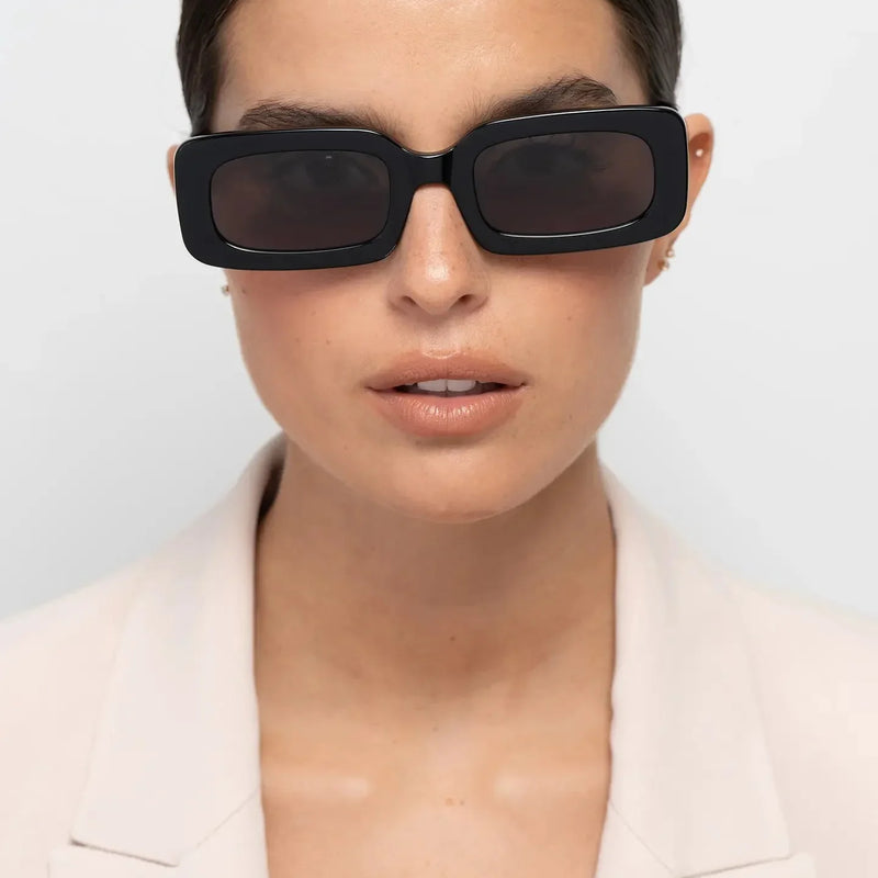
 Rectangular geometry creates horizontal definition, but tortoise prevents that structure from becoming one uninterrupted dark line across the face.
Why panto frames offer softer structure for women

Why should shape and colour be chosen together?
When do round frames work particularly well for women?
Round eyewear remains relevant in 2027, but the strongest versions are not necessarily small, delicate or traditionally retro.
More substantial acetate changes the character of the shape.
Instead of disappearing into the face, a thicker round frame creates a clearer boundary around the eyes while preserving the softness of curved geometry.
This can be particularly useful when the face contains stronger angles and the wearer wants contrast rather than repetition.
Round frames can also work on softer faces, but the result depends on the amount of definition created by the upper frame, colour and acetate thickness.
A substantial black round frame creates a very different effect from a translucent crystal version of similar dimensions.
The first creates a stronger outline.
The second retains the round geometry while allowing more of the face to remain visually present through the material.
This distinction matters because shape alone does not determine how strong a frame will look.
Material and colour can make the same geometry feel considerably more or less dominant.
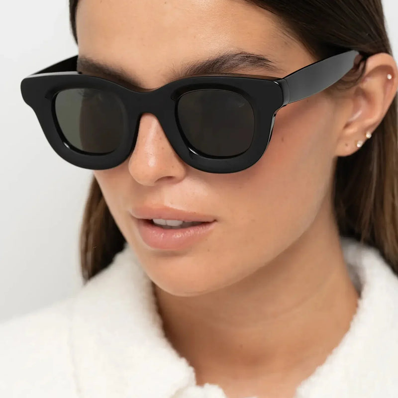
 A side view shows why substantial round eyewear does not need to feel visually dense. Crystal acetate keeps the material volume visible while transparency softens its relationship with the face.
Why does frame width matter more than simply going oversized?
Oversized eyewear is often discussed as though size itself creates the effect.
In reality, width is one of the most important variables.
A frame can have relatively deep lenses without extending excessively beyond the face.
Another can have less lens height but create a much broader horizontal effect.
These two frames may both be described as oversized while changing facial proportions in very different ways.
A wider frame can make the central face appear relatively narrower.
It can also add horizontal emphasis and create greater presence around the temples.
But more width is not automatically better.
If the frame extends too far beyond the face, the sunglasses can appear disconnected from the wearer's proportions and may also fit less securely.
The useful goal is therefore not maximum width.
It is intentional width.
The outer edges of the frame should create the amount of horizontal presence you want while still making sense in relation to the face.
For a deeper explanation of this relationship, how frame width changes facial proportions explains why even small differences in width can noticeably alter the face.
If you are unsure whether a frame has crossed from deliberately large into simply too large, use how to know if sunglasses are too big or too small.
A better way to think about oversized eyewear
Do not ask only whether the frame is large. Ask where the additional scale appears. More width changes horizontal balance; more lens height changes vertical presence; thicker acetate increases the visibility of the silhouette. These effects are not interchangeable.
Are oversized sunglasses still a women's trend for 2027?
Yes, but the direction is becoming more considered.
The useful version of oversized eyewear is less about covering as much of the face as possible and more about using scale intentionally.
A larger frame can create confidence and presence.
It can also provide more space for colour, pattern and acetate depth to become visible.
But oversized geometry becomes harder to balance when several strong elements are combined at once.
Very wide dimensions, very tall lenses, thick dark acetate and high lens contrast can produce significantly more visual weight together than any one of those features would create alone.
This is why some larger frames feel contemporary and controlled while others can quickly dominate the wearer.
The distinction is useful when comparing oversized vs standard sunglasses: the decision should be based on the visual and physical effect of scale, not on the assumption that one category is more fashionable.

How does eyebrow position change which women's eyewear looks right?
The relationship between the upper frame and eyebrows can strongly affect whether sunglasses appear integrated with the face.
This is especially important with substantial eyewear because the upper line becomes more visible.
A frame that sits too low may create an unnecessary visual gap between the eyebrows and eyewear.
A frame that rises too high can cover too much of the brow and change the expression of the upper face.
The goal is not to follow the eyebrow shape perfectly.
Different frame geometries will naturally create different relationships.
Instead, look for a position where the upper frame and brows feel visually connected rather than accidentally competing.
This can also explain why two frames with similar lens dimensions look very different on the same person.
One may sit in a more natural relationship with the brow line.
The other may create too much space or overlap.
For a dedicated explanation, how eyebrow position affects which sunglasses suit you explores this relationship in greater detail.
Why is the upper frame becoming more important in women's eyewear?
The upper frame sits close to the brows, which makes it one of the strongest lines in the complete silhouette.
A straighter upper line creates more horizontal structure.
A gently curved upper line can feel softer.
A slightly lifted outer corner can introduce directional energy.
This means two frames with similarly rounded lenses can still produce different effects if their upper lines are different.
For 2027, this creates a useful alternative to chasing entirely new shapes.
Small changes in the upper frame can modernise familiar geometries without making them difficult to wear.
A panto can feel more contemporary through a stronger brow line.
A rectangle can feel softer through less severe corners.
A round frame can gain more definition when the upper portion carries additional structure.
This is another reason to judge the complete frame rather than relying only on category labels such as round or rectangular.

Why is substantial acetate important in women's eyewear for 2027?
Substantial acetate gives designers another way to create presence without depending entirely on unusual shape.
Increasing material around the lenses makes the silhouette easier to read.
It can reveal more colour.
It can make tortoise pattern more visible.
With crystal acetate, thicker edges can make transparency and material depth easier to perceive.
This is why substantial acetate continues to work across rectangular, panto and round frames.
However, thickness should not be interpreted as a quality ranking.
A thicker frame is not automatically better.
The additional material needs to work with frame width, lens height, bridge position and colour.
Otherwise, visual weight can accumulate faster than intended.
This distinction is explored more closely in why thick acetate frames can look more expensive.
If the material itself is your main interest, why premium acetate looks different explains how depth, transparency and surface treatment change what the eye sees.
Why are transparent frames becoming more useful for women?
Transparent and crystal frames solve a practical design problem.
They allow a woman to wear a substantial silhouette without creating the same visual density as an opaque dark frame.
This happens because skin tone and light remain partly visible through the acetate.
The physical frame can therefore remain thick while its boundary with the face becomes softer.
This is particularly useful when the wearer likes the architecture of bold eyewear but finds solid black too dominant.
Crystal frames can also make colour behave differently.
A translucent peach, yellow or neutral crystal does not create the same continuous block of colour as opaque acetate.
The result changes with lighting, skin tone and the thickness of the material.
This gives transparent eyewear more visual complexity than simply calling it “clear”.
For the underlying principle, why transparent frames create softer facial balance explains how transparency changes the relationship between frame and face.

Are dark or light frames more relevant for women in 2027?
Both are relevant because they solve different visual problems.
Dark frames create clearer definition.
They make the outer boundary of the eyewear easier to see and can strengthen the area around the eyes.
Lighter and transparent frames allow more of the face to remain visually dominant.
They can therefore support substantial dimensions without creating the same degree of contrast.
This means the choice should begin with the effect you want rather than the idea that one colour family is more current.
Choose darker frames when you want the eyewear to define the face more strongly.
Choose lighter or transparent frames when you want visible geometry with a softer boundary.
The principle is explained directly in why dark frames create stronger facial definition and why transparent frames create softer facial balance.
Why is frame contrast one of the most important women's eyewear decisions?
Contrast determines how quickly the eye notices the sunglasses relative to the face.
High contrast makes the frame more immediate.
Lower contrast allows the silhouette to remain present while reducing its dominance.
This can be influenced by several things at once:
- how dark or light the frame is relative to the wearer;
- whether the acetate is opaque, patterned or transparent;
- how thick the frame is;
- how large the silhouette is;
- and how much contrast exists between the lenses and frame.
This is why the same black frame can look controlled at one scale and significantly stronger at another.
It is also why tortoise often behaves differently from black even when both are relatively dark.
Pattern interrupts the continuous boundary.
For the complete principle, how frame contrast changes your appearance explains how contrast affects facial definition and overall presence.
 Deeper colour offers a middle ground between neutral and bright eyewear. Burgundy can retain enough depth to define the frame while introducing more colour variation than black.
What does visual weight mean in women's eyewear?
Visual weight describes how dominant the sunglasses appear on the face.
It is different from physical weight.
A lightweight black frame can look visually strong.
A physically substantial crystal frame can appear visually softer.
This distinction is especially important in 2027 because thicker acetate and more visible geometry remain relevant.
Women who like substantial eyewear do not necessarily need to accept maximum visual density.
Colour and transparency can be used to regulate the effect.
A larger tortoise frame can feel softer than the same geometry in black.
A crystal frame can reduce contrast further.
A light opaque frame can retain a clearly visible silhouette while changing the type of contrast it creates.
Understanding visual weight makes trend adoption more precise because it separates how much frame exists from how strongly the frame is perceived.
For a focused explanation, why transparent eyewear feels less visually heavy explores this difference directly.
BBN insight
A bold frame does not need to be visually heavy. Size and acetate thickness determine how much frame is present; colour, pattern and transparency help determine how strongly that frame is perceived.
How should shape, width and colour work together?
The strongest eyewear choices usually resolve these three variables together.
| If you want | Shape direction | Width direction | Colour direction |
|---|---|---|---|
| More facial definition | Rectangular or more structured panto. | Enough width to create horizontal presence without disconnecting from the face. | Black or another deeper opaque tone. |
| Softer structure | Panto or softened rectangle. | Balanced rather than deliberately extreme. | Tortoise, olive or another muted tone. |
| Substantial eyewear without maximum contrast | Round, panto or rectangular. | Can be more generous if fit remains appropriate. | Crystal, translucent or lighter acetate. |
| More colour without novelty | A familiar geometry such as panto or rectangle. | Controlled width. | Burgundy, olive or another deeper muted colour. |
This is more useful than asking which single frame is “most fashionable”.
The trend should help create the visual result, not replace the decision.
What Part 2 tells us about women's eyewear in 2027
- Round frames can be substantial and contemporary rather than delicate or purely retro.
- Frame width and lens height create different kinds of scale and should not be treated as the same thing.
- Oversized eyewear remains relevant, but deliberate proportion matters more than maximum size.
- The relationship between the upper frame and eyebrows influences how integrated eyewear appears.
- The upper frame can modernise familiar shapes without requiring extreme geometry.
- Substantial acetate makes shape, colour and material depth easier to perceive.
- Thicker acetate is a design choice, not an automatic quality signal.
- Transparent frames allow substantial geometry to coexist with softer visual weight.
- Dark frames create stronger facial definition, while lighter and transparent frames reduce the density of the boundary.
- Contrast depends on colour, opacity, thickness and scale together.
- Physical weight and visual weight are different.
- Shape, width and colour should be resolved as one decision rather than three unrelated choices.
Next: the women's eyewear colours shaping 2027 — tortoise, black, olive, burgundy, crystal and lighter neutrals — plus lens colour, warm versus cool tones, wardrobe compatibility and which trends have the strongest chance of lasting beyond one season.
Which eyewear colours are shaping women's style in 2027?
Colour is becoming one of the most useful ways to make women's eyewear feel current without depending on an extreme silhouette.
The strongest directions for 2027 are not limited to one dominant trend colour.
Instead, several colour families solve different styling problems.
Black remains useful when the objective is stronger definition and a clear graphic outline.
Tortoise retains depth while breaking that outline into warmer tonal variation.
Olive introduces colour with relatively low saturation, making it easier to combine with an everyday wardrobe.
Burgundy creates a deeper colour statement that can remain more restrained than brighter red.
Crystal and translucent colours allow the material itself to become part of the effect, reducing visual density while keeping substantial acetate visible.
Cream and lighter neutrals move in the opposite direction from black by keeping the silhouette clear while changing the contrast around the eyes.
This variety is important because the best colour trend is not simply the shade receiving the most attention.
It is the colour that creates the right relationship between the frame, face and wardrobe.
For the broader colour forecast, sunglasses colour trends 2027 explores the main directions in greater depth.
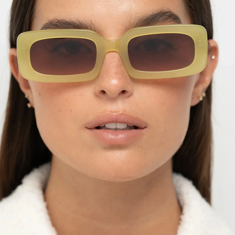
 Olive demonstrates why colour does not need high saturation to change a frame. The rectangular geometry remains clear, while the muted green creates a different relationship with the face than black.
Are black frames still relevant for women in 2027?
Yes.
Black eyewear does not need to disappear for a new trend cycle to begin.
Its value comes from contrast.
Opaque black makes the frame boundary easy to see, which can create stronger definition around the eyes and make the geometry more immediate.
This works particularly well when the wearer wants the sunglasses to act as a structural element rather than blend into the face.
But black also amplifies the silhouette.
A thick, wide black frame will usually appear more visually dominant than the same dimensions in translucent acetate.
This means black becomes most effective when the geometry itself is well judged.
There is less need to make the frame simultaneously very large, very thick and unusually complex.
For the underlying facial effect, why dark frames create stronger facial definition explains why darker outlines can make features appear more structured.
Why does tortoise remain important in women's eyewear?
Tortoise offers some of the definition associated with darker eyewear without creating one uninterrupted block of colour.
The pattern introduces variation through the acetate.
This can make substantial frames feel warmer and visually more layered.
It is particularly useful when black feels too severe but a transparent frame feels too light.
Tortoise also responds differently depending on the shape.
On a rectangular frame, the pattern can soften stronger horizontal geometry.
On a panto, it can reinforce the already softer relationship between curved lenses and the upper frame.
On a substantial round frame, it can create visible material depth without relying on bright colour.
This versatility helps explain why tortoise survives trend cycles so effectively.
For a direct decision between the two classic dark-frame directions, use black vs tortoise sunglasses.
 Tortoise sits between the graphic density of black and the lower visual weight of crystal acetate. Pattern preserves definition while breaking up the frame's continuous outline.
Why is olive becoming a useful alternative to traditional neutrals?
Olive works because it introduces colour without requiring the frame to behave like a bright accessory.
Its relatively muted character allows the geometry to remain the dominant design signal.
This makes olive particularly useful on substantial acetate frames.
A strong rectangular or panto silhouette already creates visual presence.
The colour does not need to compete with it.
Olive can also sit naturally alongside wardrobe colours such as cream, navy, brown, grey, denim and other earth tones.
This gives it a practical advantage over more saturated trend colours that may work beautifully with a smaller range of outfits.
For 2027, this type of muted colour is useful because it creates novelty through nuance rather than intensity.
The frame feels different from black or tortoise, but it does not necessarily require a completely different wardrobe around it.
Why is burgundy a strong women's eyewear colour for 2027?
Burgundy offers another route to controlled colour.
It is deeper than a bright red and therefore retains some of the visual authority associated with darker frames.
At the same time, the red undertone prevents it from behaving like a conventional neutral.
This makes burgundy particularly useful for women who want the eyewear to be recognisable but do not necessarily want a very bright frame.
The effect also changes with geometry.
On a panto, burgundy can provide the main point of expression while the silhouette remains familiar.
On a more angular frame, the combination would create stronger total visual impact because both shape and colour would become more directional.
This returns to one of the central 2027 principles:
When colour becomes more expressive, shape does not always need to become more extreme.
 Burgundy provides visible colour while retaining the depth of a darker frame. Pairing it with familiar panto geometry allows colour to carry most of the expression.
Why are crystal and translucent frames important for 2027?
Crystal acetate changes the relationship between material thickness and visual weight.
A frame can remain physically substantial while appearing softer because light and skin tone remain partly visible through the material.
This gives women another way to wear bold acetate.
Instead of reducing the frame dimensions, visual density can be reduced through transparency.
Crystal colour also behaves differently from opaque colour.
Peach, yellow and other translucent tones can appear more or less pronounced depending on lighting, material thickness and what sits behind the frame.
This gives the acetate a changing quality that a flat opaque colour does not reproduce in exactly the same way.
For women who like substantial frames but find black too visually dominant, crystal acetate can therefore be particularly useful.
For a deeper explanation, why transparent frames create softer facial balance explains the relationship between transparency and facial contrast.

What role do cream and lighter neutral frames play?
Lighter neutral frames offer a different alternative to dark eyewear.
Unlike transparent acetate, they can remain opaque while still reducing the dark boundary around the eyes.
This creates an interesting combination.
The geometry remains easy to see because the frame itself is visible, but the visual effect is different from black or deep tortoise.
On a rectangular silhouette, cream can preserve clear structure without producing the same severity as a dark frame.
This can be useful when the wearer wants directional geometry but softer colour contrast.
It also demonstrates why colour and shape should not be evaluated independently.
A strong shape can tolerate a quieter colour.
A quieter shape can tolerate stronger colour.
That balance is more useful than assuming every 2027 frame needs to maximise both.
Should you choose warm or cool-toned sunglasses?
Trend colour matters less if the shade consistently feels disconnected from the wearer.
Warm and cool tone analysis can therefore be useful as a starting point, but it should not become a rigid rule.
Warm tortoise, amber, brown and some olive or burgundy variations can create a more harmonious relationship with warmer colouring.
Cooler greys, some crystal shades, black and cooler colour variations can create a different relationship with cooler colouring.
But contrast preference matters too.
A woman may deliberately choose a colour that contrasts with her natural colouring because she wants the eyewear to become more visible.
The useful question is therefore not simply “Does this match my undertone?”
Ask:
Do I want the frame to harmonise with my colouring or deliberately contrast with it?
For a more complete decision framework, warm vs cool tone sunglasses explains how undertone and contrast can be considered together.
Colour should solve a styling problem
Black can add definition. Tortoise can soften a dark outline. Olive can introduce muted colour. Burgundy can create deeper expression. Crystal can reduce visual density. Cream can preserve structure while replacing dark contrast. Choose the effect before choosing the trend.
Which sunglass lens colours matter for women in 2027?
Lens colour changes more than the appearance of the lens itself.
It affects how the frame colour is perceived and how much contrast exists across the complete pair of sunglasses.
Grey lenses tend to keep the visual result relatively neutral.
Brown lenses can reinforce warmth, particularly with tortoise and earth-toned acetate.
Green lenses can introduce subtle colour while remaining relatively versatile.
Blue lenses can create a cooler and more noticeable contrast with warmer frame colours.
Gradient lenses add another variable because the upper and lower parts of the lens do not carry the same visual density.
This can soften the lower portion of substantial eyewear while retaining greater depth across the upper eye area.
For practical colour comparisons, see brown vs grey sunglasses, green vs brown sunglasses and gradient vs solid lenses.
Why do gradient lenses work particularly well with substantial women's frames?
Gradient lenses can reduce the sense that the entire lens area is one equally dark block.
This becomes useful when the frame itself already has significant visual presence.
The darker upper portion can retain definition around the eyes.
The lighter lower portion allows more facial information to remain visible.
The result can feel softer than a uniformly dark lens in the same frame.
This does not make gradient lenses inherently better.
Solid lenses can create a cleaner, more consistent graphic effect.
The choice depends on whether you want the lens to reinforce the frame's visual weight or moderate it.
This is why lens colour and density should be considered as part of the complete design rather than as an isolated technical specification.
 Gradient brown lenses reinforce the warmth of tortoise while reducing uniform darkness across the complete lens area. Frame and lens colour therefore work as one visual system.
How should women's eyewear work with a wardrobe in 2027?
The most useful eyewear trend is one you can actually wear.
This makes wardrobe compatibility a stronger buying signal than novelty alone.
If most of your clothing is neutral, eyewear can become the main colour accent.
Burgundy or olive may therefore introduce enough variation without requiring other strong accessories.
If your wardrobe already contains substantial colour and pattern, black, tortoise or a softer crystal frame may provide more flexibility.
If you regularly wear warm browns, cream and earth tones, tortoise and olive can create continuity.
If you wear more monochrome black, grey, white or navy, a deeper burgundy or crystal colour can create deliberate contrast.
The objective is not perfect matching.
It is repeatability.
A frame that works with several outfits has a better chance of remaining useful after the initial excitement of the trend has disappeared.
How does quiet luxury influence women's eyewear in 2027?
Quiet luxury in eyewear is less useful as a logo-free aesthetic label than as a design principle.
The frame needs to create interest through proportion, material and finishing rather than depending on highly visible branding.
This can make substantial acetate particularly effective.
Tortoise depth, crystal transparency, a controlled burgundy or a well-proportioned black silhouette can all create identity without requiring a large logo to explain the frame.
The same principle supports longer-term wear.
If the design remains convincing after branding is mentally removed, the wearer has more reason to value the frame itself.
For the complete idea, quiet luxury sunglasses without logos explores how material, proportion and restraint can create presence without overt branding.
 Distinctive eyewear does not need overt branding or maximum contrast. Proportion, acetate volume and an unusual but restrained colour can provide the identity.
Which women's eyewear trends are most likely to last beyond 2027?
No trend can be guaranteed to remain equally relevant.
But some directions have stronger long-term potential because they are built on adaptable design principles rather than one very specific novelty.
Well-proportioned rectangular frames have longevity because horizontal structure can be adjusted through width, lens height and corner treatment.
Panto shapes remain adaptable because they sit between curved and structured eyewear.
Tortoise has longevity because pattern provides an alternative to both solid dark and transparent frames.
Black remains useful because facial definition is a visual function rather than a seasonal colour story.
Muted colours such as olive and burgundy have stronger repeat-wear potential when they integrate naturally with a wardrobe.
Crystal acetate has practical longevity because transparency solves a recurring styling problem: how to wear substantial frames with less visual density.
By contrast, the more a frame depends on an extreme combination of size, colour and unusual geometry, the more likely its appeal may be tied to a specific moment.
This does not make experimental eyewear a bad choice.
It simply means the buyer should distinguish between a frame chosen for lasting versatility and a frame chosen deliberately for fashion impact.
How can you tell whether a 2027 eyewear trend will still suit you later?
Remove the year from the description.
Then ask what you actually like about the frame.
Is it the way the rectangle adds definition?
The way tortoise works with your colouring?
The way crystal acetate lets you wear a larger silhouette?
The way burgundy introduces colour without becoming too bright?
The way the width balances your facial proportions?
If you can describe the appeal without using the word “trend”, the frame has a stronger reason to remain useful after the trend cycle changes.
This is the same logic behind building a more durable eyewear wardrobe.
For the complete collection approach, how to build a timeless sunglasses collection explains how different pairs can serve distinct roles rather than duplicate one another.
BBN perspective
A trend becomes more useful when you can explain why it works for you without mentioning the year. Shape, colour, contrast and proportion are more durable reasons to choose eyewear than novelty alone.
Which 2027 frame colour should you choose?
| Colour direction | Main effect | Consider it if | Consider another direction if |
|---|---|---|---|
| Black | Strong definition and a clear graphic outline. | You want the eyewear to create visible facial structure. | Dark frames already feel too dominant on you. |
| Tortoise | Warmth, pattern and softer dark-frame definition. | You want material depth without one continuous dark outline. | You prefer cleaner solid-colour geometry. |
| Olive | Muted colour with relatively controlled contrast. | You want something less conventional than a neutral but still easy to repeat. | You want a brighter colour statement. |
| Burgundy | Deeper colour with noticeable but controlled expression. | You want colour to become the main personality of the frame. | You want the frame to behave almost like a neutral. |
| Crystal | Substantial geometry with lower visual density. | You like bold acetate but want more of the face to remain visible. | Strong definition is your main objective. |
| Cream or light neutral | Visible geometry without a dark outline. | You want structured eyewear with a lighter colour relationship. | You want the frame to recede through transparency rather than lighter colour. |
What Part 3 tells us about women's eyewear in 2027
- Colour is one of the easiest ways to make familiar eyewear geometry feel current.
- Black remains relevant because it creates strong facial definition rather than because it belongs to one season.
- Tortoise provides dark-frame presence with warmer tonal variation.
- Olive introduces colour without requiring high saturation.
- Burgundy offers a deeper alternative to bright red and can make colour the main expressive element.
- Crystal acetate allows substantial frames to retain softer visual weight.
- Cream and lighter neutrals preserve visible geometry while replacing dark contrast.
- Warm and cool tone guidance is useful, but harmony versus deliberate contrast is the more important decision.
- Lens colour changes the complete appearance of the frame rather than functioning as an isolated detail.
- Gradient lenses can soften visual density across substantial frames.
- Wardrobe compatibility is an important indicator of whether a trend will translate into repeat wear.
- Design-led eyewear does not need large logos to create identity.
- Rectangular, panto, tortoise, black, muted colour and crystal directions have stronger long-term potential when their underlying visual effect works for the wearer.
- A useful test for longevity is whether you can explain why you like the frame without mentioning that it is currently trending.
Next: the complete 2027 women's eyewear buying guide, face-shape and style decision framework, Bo Bo Noir frame examples, trend comparison table, frequently asked questions, final recommendations and related reading.
How should you choose women's eyewear for 2027?
The most reliable decision starts with the effect you want and ends with the trend.
Not the other way around.
A fashionable frame can still be the wrong width.
A beautiful colour can still create more contrast than you enjoy wearing.
A substantial acetate frame can still feel disproportionate if its lens height and outer width do not work with your face.
This is why the strongest 2027 choice combines three forms of compatibility:
- Facial compatibility: the frame width, lens height, bridge and upper line work with your proportions.
- Visual compatibility: shape, colour and contrast create an effect you actually like on your face.
- Lifestyle compatibility: the frame works with enough of your real wardrobe and routine to be worn frequently.
Trend relevance should confirm those decisions rather than replace them.
If facial proportions are still your main uncertainty, best sunglasses for women's face shape provides the broader starting point.

The seven-step women's eyewear test for 2027
1. Decide what you want the frame to do
Start with the visual result.
Do you want more facial definition?
Softer contours?
More colour?
Less contrast?
Or a more substantial silhouette?
This immediately narrows the options. Rectangles create stronger direction. Panto frames balance curves and structure. Crystal acetate lowers visual density. Dark frames increase definition.
2. Check width before style
A fashionable silhouette cannot compensate for incorrect frame width.
Too narrow and the frame can create pressure or make the face appear broader by comparison.
Too wide and the eyewear may feel visually disconnected or less stable.
For sizing guidance, use what size sunglasses should I choose?.
3. Evaluate how the bridge positions the frame
The bridge affects more than comfort.
It helps determine how high or low the frame sits, how the lenses relate to the eyes and how the upper frame interacts with the eyebrows.
If you want the full fit framework, how should sunglasses fit your face? explains what to check.
4. Judge the frame from more than one angle
Do not rely entirely on the front view.
A three-quarter or side view reveals acetate thickness, temple position and how far the frame projects from the face.
This becomes especially important with substantial eyewear.
5. Choose the amount of contrast you actually want
Black creates stronger definition.
Tortoise retains depth while breaking up the outline.
Olive and burgundy introduce colour.
Crystal reduces the density of the frame boundary.
Cream and lighter neutrals preserve visible geometry without creating the same dark contrast.
6. Compare the frame with your real wardrobe
Do not imagine an entirely different wardrobe around the sunglasses.
Look at the colours and proportions you already wear.
If you can quickly imagine the frame working with several existing outfits, it has stronger repeat-wear potential.
7. Remove the trend label
Imagine nobody had told you the frame was relevant for 2027.
Would you still choose the shape?
Would you still like the colour?
Would the proportions still work for you?
If the answer remains yes, the frame has a stronger chance of becoming personal style rather than a temporary purchase.
The shortest version
Choose the effect first, resolve width and fit second, choose colour and material third, and use the trend only to refine the direction. A frame has stronger long-term value when you would still want it without the 2027 label.
Which women's eyewear direction should you start with?
| Your priority | Start with | What it creates | Consider another direction if |
|---|---|---|---|
| More facial definition | Rectangular geometry in a darker or more opaque colour. | A stronger horizontal line and clearer boundary around the eyes. | Your features already feel strongly angular or dark frames feel severe. |
| Softer structure | Panto in tortoise or olive. | Curved lower geometry with enough upper-frame structure to remain defined. | You want a strongly angular or fully round silhouette. |
| Bold shape with softer visual weight | Substantial crystal round or panto eyewear. | Visible acetate volume with more of the face remaining visually open. | Your priority is maximum definition. |
| More colour without high saturation | Olive or burgundy. | A recognisable colour identity without depending on a bright frame. | Your wardrobe gives you few opportunities to repeat the colour. |
| Structured shape without dark contrast | Cream, light neutral or crystal acetate. | Clear geometry with a lighter relationship around the eyes. | You want the eyewear to create a dark graphic outline. |

Which Bo Bo Noir frames illustrate the main women's eyewear directions?
The following frames are examples of the principles already explained.
They are not ranked as universal winners.
The useful question is what each frame creates — and whether that is the effect you want.
Jane Olive Green — rectangular definition with softer colour contrast
Jane Olive Green uses rectangular geometry to create horizontal structure while olive reduces some of the starkness that the same silhouette could produce in black.
Creates: stronger facial definition with a muted colour direction.
Best considered for: women who like rectangular eyewear but want colour to soften the graphic effect.
Consider another direction if: you prefer curved lower geometry or want the lowest possible contrast.
Visual effect: structured, directional and recognisable without relying on a bright colour.
Triboulet Olive — softer panto structure with everyday colour
Triboulet Olive combines curved lower geometry with a more structured upper frame.
Olive introduces personality while remaining relatively easy to combine with black, navy, denim, cream, stone and brown.
Creates: softer structure with controlled earth-toned colour.
Best considered for: women who want a more curved silhouette without losing definition around the eyes.
Consider another direction if: you want a strongly rectangular frame or much higher contrast.
Visual effect: balanced, warm and less severe than a dark opaque rectangle.

Narr Burgundy — deeper colour with familiar panto geometry
Narr Burgundy lets colour carry much of the expression while keeping the underlying geometry relatively familiar.
Creates: deeper colour identity with balanced curvature.
Best considered for: women who want more colour than black or tortoise without moving towards a highly saturated bright frame.
Consider another direction if: maximum neutrality or very low contrast is your priority.
Visual effect: expressive but controlled, especially beside navy, charcoal, cream, brown and camel.
William Crystal Peach — substantial round geometry with softer contrast
William Crystal Peach demonstrates how transparency can separate frame thickness from visual heaviness.
The round silhouette remains obvious, but the crystal acetate allows light and skin tone to remain partly visible through the material.
Creates: bold round geometry with lower visual density.
Best considered for: women who like substantial acetate but find dark frames too dominant.
Consider another direction if: you want stronger horizontal structure or a clearly dark frame boundary.
Visual effect: expressive scale with a softer relationship to the face.
For the principle behind the effect, read why transparent eyewear feels less visually heavy.

How do the main Bo Bo Noir women's frame directions compare?
| Frame | Main effect | Best considered for | Main trade-off |
|---|---|---|---|
| Jane Olive Green | Horizontal definition with muted colour. | Women who want rectangular structure without choosing black. | More directional than a panto or round frame. |
| Triboulet Olive | Balanced panto geometry with earth-toned colour. | Women who want softer structure with everyday versatility. | Less graphic than a dark rectangular frame. |
| Narr Burgundy | Balanced panto geometry with deeper colour identity. | Women who want colour to become part of their signature. | Less neutral than tortoise or olive. |
| William Crystal Peach | Substantial round geometry with reduced visual density. | Women who want expressive scale without maximum contrast. | Provides less horizontal definition than a rectangle. |
The purpose of the comparison is not to identify one “best” women's frame.
It is to match the frame's visual consequence with the result you actually want.
BBN insight
The strongest product recommendation is not “this is the best frame”. It is “this frame creates this effect — and that effect may or may not be right for the way you want your face and wardrobe to look.”
What should you check before buying women's eyewear online?
Online shopping removes the ability to wear the frame before deciding, which makes product information and photography more important.
Before buying, compare:
- Total frame width: compare it with sunglasses you already know fit well.
- Lens height: decide whether you want more or less vertical presence.
- Bridge: consider how high or low the frame is likely to sit.
- Front photography: use it to judge geometry and proportions.
- Side photography: use it to judge acetate thickness, temple direction and construction.
- Worn photography: use it to understand visual presence, not as a promise that the frame will look identical on another face.
- Transparency: remember that crystal acetate can change considerably with light and skin tone.
- Existing wardrobe: choose colours you can realistically repeat rather than colours that work only with one imagined outfit.
If you are uncertain about physical scale, how to know if sunglasses are too big or too small helps diagnose common sizing mistakes.
If the main question is construction rather than style, how to tell if glasses are high quality explains what to inspect in materials, alignment, finishing and hinges.

Frequently asked questions
What are the main women's eyewear trends for 2027?
The main directions include more substantial acetate, broader rectangular frames, balanced panto and round silhouettes, tortoise, olive, burgundy, crystal and lighter neutral finishes, with greater attention to width, brow line and visual weight.
Are oversized sunglasses still in style for women in 2027?
Yes, but scale is becoming more controlled. The strongest oversized frames use width, lens height and acetate thickness deliberately rather than simply maximising every dimension.
Are rectangular sunglasses fashionable for women in 2027?
Yes. Rectangular frames remain important because they create horizontal definition. More wearable versions can use slightly deeper lenses, softer corners or quieter colours rather than relying on extreme narrowness.
Are round glasses still fashionable for women?
Yes. Round frames remain relevant, particularly when substantial acetate gives them stronger visual presence or crystal finishes reduce the density of the outline.
What are panto sunglasses?
Panto frames generally combine a curved lower lens with greater structure through the upper frame, placing them between fully round and more angular eyewear.
Are panto sunglasses flattering for women?
They can be particularly useful when you want softer lower geometry without losing definition around the brow. Width, lens height and colour still need to work with the individual face.
What frame colour is trending for women in 2027?
There is no single dominant colour. Black, tortoise, olive, burgundy, crystal and lighter neutral directions all matter because they create different levels of contrast and visual weight.
Are black sunglasses still fashionable for women?
Yes. Black remains useful because it creates strong facial definition and makes frame geometry particularly clear.
Are tortoise sunglasses still in style?
Yes. Tortoise remains useful because it provides dark-frame depth while pattern breaks up the continuous outline created by solid black.
Is olive a versatile eyewear colour?
It can be. Olive works particularly well with wardrobes containing black, navy, denim, brown, cream, stone and other muted colours.
Are burgundy frames easy to wear?
They can be when your wardrobe already contains navy, charcoal, brown, cream, camel or other colours that work with deeper warm tones. Burgundy is more expressive than a conventional neutral but less intense than a bright red.
Are transparent frames still fashionable in 2027?
Yes. Crystal and translucent acetate remain relevant because they allow substantial frame geometry to create presence with less visual density than opaque dark acetate.
Are cream or light frames flattering?
They can be when you want visible frame geometry without a dark outline. Their effect depends on contrast with the wearer, frame thickness and the shape itself.
Should sunglasses match your skin undertone?
Undertone can be a useful guide, but it should not become a rigid rule. Decide whether you want the frame to harmonise with your colouring or deliberately create contrast.
For a deeper comparison, read warm vs cool tone sunglasses.
Should women choose sunglasses according to face shape?
Face shape can provide a useful starting point, but width, lens height, brow position, visual weight and colour contrast often provide more precise guidance.
How should women's sunglasses fit?
The frame should feel stable without excessive pressure, sit at a useful height on the bridge and maintain an appropriate relationship with the temples and eyebrows.
For the complete fit guide, see how should sunglasses fit your face?.
Can bold sunglasses look elegant rather than overpowering?
Yes. Bold eyewear becomes easier to balance when only one or two variables carry most of the visual strength. A substantial shape can use softer colour, while an expressive colour can use familiar geometry.
See bold sunglasses without looking overpowering for the complete framework.
Do women's sunglasses need large logos to look premium?
No. Proportion, material, finishing, colour and a coherent design language can create identity without relying on prominent branding.
This is explored further in quiet luxury sunglasses without logos.
Which 2027 eyewear trends are most likely to last?
Directions based on repeatable visual functions have stronger long-term potential: well-proportioned rectangles, panto shapes, black, tortoise, muted colour and crystal acetate all solve enduring questions of definition, balance and contrast.
How can I avoid buying sunglasses that look dated quickly?
Choose the frame for a reason that survives the trend label. If you genuinely prefer its proportions, colour, contrast and relationship with your wardrobe, it has a stronger chance of remaining useful.
Which Bo Bo Noir frame creates stronger rectangular definition?
Jane Olive Green uses a rectangular silhouette to create stronger horizontal structure while olive provides a softer colour direction than black.
Which Bo Bo Noir frame offers softer panto structure?
Triboulet Olive combines curved lower geometry, upper-frame structure and muted earth-toned colour.
Which Bo Bo Noir frame works for women who want a lower-contrast bold shape?
William Crystal Peach combines substantial round geometry with translucent acetate, reducing visual density without removing frame presence.
The women's eyewear 2027 checklist
- The frame creates a visual effect you actually want rather than simply following a trend.
- The total width works with your facial proportions.
- The lens height creates the right amount of vertical presence.
- The bridge positions the frame at a useful height.
- The upper frame works intentionally with your eyebrows.
- The shape creates the amount of structure or softness you prefer.
- The colour produces a level of contrast you enjoy repeating.
- The frame works with clothing you already own.
- The material remains convincing from several angles.
- The design still appeals when you mentally remove the trend label.
- The product has a clear role rather than duplicating another pair you already own.
- You can imagine choosing it on an ordinary day, not only for a particular look.
The more of these conditions a frame satisfies, the stronger its chance of moving from a 2027 trend into lasting personal style.
What should women take from the eyewear trends of 2027?
The strongest women's eyewear trends for 2027 are not defined by one universal frame.
They are defined by greater control.
Rectangular frames can create stronger horizontal definition.
Panto frames can introduce softness without removing structure.
Round frames can become more substantial without feeling delicate.
Black can create stronger contrast.
Tortoise can soften a dark outline through pattern.
Olive and burgundy can introduce controlled colour.
Crystal acetate can allow bold geometry to feel visually lighter.
Cream and lighter neutrals can preserve structure without relying on dark contrast.
The important decision is not which trend looks newest.
It is which direction creates a relationship between frame, face and wardrobe that you want to repeat.
The best women's eyewear trend for 2027 is the one that still makes sense when nobody is calling it a trend.
When the shape, width, colour and visual weight remain convincing after novelty disappears, the frame has moved beyond fashion forecasting.
It has become part of your style.
Final BBN perspective
Use trends to expand the number of options you understand, not to outsource your choice. The strongest frame is the one whose effect on your face and wardrobe remains useful after the trend cycle moves forward.
Explore eyewear through shape, colour and visual balance
Compare Bo Bo Noir sunglasses after deciding which geometry, contrast and level of visual presence work best for you.
Continue reading
- Eyewear Trends 2027: The Complete Guide
- Sunglasses Colour Trends 2027
- Sunglasses Trends Women 2026: What Actually Works
- Best Sunglasses for Women's Face Shape
- Best Rectangular Sunglasses for Women
- How Frame Shape Changes Facial Balance
- Warm vs Cool Tone Sunglasses
- Black vs Tortoise Sunglasses
- Bold Sunglasses Without Looking Overpowering
- Quiet Luxury Sunglasses Without Logos