Free Worldwide Shipping • 14-Day Returns • Designed in PortugalFree Worldwide Shipping • 14-Day Returns • Designed in PortugalFree Worldwide Shipping • 14-Day Returns • Designed in PortugalFree Worldwide Shipping • 14-Day Returns • Designed in PortugalFree Worldwide Shipping • 14-Day Returns • Designed in PortugalFree Worldwide Shipping • 14-Day Returns • Designed in PortugalFree Worldwide Shipping • 14-Day Returns • Designed in PortugalFree Worldwide Shipping • 14-Day Returns • Designed in PortugalFree Worldwide Shipping • 14-Day Returns • Designed in PortugalFree Worldwide Shipping • 14-Day Returns • Designed in PortugalFree Worldwide Shipping • 14-Day Returns • Designed in PortugalFree Worldwide Shipping • 14-Day Returns • Designed in PortugalFree Worldwide Shipping • 14-Day Returns • Designed in PortugalFree Worldwide Shipping • 14-Day Returns • Designed in PortugalFree Worldwide Shipping • 14-Day Returns • Designed in Portugal
Some sunglasses are immediately recognisable because of a logo. Others are recognisable before you know who made them. Their proportions feel intentional, the material belongs to the shape, the colour changes the character of the frame rather than merely decorating it, and different models seem to share a visual logic without looking identical.
That distinction is central to understanding what makes a sunglasses brand feel design-led. The term is frequently used in fashion and eyewear, but it becomes meaningless if it simply means stylish, independent, expensive or unconventional. A genuinely design-led brand needs something more difficult to build: a coherent way of making decisions.
This matters when buying sunglasses because branding can make very different products appear equivalent. Two frames can use acetate, dark lenses and similar rectangular geometry while communicating very different levels of design intention. The useful question is therefore not simply whether a frame looks good. It is why it looks the way it does — and whether the brand can answer that question consistently across a collection.
Design becomes easier to recognise when shape, material and colour appear to solve the same visual problem. No single feature needs to carry the identity alone.
Quick Answer
A design-led sunglasses brand builds its identity through a consistent system of design decisions rather than relying primarily on logos, trend recognition or isolated statement frames. Look for recurring logic in silhouette, proportion, material, colour, construction and detail across different models. The frames do not need to look alike, but they should feel related. The strongest test is whether you can understand why a frame looks the way it does — and whether that same design thinking remains visible elsewhere in the collection.
BBN Insight
A well-designed frame and a design-led brand are not the same thing. A company can produce one excellent pair of sunglasses without possessing a coherent design language. A design-led brand has the harder task: it must repeat principles without merely repeating products. Different frames should solve different wearing problems while still revealing a recognisable way of thinking.
1. What does “design-led” actually mean in eyewear?
A design-led eyewear brand begins with a design intention and uses the product to express it. That sounds simple, but it creates an important distinction. The objective is not merely to produce an attractive frame and then construct a story around it. Shape, proportion, material, colour and construction should emerge as connected decisions.
Imagine two substantial acetate rectangles. One may use thickness because thick frames are currently desirable. The other may use additional material to strengthen the brow, create depth around the lens, control the outer corners and establish a particular relationship with the face. Visually, both could be described as “bold acetate sunglasses.” From a design perspective, however, the second gives the material a clearer job.
This is why design-led should not be treated as an aesthetic category. A frame does not need to be minimalist, architectural or unusual to qualify. Classic round sunglasses can be design-led. So can an aviator, a panto or a rectangle. What matters is whether the decisions within the frame are coherent enough to explain the result.
What design-led does mean
What it does not automatically mean
A coherent relationship between design decisions.
Expensive.
Recognisable principles across different frames.
Independent.
Material and construction supporting the intended form.
Handmade.
A clear point of view about proportion, identity and use.
European.
Design identity that remains legible without prominent branding.
Experimental or unconventional.
Different products that feel related without becoming copies.
Following one recognisable trend across an entire collection.
The distinction also protects buyers from several shortcuts. A high price can reflect many legitimate costs, but price cannot prove design coherence. Handmade production can describe how something is manufactured, but it does not establish whether the underlying proportions are good. Independence describes ownership, not design quality. European origin describes geography, not creative intention.
A design-led brand therefore earns the description through the relationship between decisions. Once you begin looking for those relationships, the term becomes something you can evaluate rather than something you have to accept from marketing copy.
BBN Insight: design is a system, not a feature
A distinctive hinge does not make a brand design-led. Neither does thick acetate, an unusual lens shape or a fashionable colour. The stronger evidence appears when several decisions reinforce one another and the same logic remains recognisable in other products. Individual features attract attention; systems create identity.
2. What is the difference between design-led and fashionable eyewear?
Fashionable eyewear and design-led eyewear are not opposites. A well-designed frame can be highly fashionable, and a design-led brand can respond intelligently to contemporary culture. The difference lies in what is driving the decisions.
Trend-led design often begins with a recognisable market signal: narrow rectangles are gaining attention, transparent acetate is becoming more visible, oversized forms are returning, or a particular colour is appearing across fashion. A brand can respond quickly by adopting those signals. That may produce attractive and commercially successful sunglasses, but trend recognition alone does not create a distinctive design language.
A design-led approach asks another question: how should this idea be interpreted through our own way of designing? A rectangle may become wider or shallower. The brow may gain more weight while the lower rim becomes quieter. Transparent acetate may be chosen because it reduces perceived visual weight rather than because transparency is currently fashionable.
This distinction becomes particularly important when trends spread quickly. Once dozens of brands offer similar silhouettes, novelty loses its ability to distinguish them. What remains is proportion, material treatment, colour judgement, construction and the relationship between the frame and the wearer.
Trend-led question: “Does this frame look current?”
Design-led question: “What has the designer done with this shape that makes it worth choosing?”
A strong pair of sunglasses can answer yes to both. The second question simply gives you more information about what may remain interesting after the first answer changes.
3. Why is silhouette only the beginning?
Silhouette is one of the fastest ways to read eyewear. Before you notice hinge construction or acetate depth, you usually perceive the overall contour: rectangular, rounded, panto, cat-eye, aviator, oversized, narrow or something between established categories.
That makes silhouette important, but not sufficient. Saying that a brand makes “bold rectangular sunglasses” tells you approximately as much as saying a furniture designer makes rectangular tables. The category establishes a starting geometry; design begins in what happens inside and around that geometry.
Consider a rectangle. Lens depth determines whether it feels narrow or substantial. Outer corners can be sharp, softened or lifted. The brow can be straight or subtly curved. The bridge can visually connect both lenses or create separation. Frame width changes the relationship with the temples and cheekbones. Acetate thickness determines how strongly the perimeter is perceived.
These changes are individually small compared with switching from a rectangle to a round frame, yet they can produce dramatically different facial effects. This is why good eyewear design cannot be evaluated through shape labels alone.
A rectangle is only the category. Its identity comes from decisions such as lens depth, brow weight, outer-corner treatment, frame width and the amount of contrast created against the face.
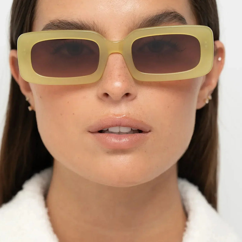
The Jane Shiny Black makes this visible. Its rectangular identity is immediate, but the wearing effect comes from more than straight lines. The substantial dark perimeter increases facial definition, while the controlled lens depth prevents the frame from becoming simply oversized. The geometry gives the face structure rather than treating “bold” as an instruction to maximise every dimension.
This also explains why apparently similar sunglasses can feel very different when worn. Product categories are broad. Faces are not. Small proportional changes determine whether the frame feels severe, balanced, soft, lifted, heavy or precise.
If you are comparing frames online, this is one reason to look beyond the product name and inspect worn photography carefully. Our guide to choosing sunglasses online without trying them on explains how to read those visual cues before buying.
BBN Insight: shape names describe categories; proportions create character
Two brands can both make rectangular, round or panto sunglasses without producing the same design. The more useful signature often lives in the relationships inside the shape — width to height, brow to lower rim, bridge to lenses, material volume to facial scale. Those relationships are where familiar geometry becomes a specific design.
4. How does proportion reveal design intention?
If silhouette tells you what family a frame belongs to, proportion tells you much more about its personality. It determines how the different parts of the frame relate to one another and, once worn, how the object relates to the face.
This is one of the clearest places to look for design intention because proportion rarely announces itself as loudly as colour or thickness. You notice its consequences instead. A frame feels balanced. The brow sits convincingly. A substantial front has enough lens area to avoid looking congested. A round shape feels architectural rather than delicate. A wide frame still appears controlled.
Good proportion is not a universal mathematical formula. The same relationship will not suit every design objective or every face. A deliberately oversized frame requires different internal balance from a compact panto. What matters is whether the relationships support the intended visual effect.
This is why proportion can also reveal weak design. A frame may contain expensive acetate and technically impressive finishing yet still feel unresolved if the bridge is visually too narrow for the lenses, the lower rim carries unnecessary weight or the outer width overwhelms the internal geometry.
Four proportional relationships worth checking
Lens width vs lens depth: influences whether a frame reads as narrow, balanced or vertically dominant.
Brow weight vs lower rim: affects whether visual emphasis sits higher on the face or surrounds the lens more evenly.
Bridge vs lens geometry: determines whether the two lenses feel connected, separated or visually compressed.
Overall width vs material volume: influences whether a substantial frame feels confident or simply oversized.
Proportion also explains why copying the most obvious feature of a successful frame rarely reproduces its quality. Increasing acetate thickness or widening a lens shape can imitate the headline characteristic while losing the relationships that made the original design coherent.
For the buyer, that produces a practical rule: do not ask only whether you like the shape; ask what the proportions are doing to that shape. It is one of the fastest ways to move from recognising a trend to evaluating design.
5. When does material become part of the design?
Material becomes meaningful when it helps explain why a frame has the shape, weight, colour and visual presence that it does. Simply stating that sunglasses use acetate or metal tells you very little about the quality of the design. The more useful question is what the designer is asking that material to do.
Acetate can support substantial rims, sculpted surfaces, transparent colour, tortoise pattern and strong edge definition. Metal can enable thinner profiles, lighter visual weight and different structural relationships between lenses, bridge and temples. Neither material has a monopoly on good design. Each creates different possibilities and different constraints.
This distinction matters because material language is frequently used as shorthand for premium quality. A frame can use high-quality acetate and still have unconvincing proportions. Conversely, a visually simple frame can use material with great intelligence if thickness, surface, colour and geometry have been carefully coordinated.
In substantial acetate eyewear, for example, additional volume increases the visibility of almost every design decision. The brow becomes stronger. Corners become more noticeable. Colour occupies more facial area. The relationship between lens opening and surrounding material becomes harder to ignore. More material creates more opportunity for expression, but also more responsibility to control it.
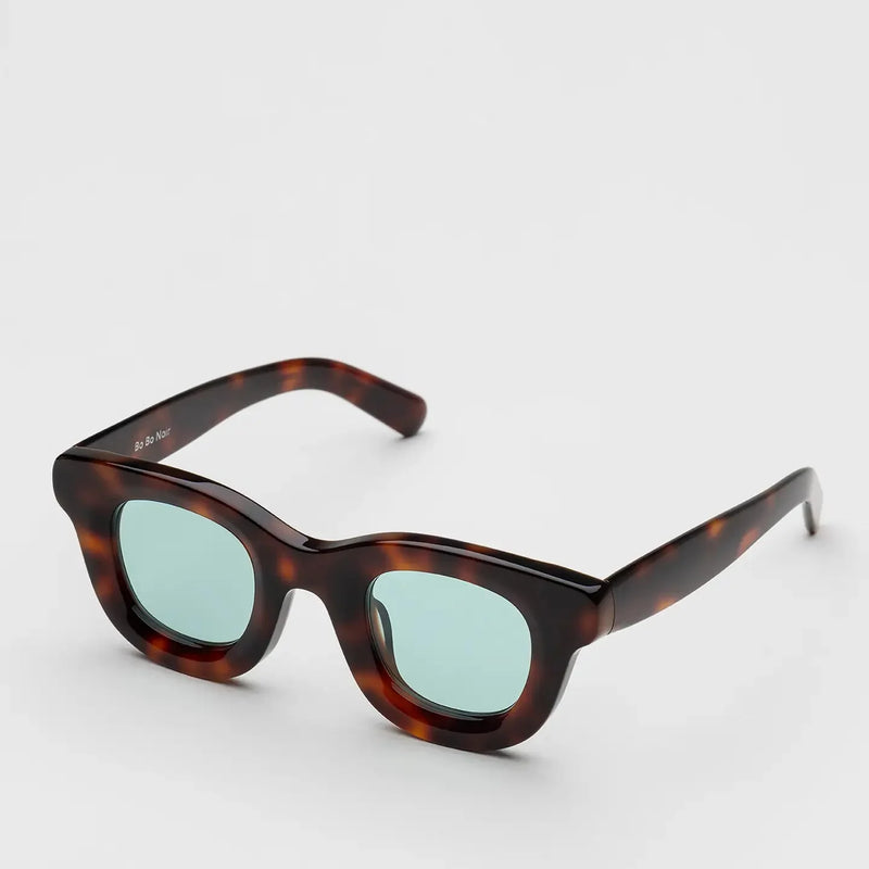
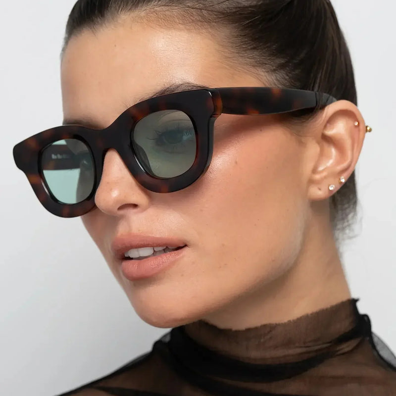
In a substantial acetate frame, material is not merely specified; it becomes part of the geometry. Tortoise pattern, rim volume and rounded lens openings work together to determine how strongly the frame is perceived.
William Tortoise demonstrates the principle through a different geometry from the rectangular Jane shown earlier. The round form changes how the same broad idea of substantial acetate is perceived. Pattern interrupts the visual continuity of the material, while the rounded lens openings soften some of the structural force created by the frame volume.
This is also where a design-led collection begins to reveal itself. Consistency does not require using the same silhouette repeatedly. A rectangle and a round frame can belong to the same design language when they share an attitude toward material presence, proportion, clarity and identity.
When comparing apparently premium frames, examine what the material contributes beyond its name. Our guide to what makes some sunglasses feel premium explores how material, construction and visual resolution work together.
BBN Insight: premium material cannot rescue unresolved design
Material quality matters, but it operates inside a design rather than above it. Better acetate gives a designer possibilities; it does not decide how intelligently those possibilities are used. The finished frame still needs proportion, geometry, colour and construction to turn material potential into a convincing object.
6. Why is colour a structural design decision?
Colour is often treated as the final stage of eyewear design: create the shape first, then offer it in black, tortoise, green or transparent acetate. On the face, however, colour can change the perception of the shape so significantly that treating it as decoration misses part of its design function.
The reason is contrast. A glossy black frame usually creates a clearly visible perimeter against the skin. Transparent or lightly tinted acetate allows more facial information to remain visible through or around the frame. Tortoise interrupts a continuous surface with variation. Olive, burgundy and other muted colours can create noticeable material presence without producing the same contrast as opaque black.
The physical dimensions may remain identical, yet the frame can appear heavier, softer, warmer, sharper or more integrated with the face. This means colour changes perceived visual weight even when it does not change actual frame weight.
A design-led approach therefore considers colour in relation to geometry. If a silhouette already has considerable material volume, a translucent colour can moderate its effect. If a familiar shape needs greater definition, black can make the perimeter more assertive. Patterned acetate can add complexity while breaking up a large continuous area.
The geometry can remain substantial while transparency changes its visual intensity. Crystal acetate allows more light and facial information through the frame, reducing the perceived weight of the silhouette.
Comparing William Crystal Peach with William Tortoise makes this particularly clear because the underlying frame language remains closely related. The important variable is no longer simply round versus rectangular. Colour and transparency alter how strongly the material announces itself.
This is useful when buying bold sunglasses. If you like a substantial silhouette but find opaque black too dominant, changing colour may solve the problem without requiring a thinner or smaller frame. Conversely, if a transparent frame feels visually weak on you, increasing contrast can give the same broad geometry more definition.
BBN Insight: colour can tune a silhouette without redesigning it
One of the most useful ways to understand eyewear colour is as an intensity control. Geometry establishes the physical shape; colour helps determine how forcefully that shape is perceived. This is why choosing another colourway can sometimes solve a facial-balance problem more effectively than abandoning the silhouette altogether.
7. What does construction reveal about a design-led frame?
A frame is not only a drawing viewed from the front. It is a physical object that has to hold lenses, connect to temples, open and close, sit on the bridge and maintain its intended geometry through repeated use. Design therefore has to survive the transition from visual idea to wearable object.
This is where construction becomes part of design rather than a separate technical subject. Bridge shape affects both appearance and how the frame meets the nose. Temple placement influences the side profile and how the front sits relative to the face. Hinge position can affect visual continuity as well as movement. Material thickness has implications for both silhouette and structure.
A design-led brand does not necessarily make these technical elements visually prominent. In some frames, engineering is deliberately visible. In others, construction is quieter because the intended effect depends on a clean silhouette. The important point is that construction should support the design intention rather than fight against it.
This also explains why an impressive sketch is not enough. A frame can look compelling as a two-dimensional concept and become less convincing when physical requirements are introduced. The bridge may need refinement, temples may alter the perceived balance, or excessive material may create unnecessary bulk. Design continues while these problems are being resolved.
Four questions that connect construction to design
Does the bridge belong to the geometry? It should look integrated with the lens shapes rather than inserted as an afterthought.
Do the temples continue the visual logic? A convincing front can lose coherence if the side profile appears unrelated.
Is material volume doing useful work? Thickness should support structure, surface or silhouette rather than existing only to signal boldness.
Does the physical object preserve the original intention? A strong concept should remain convincing when viewed from the front, side and three-quarter angles.
For consumers, many engineering decisions remain invisible, and they do not need to become manufacturing experts. The useful lesson is simpler: good eyewear design should continue making sense when you stop looking at the front view.
This is one reason online product photography matters so much. A brand that provides clear front, side, angle and worn views makes it easier to judge whether the frame works as a complete object rather than as a single flattering image.
BBN Insight: manufacturability is part of design maturity
A design idea becomes more convincing when it survives contact with physical requirements. The goal is not simply to preserve a sketch at all costs, but to resolve structure, wearability and production without losing the original visual intention. That transition from concept to coherent object is one of the less visible signs of mature product design.
8. How can you recognise design consistency across a collection?
This is where evaluating a brand becomes more revealing than evaluating a single pair of sunglasses. One successful frame can result from a strong individual idea. A design-led brand needs to demonstrate that its thinking can extend across different shapes, colours, proportions and wearing needs.
The mistake is to look for repetition. Consistency does not mean every frame should share the same brow, lens shape or acetate thickness. If a collection contains ten minor variations of one successful rectangle, it may have a recognisable look without demonstrating much design range.
A stronger collection repeats relationships and principles. Perhaps the frames consistently give material enough presence to shape the face. Perhaps classic geometries are simplified rather than decorated. Perhaps colour is used to control intensity. Perhaps proportions remain assertive but disciplined. Those principles can survive even when one model is rectangular and another is round or panto.
Collection consistency does not require identical shapes. A panto frame can share design logic with rectangular and round models through material presence, controlled proportion, clear geometry and deliberate colour.
This gives buyers a useful way to evaluate a brand website. Do not look only at the frame you intend to purchase. Open several models that you would never personally wear. Ask whether you can still identify a common design attitude. If the answer is yes, the brand may have built something deeper than a collection of individually fashionable products.
Then ask a second question: are the differences meaningful? A good collection should provide alternatives for different faces and visual preferences rather than forcing everyone into one signature shape. Recognition and variety need to coexist.
This is the beginning of what we can call the collection test: can a brand change the product without losing the principles that make its design recognisable? If it can, design identity is operating at system level rather than only at product level.
BBN Insight: consistency means repeating principles, not products
A recognisable collection should contain enough continuity to feel authored and enough variation to remain useful. When every frame looks identical, identity becomes repetition. When every frame looks unrelated, identity disappears. Design-led brands operate in the more difficult space between those two extremes.
9. What is the difference between originality and novelty?
Originality is one of the hardest qualities to judge in eyewear because the product works within a relatively constrained vocabulary. Most sunglasses still need two lenses, a bridge, temples and a structure that can be worn comfortably on the face. Rectangles, rounds, pantos, cat-eyes and aviators also carry decades of design history.
The result is an important distinction: original eyewear does not have to invent a shape that has never existed before. In fact, chasing visual difference at any cost can produce novelty rather than meaningful originality.
Novelty asks, “How can this look different?” Design asks a more demanding question: “What can we change that makes the object more specific, coherent or expressive?” The answer may involve only a few millimetres of additional lens depth, a different relationship between bridge and brow, a more controlled corner, an unexpected acetate colour or a reinterpretation of familiar geometry.
This matters because extreme features are easy to notice and therefore easy to mistake for creativity. An exaggerated temple, unusual cut-out or radically distorted lens shape may be original, but difference alone does not tell you whether the decision improves the frame. Visual surprise is evidence of novelty; it is not automatically evidence of design quality.
The opposite mistake is assuming that familiar forms cannot be original. Much of good product design operates through reinterpretation. The designer inherits an established type, understands what makes it recognisable, then changes proportion, material, surface or detail without destroying its usefulness.
For buyers, this creates a better standard than asking whether you have seen something similar before. Ask instead: does this frame have a sufficiently specific point of view that its differences feel intentional rather than arbitrary?
BBN Insight: originality can come from editing
Adding an unusual feature is only one way to create distinction. Removing unnecessary detail, changing a familiar proportion or giving more emphasis to one part of a classic form can be equally original. In mature design, knowing what not to change can be as important as knowing what to change.
10. How can good eyewear design survive trend cycles?
Designing beyond trends does not mean ignoring contemporary culture. Sunglasses inevitably belong to a moment: proportions shift, colours gain relevance, archive shapes return and the way people style eyewear changes. The more useful distinction is whether a frame depends on the trend for its entire reason to exist.
A frame built almost entirely around novelty may feel strongest at the moment when its defining feature is culturally new. Once that feature becomes common, there may be little left to sustain interest. A more resolved design has additional layers: convincing proportion, a useful relationship with the face, material that suits the geometry and enough character to remain identifiable after the initial surprise has faded.
This is why timeless should not be confused with neutral. Black rectangles, tortoise pantos and classic aviators can age badly when their proportions are too closely tied to a particular moment. Conversely, a bold burgundy frame or substantial round silhouette can remain compelling if its design logic is strong enough.
The practical goal is therefore not to find sunglasses that look as though they belong to no era. It is to find frames whose design value is not exhausted by the era in which you bought them.
One way to test this is to mentally remove the styling around the product. Ignore the campaign, clothing, seasonal colour story and current trend vocabulary. Look at the frame alone. Does the proportion still feel considered? Does the silhouette still have character? Does the material still make sense?
Imagine the frame without the campaign image, celebrity association, seasonal styling or trend label.
If the object itself still gives you reasons to choose it, the design has something to stand on after the trend moves on.
11. How can you recognise a design-led sunglasses brand before buying?
You do not need professional design training to evaluate whether a sunglasses brand appears design-led. You need to replace a few familiar shopping shortcuts with better questions.
Start with the product rather than the brand story. Look at several frames without concentrating on logos or model names. Compare their silhouettes, bridges, lens depths, outer corners, material volume and colour choices. You are looking for recurring judgement rather than recurring decoration.
Next, move beyond the front photograph. A frame that only works from one carefully selected angle is difficult to evaluate as product design. Side and three-quarter views reveal temple relationships, material depth, hinge placement and how the front transitions into the rest of the object. Worn images reveal another layer: whether the intended visual balance survives contact with a face.
Then read what the brand says about itself. Useful design communication explains ideas with enough specificity to be tested against the products. Broad phrases such as “timeless quality,” “unique style” or “crafted for individuals” may describe an aspiration, but they tell you less than a clear explanation of the forms, references, materials or principles behind a collection.
Finally, inspect more than the model you like. This is crucial. A single frame tells you about a product; a collection tells you about the brand.
What to examine
Stronger design-led signal
What not to assume
Silhouette
Different shapes reveal a related point of view.
An unusual shape is automatically better designed.
Proportion
Dimensions and visual weight support the intended character.
Bigger or thicker means more premium.
Material
Material properties contribute to shape, surface and presence.
A material name proves design quality.
Colour
Colour changes or reinforces the visual effect of the frame.
More colourways mean stronger design.
Construction
Front, bridge, temples and details feel like one object.
Visible complexity is automatically superior.
Collection
Principles remain recognisable while products genuinely vary.
Repeating one successful shape proves a design language.
There is another useful signal: how much work the logo has to do. Branding is not inherently negative; names and symbols have always been part of fashion. But if removing a prominent logo makes a collection visually anonymous, much of its recognisability may be coming from branding rather than product design.
The reverse is more interesting. If you can cover the logo and still recognise recurring decisions in shape, proportion, colour or material, the product itself is carrying more of the identity.
Before purchasing, combine this design assessment with practical checks around fit, dimensions, lenses and product information. Our guide to what to check before buying sunglasses online covers that second part of the decision.
BBN Insight: look for identity after removing the identity markers
A useful test is to mentally remove the logo, campaign and brand name. What remains should still contain information. Silhouette, proportion, colour, material and detail do not need to identify the maker with absolute certainty, but they should give the frame enough character that the logo is confirming an identity rather than creating one from nothing.
12. How does Bo Bo Noir approach design-led eyewear?
At Bo Bo Noir, the design starting point is the idea that eyewear should shape a look rather than merely complete it. That leads naturally towards frames with presence, but presence alone is not the objective. The more important challenge is balancing character with restraint.
Bo Bo Noir was co-founded by Portuguese designer João Bessa, who founded Bessa Design in 2013. His broader design work explores relationships between past and present, using design history as material for contemporary forms. In eyewear, that approach appears through familiar geometries and references — including classic and mid-century forms — reconsidered through proportion, structure, colour and simplification.
This is why the objective is not to make every Bo Bo Noir frame look alike. A rectangular Jane, round William, panto Triboulet and Narr can perform different visual roles. The connection is intended to sit at the level discussed throughout this guide: strong silhouettes, considered proportions, material presence, clear geometry and colour used deliberately rather than incidentally.
The frames use high-quality acetate, which provides durability, comfort and depth of colour while allowing material itself to become visually expressive. Production takes place in specialised eyewear facilities with extensive industry experience, with an emphasis on consistency and attention to detail. Creative direction, brand development and design vision are based in Portugal.
That distinction is important. A design-led identity should not depend on vague provenance language. Where the design vision is developed, how a product is manufactured and where production takes place are related questions, but they are not interchangeable claims. What matters here is whether the final frame expresses the intended design clearly and consistently.
Narr Burgundy shows the design logic on the face: a recognisable panto foundation, substantial acetate, controlled proportions and colour strong enough to create identity without relying on an oversized logo.
Narr Burgundy is useful here because none of its individual ingredients needs to be presented as unprecedented. Panto geometry has history. Burgundy is an established eyewear colour. Acetate is fundamental to modern frame design. The design question is how those familiar elements are combined and edited into a specific expression.
The same principle applies when moving through the collection. Jane creates more linear facial structure. William explores round geometry with substantial material presence. Triboulet uses a panto vocabulary differently again. The aim is not a uniform face for every wearer, but enough shared thinking for the frames to belong to the same design world.
For readers exploring this part of the eyewear market more broadly, our guide to independent eyewear brands from Europe to know compares different design perspectives without treating independence, geography or price as automatic measures of quality.
BBN Insight: a design language should create freedom, not a uniform
The purpose of a design language is not to make every customer wear the same frame. Its value is that different products can express a common point of view while giving different faces, personalities and wardrobes different ways into the brand. Recognition should come from the thinking behind the objects, not from forcing every object into one template.
13. The four tests for evaluating a design-led eyewear brand
The principles in this guide can be reduced to four practical tests. They are useful because each examines a different level of design: the individual product, the wider collection, the role of branding and the durability of the idea over time.
None requires specialist knowledge. The objective is simply to move beyond “I like this” or “this looks premium” and identify what is actually creating the impression.
Test
Question to ask
What a strong answer suggests
1. The one-frame test
Does this frame make sense as an object?
Silhouette, proportion, material, colour and construction reinforce one another.
2. The collection test
Can the brand change shape without losing its design logic?
Identity exists at brand level rather than in one successful product.
3. The logo test
If the branding disappeared, would the frames still have character?
The product itself carries a meaningful share of the brand identity.
4. The time test
Would the design still offer reasons to wear it after the trend changes?
Its value extends beyond novelty or seasonal recognition.
The one-frame test
Begin with the product in front of you. Ignore the reputation of the brand and ask whether its major decisions support the same idea. If the frame is substantial, does the proportion control that volume? If the colour is strong, does it improve the silhouette or merely attract attention? If a detail is unusual, does it contribute to the whole?
A good result does not require complexity. In fact, simple eyewear can make this test more demanding because there are fewer decorative features available to distract from weak proportion. The frame should become more convincing as you examine it, not less.
The collection test
Now move away from your preferred model and examine several others. Include shapes you would not personally buy. Look for recurring principles in proportion, material treatment, colour, geometry and detail rather than identical visual signatures.
This test separates a successful product from a more developed design language. The challenge is to repeat judgement without repeating the same answer.
The logo test
Imagine covering every visible brand mark. Does enough character remain? This is not an argument against logos. It is a way of determining how much identity resides in the object itself.
The strongest design-led brands do not necessarily make products that everyone can identify instantly from across a room. That would be an unrealistic standard. The more useful question is whether the product becomes generic when its name disappears.
The time test
Finally, remove the current cultural moment. Imagine that the silhouette is no longer being discussed as a trend and the campaign styling has changed. Would the frame still have convincing proportions, an appropriate relationship with your face and enough character to justify wearing it?
No design can be guaranteed to remain desirable forever. Personal taste changes too. The purpose of the time test is more modest: to distinguish design value that happens to be contemporary from value that exists only because something is currently fashionable.
The design-led shortcut
If you remember only one framework, use this: one frame → collection → logo removed → trend removed. If the product remains coherent at each stage, you have progressively stronger evidence that the brand's identity is being carried by design rather than by novelty or branding alone.
14. Frequently asked questions
What is a design-led sunglasses brand?
A design-led sunglasses brand uses a coherent set of design principles to shape its products and identity. Those principles may appear through silhouette, proportion, material, colour, construction and detail. The key is consistency of thinking across different frames rather than dependence on one signature product, prominent branding or a current trend.
How can you tell if sunglasses are well designed?
Look at how the major elements relate to one another. The silhouette should have controlled proportions, the material should support the intended geometry, colour should reinforce or deliberately modify visual weight, and the bridge and temples should feel integrated with the front. Worn and three-quarter photographs can reveal whether those relationships continue to work beyond a straight product view.
Does expensive eyewear have better design?
Not automatically. Price can reflect materials, manufacturing, distribution, development, brand positioning and other costs, but it cannot by itself prove strong design. A useful evaluation separates price from the frame and asks whether its proportions, materials, construction and visual identity justify your interest in the product.
Does handmade eyewear mean it is design-led?
No. Handmade describes aspects of how a product is made; design-led describes how design decisions guide the product and collection. Skilled production can execute a design beautifully, but craftsmanship and design intention are related rather than interchangeable concepts.
Are independent eyewear brands more design-led?
Not necessarily. Independence can give a brand greater freedom to establish a specific point of view, but ownership structure does not guarantee good design. Independent and larger eyewear brands should both be judged by the coherence and quality of their products rather than by independence alone.
Do design-led sunglasses have to look unusual?
No. A design-led frame can use familiar rectangular, round, panto, cat-eye or aviator geometry. Originality often comes from proportion, editing, material treatment and detail rather than from inventing an unfamiliar silhouette. Novelty can attract attention, but difference alone is not evidence of stronger design.
Why is proportion important in sunglasses design?
Proportion controls relationships such as lens width to depth, brow weight to lower rim, bridge size to lens geometry and overall frame width to material volume. These relationships influence whether sunglasses appear balanced, heavy, delicate, sharp or soft on the face, even when the basic shape remains the same.
Can colour make the same sunglasses look more or less bold?
Yes. Colour changes perceived visual weight. Opaque black generally creates stronger contrast and a clearer perimeter, while transparent acetate allows more facial information and light to remain visible. Tortoise and muted colours can sit between those effects. This is why changing colour can alter the presence of a frame without changing its dimensions.
Can a design-led brand still follow trends?
Yes. Being design-led does not require ignoring fashion. The distinction is whether a trend is interpreted through the brand's own design language or simply reproduced because it is popular. A strong design should retain meaningful qualities — such as proportion, wearability and character — after the novelty of the trend declines.
Does a European eyewear brand have to manufacture in Europe?
No. Brand origin, design location and manufacturing location are separate pieces of information. A European brand may develop its creative direction in Europe while working with specialised production facilities elsewhere. Buyers should evaluate specific provenance claims rather than assuming that a brand's geographic identity automatically describes where every frame is manufactured.
BBN Insight: the best evidence is cumulative
No single characteristic proves that an eyewear brand is design-led. Not acetate. Not price. Not independence. Not country of origin. Not an unusual silhouette. The evidence becomes stronger when proportion, material, colour, construction and collection consistency repeatedly point towards the same design intention.
Final thoughts: design-led eyewear gives you more than a recognisable look
The phrase “design-led” is useful only when it describes something you can actually observe. In sunglasses, that means looking beyond a logo, campaign or material claim and examining how decisions work together.
Start with silhouette, but do not stop there. Look at proportion. Ask what the material contributes to the form. Notice how colour changes visual weight. Examine whether the bridge, temples and side profile continue the logic of the front. Then move from the individual frame to the collection and see whether the brand can create genuine variety without losing its point of view.
That process also makes shopping more personal. The objective is not to identify one universally superior design language. A restrained metal frame and a substantial acetate panto can both be intelligently designed while serving very different wearers. Good design gives you clearer reasons to choose; it does not make the choice for you.
For Bo Bo Noir, this means treating eyewear as part of personal identity: classic forms reconsidered through strong silhouettes, considered proportions, expressive acetate and a balance between boldness and restraint. The frame should have enough presence to shape a look, while enough clarity to remain relevant beyond a single trend cycle.
Ultimately, the most useful sign of a design-led sunglasses brand is not that every product looks the same. It is that, after examining several different products, you begin to recognise the decisions before you need to see the name.
Explore eyewear designed with presence, character and clarity.
Discover Bo Bo Noir sunglasses and explore bold, refined frames designed beyond trends.
Enjoy a 10% discount on your purchase! Sign up for our newsletter now.Enjoy a 10% discount on your purchase! Sign up for our newsletter now.Enjoy a 10% discount on your purchase! Sign up for our newsletter now.Enjoy a 10% discount on your purchase! Sign up for our newsletter now.Enjoy a 10% discount on your purchase! Sign up for our newsletter now.Enjoy a 10% discount on your purchase! Sign up for our newsletter now.Enjoy a 10% discount on your purchase! Sign up for our newsletter now.Enjoy a 10% discount on your purchase! Sign up for our newsletter now.Enjoy a 10% discount on your purchase! Sign up for our newsletter now.Enjoy a 10% discount on your purchase! Sign up for our newsletter now.Enjoy a 10% discount on your purchase! Sign up for our newsletter now.Enjoy a 10% discount on your purchase! Sign up for our newsletter now.Enjoy a 10% discount on your purchase! Sign up for our newsletter now.Enjoy a 10% discount on your purchase! Sign up for our newsletter now.Enjoy a 10% discount on your purchase! Sign up for our newsletter now.