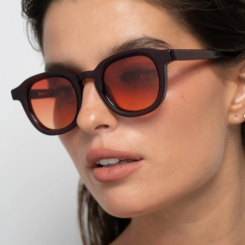
Rich tones feel more controlled because they create depth without relying on aggressive brightness or excessive contrast.
The strongest tonal eyewear creates presence through depth, restraint and balance rather than visual intensity alone.
This makes colour feel intentional rather than decorative.
Narr Burgundy is built around this relationship between deep colour, structured geometry and controlled intensity.

WHY RICH TONES CREATE DEPTH
Deeper colour tones create visual depth because they hold contrast without becoming overly bright.
This allows the frame to feel distinctive while maintaining a composed everyday presence.
The result is stronger than neutral tones, but more controlled than high-saturation colour.
DEPTH VS BRIGHTNESS IN EYEWEAR
Many coloured frames create attention through brightness. Rich tones create attention differently.
Instead of relying on saturation, deeper colours create visual interest through tonal complexity and depth.
This often makes rich colours feel more refined, more intentional and easier to wear over time.
WHY CONTROLLED INTENSITY FEELS MORE REFINED
Controlled intensity gives eyewear a stronger visual identity without making it feel difficult to wear.
The balance comes from combining deeper tones with structured geometry and restrained contrast.
Narr Burgundy uses this balance to create warmer presence without excessive visual weight.

WHY RESTRAINT MAKES COLOUR FEEL STRONGER
The most effective use of colour often comes from restraint rather than excess.
When colour is deep and controlled, it creates a stronger long-term impression than colours that rely on immediate visual impact.
This creates a quieter but more enduring form of presence.
RICH TONES VS BRIGHT COLOURS
Bright colours create visibility through intensity. Rich tones create visibility through depth.
This difference allows burgundy frames to feel expressive without becoming visually loud.
The result feels distinctive while remaining composed across different environments and styling choices.
WHO RICH TONAL FRAMES WORK BEST FOR
Rich tonal frames work especially well for people who want more visual depth than neutral sunglasses without choosing something overly bright.
They are suited to those drawn to warmer, more atmospheric eyewear with clear structure and controlled presence.
They also appeal to people who want colour in their eyewear without sacrificing versatility or everyday wearability.
Narr Burgundy is designed around this balance between tonal depth and directional definition.
RELATED READING
Explore how personal expression and warmth influence the visual character of Narr Burgundy.
Why Burgundy Frames Feel More Personal Than Black Sunglasses
Why Burgundy Frames Create Warmer Presence
EXPLORE RELATED VISUAL STRUCTURES
Narr Shiny Black creates sharper structure through graphic black acetate and cooler lens contrast.
Narr Olive Yellow explores lighter translucent structure with softer tonal clarity.
William Crystal Peach creates calmer warmth through translucent structure and softer tonal depth.
COMMON QUESTIONS
Do rich tones feel more wearable than bright colours?
Yes. Deeper tones create visual interest without the intensity of highly saturated colours.
Why do rich colours feel more controlled?
They create depth and character through tonal complexity rather than brightness or strong saturation.
Do burgundy frames create strong definition?
Yes. The structured panto shape creates definition while the burgundy tone adds controlled warmth and depth.
Are burgundy sunglasses too expressive?
No. Deep burgundy feels more controlled than brighter red tones, making it easier to wear every day.
Who should choose rich tonal eyewear?
People who want colour, individuality and depth without the intensity of brighter or more attention-seeking frames.
Explore Narr Burgundy for structured panto sunglasses designed around rich tonal depth and controlled everyday presence.